Toolbar
Overview
Section titled “Overview”Toolbar was a confirmed catalog gap in the initial M6 audit (no WPF implementation existed at
all) and was built the same day to close it. NaviusToolbar is a plain lookless
ContentControl, not a ToolBar subclass (WPF’s native ToolBar brings overflow-menu/
ToolBarTray behavior this contract does not have): it walks its logical tree for any Control
implementing the IToolbarItem marker interface (buttons, links, toggle items) to give the whole
toolbar, including nested toggle groups, one shared roving Tab stop.
xmlns:navius="clr-namespace:Navius.Wpf.Primitives.Controls;assembly=Navius.Wpf.Primitives"xmlns:toolbar="clr-namespace:Navius.Wpf.Primitives.Controls.Toolbar;assembly=Navius.Wpf.Primitives"
<toolbar:NaviusToolbar Orientation="horizontal" AutomationProperties.Name="Formatting">    <toolbar:NaviusToolbarButton Content="Bold" Command="EditingCommands.ToggleBold" />    <toolbar:NaviusToolbarButton Content="Italic" Command="EditingCommands.ToggleItalic" />    <navius:NaviusSeparator Orientation="Vertical" />    <toolbar:NaviusToolbarToggleGroup Type="single" Value="{Binding Alignment, Mode=TwoWay}">        <toolbar:NaviusToolbarToggleItem Value="left" Content="Left" />        <toolbar:NaviusToolbarToggleItem Value="center" Content="Center" />        <toolbar:NaviusToolbarToggleItem Value="right" Content="Right" />    </toolbar:NaviusToolbarToggleGroup>    <toolbar:NaviusToolbarLink Content="Help" Uri="https://example.com/help" /></toolbar:NaviusToolbar>
The consumer supplies AutomationProperties.Name/LabeledBy directly (not defaulted), matching
the web contract’s “consumer must supply aria-label” requirement.
Properties
Section titled “Properties”| Property | Type | Default | From | Description |
|---|---|---|---|---|
Orientation |
string |
"horizontal" |
NaviusToolbar |
"horizontal" or "vertical"; drives the arrow-key roving axis. |
Loop |
bool |
true |
NaviusToolbar |
Arrow navigation wraps past first/last when true (default). |
Dir |
string? |
null |
NaviusToolbar |
ltr/rtl; falls back to FlowDirection when unset. |
Uri |
System.Uri? |
null |
NaviusToolbarLink |
Navigation target, the WPF analog of the web contract’s href. Command/CommandParameter/CommandTarget come from native Button. |
Type |
string |
"single" |
NaviusToolbarToggleGroup |
"single" (at most one pressed) or "multiple" (any number pressed). |
Value |
IReadOnlyList<string> |
[] |
NaviusToolbarToggleGroup |
Controlled pressed set; two-way via ValueChanged. |
Disabled |
bool |
false |
NaviusToolbarToggleGroup |
Disables every item in the group (combined with each item’s own Disabled via OR). |
Value |
string |
"" |
NaviusToolbarToggleItem |
Identifies this item in the group’s pressed-value set. |
Disabled |
bool |
false |
NaviusToolbarToggleItem |
Effective IsEnabled is Disabled || the ancestor group's own Disabled. |
NaviusToolbarButton adds no properties of its own beyond IToolbarItem; it inherits
NaviusButton’s full surface (soft-disabled mode, the OnClick funnel, and
NaviusButtonAutomationPeer).
Events
Section titled “Events”| Event | Signature | Fires when |
|---|---|---|
ValueChanged |
RoutedEventHandler |
NaviusToolbarToggleGroup’s pressed set changes on a toggle-item click, driven by ToggleButton.Checked/Unchecked bubbling. |
Keyboard interactions
Section titled “Keyboard interactions”| Key | Behavior |
|---|---|
Left/Right (horizontal) or Up/Down (vertical) |
Moves focus between enabled items (button, link, or toggle item alike), honoring Loop and Dir (RTL flip for horizontal). A nested NaviusToolbarToggleGroup’s items participate in the same scan, not their own. |
Home / End |
Jumps focus to the first/last enabled item. |
Space/Enter (on a toggle item) |
Toggles pressed state; Space is guarded against IsRepeat so a held key does not flap, Enter auto-repeat is allowed. |
Space/Enter (on a button/link) |
Native Button/ToggleButton activation. |
UIA mechanism
Section titled “UIA mechanism”NaviusToolbarAutomationPeer (a FrameworkElementAutomationPeer, not the native
ToolBarAutomationPeer, since that peer belongs to a control with overflow-menu semantics this
component does not have) reports AutomationControlType.ToolBar and an orientation-aware
GetOrientationCore(). NaviusToolbarToggleGroup ships its own peer reporting
AutomationControlType.Group. NaviusToolbarButton inherits NaviusButtonAutomationPeer via
NaviusButton; NaviusToolbarToggleItem inherits the native ToggleButton peer. Both are
test-exercised (28 [StaFact] tests in ToolbarTests.cs), including real routed-key-event
Space/Enter activation via an HwndSource-hosted pattern rather than fabricated KeyEventArgs.
Web deltas
Section titled “Web deltas”- 5 web parts (Root/Button/Link/Separator/ToggleGroup+ToggleItem) map onto 6 WPF classes plus the
IToolbarItemmarker interface.NaviusToolbarSeparatorhas no dedicated type: it reuses the general-purposeNaviusSeparatorverbatim (same precedent as Menu), so the web contract’s auto-computedaria-orientation-perpendicular-to-toolbar behavior is not reproduced; the consumer setsOrientationon the separator explicitly. NaviusToolbarToggleGroupis not a subclass ofNaviusToggleGroup, even though the parity doc’s own WPF strategy invited reusing it:NaviusToggleGroup’s roving-tab-stop logic would fightNaviusToolbarowning the single shared roving domain across mixed control types. Its pressed-set selection logic (single/multiple, clear-on-reclick, replace/toggle) is ported (duplicated), not inherited.- Known simplification: the seated Tab stop is recomputed fresh on content-change and on every
roving keypress, not via per-item
IsEnabledChangedsubscriptions, so an item’s disabled state flipping at runtime only moves the seated Tab stop at the next roving interaction, not instantly (the same simplificationNaviusRadioGroup/NaviusToggleGroupmake for their own item families). DefaultValue(the contract’s uncontrolled-initial-pressed-set parameter) is dropped, matchingNaviusToggleGroup’s own WPF port:Valueis a single plain two-wayDependencyProperty, with no separate controlled/uncontrolled distinction.NaviusToolbarLinkhas noDisabledproperty at all, matching the contract’s “no intrinsic disabled state… always participates in roving”; a consumer can still set nativeIsEnableddirectly, but that is not a modeled “Disabled” concept here.
Captures
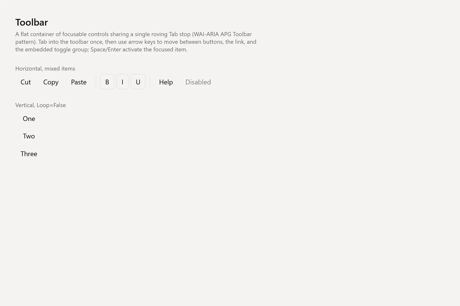
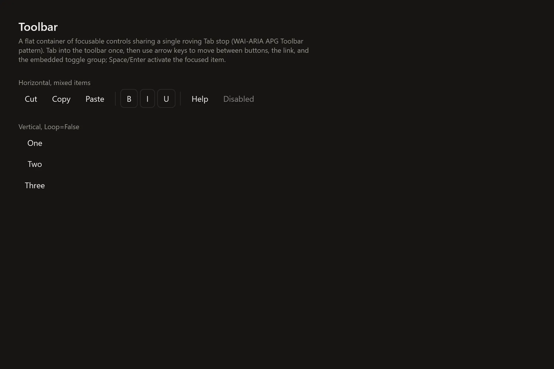
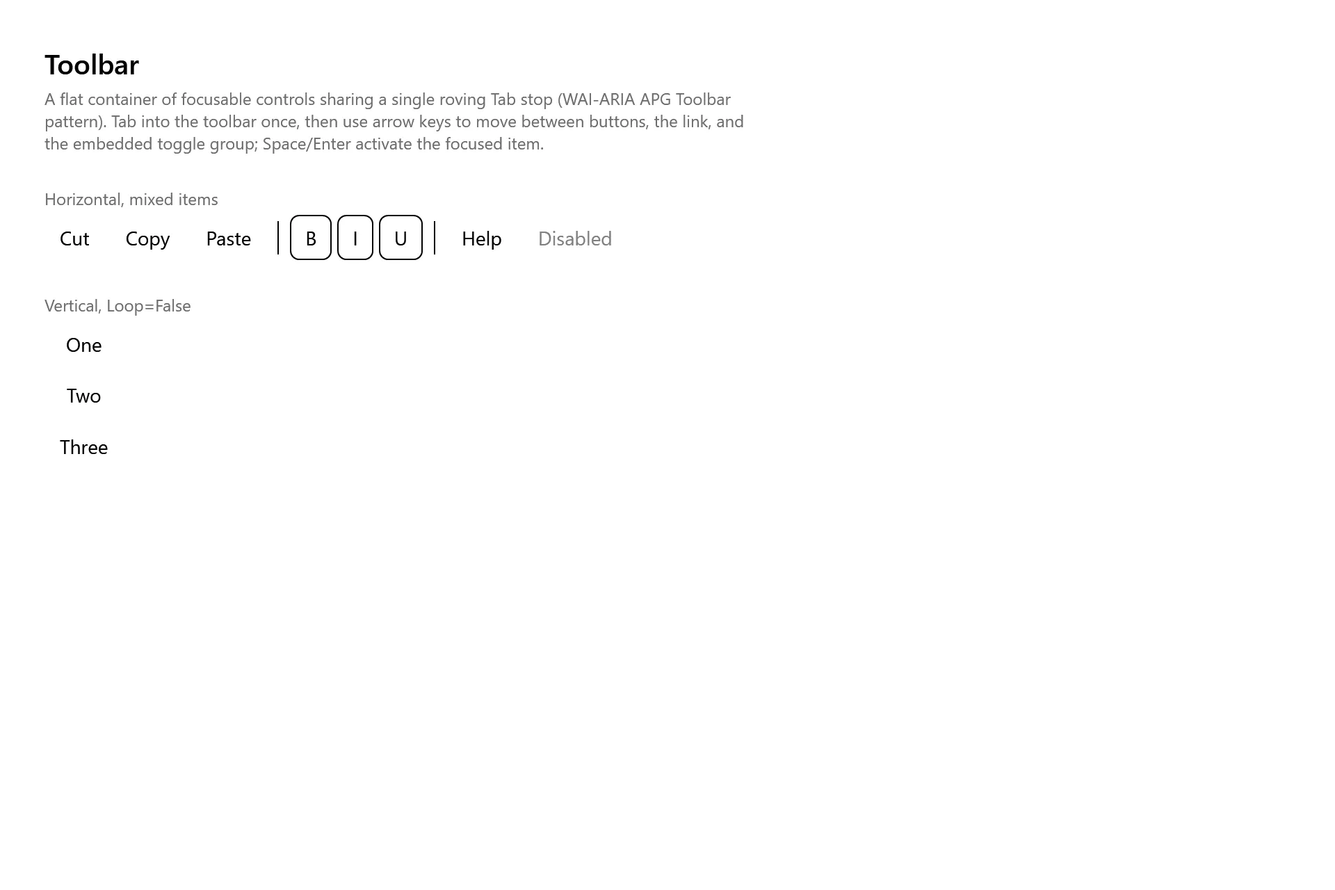
Section titled “Captures”The Toolbar Gallery page rendered at the pinned commit, in each theme.