Combobox
Overview
Section titled “Overview”Combobox is a lookless Control pairing an editable filter textbox with a popup listbox: the
web family’s 22-part Root/Input/Trigger/Value/Chips/Portal/Popup/List/Item/Group/Status anatomy
folds into one templated NaviusCombobox<TItem> (generic over the item type) built on the
non-generic NaviusComboboxBase. It supports single-select and, via Multiple, multi-select
with removable chips, filtering Items against a live Query and preserving the web’s
virtual-focus model: real keyboard focus never leaves the input, and the highlighted row is a
data pointer, not a WPF focus target.
xmlns:combobox="clr-namespace:Navius.Wpf.Primitives.Controls.Combobox;assembly=Navius.Wpf.Primitives"
<ContentControl x:Name="ComboboxHost" />
var combobox = new NaviusCombobox<string>{ Items = Fruits, Placeholder = "Search fruit...",};combobox.ValueChanged += (_, value) => SelectedFruit = value;ComboboxHost.Content = combobox;NaviusCombobox<TItem> is generic, and WPF’s compiled-XAML compiler rejects x:TypeArguments on
any element other than the document’s root, so a closed NaviusCombobox<T> cannot be declared
inline inside a larger XAML tree. It is built in code-behind instead and dropped into a plain
placeholder host, the same pattern this repo’s own Gallery page uses (ComboboxPage.xaml/
ComboboxPage.xaml.cs): a generic control is simpler to instantiate that way than via
x:TypeArguments in XAML. WPF resolves default styles per closed generic type, so the control
overrides DefaultStyleKeyProperty onto the non-generic NaviusComboboxBase. Its style lives in
Themes/Combobox.xaml, merged into the assembly’s Generic.xaml, so default styles resolve with
no consumer action.
Properties
Section titled “Properties”| Property | Type | Default | From | Description |
|---|---|---|---|---|
IsOpen |
bool |
false |
NaviusComboboxBase |
Popup open state. Two-way bindable by default. |
Query |
string |
"" |
NaviusComboboxBase |
Live filter text, tracked separately from the committed value(s). Two-way bindable by default. |
Placeholder |
string? |
null |
NaviusComboboxBase |
- |
Multiple |
bool |
false |
NaviusComboboxBase |
Enables multi-select with chips. |
Disabled |
bool |
false |
NaviusComboboxBase |
- |
ReadOnly |
bool |
false |
NaviusComboboxBase |
- |
HighlightedIndex |
int |
-1 |
NaviusComboboxBase |
Highlighted-row pointer. Virtual focus: this never moves WPF keyboard focus. |
Side |
PlacementSide |
Bottom |
NaviusComboboxBase |
Popup placement side. |
Align |
PlacementAlign |
Start |
NaviusComboboxBase |
Popup placement alignment. |
SideOffset |
double |
4 |
NaviusComboboxBase |
- |
AlignOffset |
double |
0 |
NaviusComboboxBase |
- |
ItemTemplate |
DataTemplate? |
null |
NaviusComboboxBase |
Row template; falls back to the theme’s default row template when null. |
ChipTemplate |
DataTemplate? |
null |
NaviusComboboxBase |
Chip template; falls back to the theme’s default chip template when null. |
HasSelection |
bool |
false |
NaviusComboboxBase |
Read-only. True once a value (or any value, multi-select) is committed. |
IsEmpty |
bool |
true |
NaviusComboboxBase |
Read-only. True when the filtered row list has no rows. |
StatusText |
string |
"" |
NaviusComboboxBase |
Read-only. "{n} results" text mirrored to the live region and UIA notification. |
Items |
IReadOnlyList<TItem> |
Array.Empty<TItem>() |
NaviusCombobox<TItem> |
Full item set to filter; items are the values. |
Value |
TItem? |
default |
NaviusCombobox<TItem> |
Single-select committed value. Two-way bindable by default. |
Values |
IReadOnlyList<TItem> |
Array.Empty<TItem>() |
NaviusCombobox<TItem> |
Multi-select committed values. Two-way bindable by default. |
ItemToString |
Func<TItem, string>? |
null |
NaviusCombobox<TItem> |
Maps an item to its display label. Defaults to x?.ToString(). |
Filter |
Func<TItem, string, bool>? |
null |
NaviusCombobox<TItem> |
Row-match predicate. Defaults to a case-insensitive substring match against the stringified item. |
Commands
Section titled “Commands”| Command | Description |
|---|---|
NaviusComboboxBase.RemoveChipCommand |
Bound to each chip’s remove button with the chip’s value as the command parameter; removes by value identity, never by the chip’s displayed index. |
Events
Section titled “Events”| Event | Signature | Fires when |
|---|---|---|
ValueChanged |
EventHandler<TItem?> |
The single-select committed value changes (select, clear, remove). |
ValuesChanged |
EventHandler<IReadOnlyList<TItem>> |
The multi-select committed values list changes (toggle, backspace-remove, chip-remove, clear). |
Keyboard interactions
Section titled “Keyboard interactions”| Key | Behavior |
|---|---|
ArrowDown |
Opens the popup if closed. If open, moves the highlight down by one row (clamped to the last row, no wrap). |
ArrowUp |
Opens the popup and highlights the last row if closed. If open, moves the highlight up by one row (clamped to the first row, no wrap). |
Enter |
Commits the highlighted row, if the popup is open and a row is highlighted. |
Escape |
Closes the popup and reverts the filter text to the committed value’s label. |
Tab |
Closes the popup with the same revert, without marking the key handled so real Tab focus navigation still proceeds. |
Backspace |
Multi-select only: removes the last selected value when the filter is empty and a selection exists. |
Home / Page Up |
Highlights the first row, if the popup is open. |
End / Page Down |
Highlights the last row, if the popup is open. |
All handled by a single PreviewKeyDown hook on PART_Input; no other template part has its own
key handler. ArrowLeft/ArrowRight chip roving, Delete, and Space are unhandled, matching
the web contract.
UIA mechanism
Section titled “UIA mechanism”NaviusComboboxAutomationPeer (internal, a FrameworkElementAutomationPeer declared alongside
NaviusComboboxBase rather than in its own file) reports AutomationControlType.ComboBox and
implements IExpandCollapseProvider, mapping Expand()/Collapse() to IsOpen = true/false
so the web’s aria-expanded becomes a real UIA ExpandCollapse pattern. The peer overrides
IsEnabledCore() to fold in the Disabled DP (base.IsEnabledCore() && !_owner.Disabled),
independent of the inherited IsEnabled that FrameworkElementAutomationPeer reflects by default,
so a Disabled combobox reports IsEnabled == false to UIA. Expand()/Collapse() are guarded to
match: both throw ElementNotEnabledException when Disabled or the owner is otherwise not
enabled, instead of silently opening or closing a disabled combobox. The web’s
aria-activedescendant-driven virtual-focus announcement has no WPF equivalent (WPF focus is
always a real element); no per-row SelectionItemPattern peers exist, so a screen reader is not
told which row is highlighted as ArrowUp/ArrowDown moves it. StatusText partially
compensates: it is a visible TextBlock also carrying AutomationProperties.LiveSetting="Polite"
and pushed via AutomationPeer.RaiseNotificationEvent(AutomationNotificationKind.Other, CurrentThenMostRecent, ...) on every filtered-count change, announcing the result count, not the
highlighted row. The unit suite exercises value/values commit, chip removal by value identity
(not display index), the open/close/revert lifecycle against real windows, and the Disabled
peer’s IsEnabledCore/guarded-Expand behavior; the M6 audit’s
full keyboard-table and peer walkthrough found no confirmed or plausible disparities.
Web deltas
Section titled “Web deltas”- The web’s 22 rendering parts (Root/Input/Trigger/Icon/Value/Clear/Chips/Chip/ChipRemove/Portal/
Backdrop/Positioner/Popup/Arrow/Collection/List/Row/Item/ItemIndicator/Group/GroupLabel/
Separator/Empty/Status) collapse into one lookless
NaviusCombobox<TItem>with template partsPART_Input,PART_Popup,PART_PopupContent,PART_List,PART_Chips,PART_Clear. - No discrete Trigger button part: the input itself is the anchor and trigger (opening is via
typing or
ArrowDown); only a presentational chevron glyph remains, not a separateIsTabStop="False"button. Group/GroupLabel/Separatorare not ported: the WPFItemssurface is a flatIReadOnlyList<TItem>, since grouping was optional composition on the web.- Portal’s CSS-selector
ContainerandKeepMountedhave no WPF equivalent and are dropped; the popup is aNaviusAnchoredPopuppushed through the sharedOverlayStack(Modal=false,CloseOnEscape=false,TrapFocus=false,RestoreFocus=false), matching the web’s non-modal, no-trap, virtual-focus configuration. ItemTemplate/ChipTemplateareDataTemplates (the WPF analogue ofRenderFragment<TItem>), swapped in via code rather than an ancestor-bound trigger, becauseRelativeSource FindAncestorcannot cross the popup’s separate visual tree.- Dropped web-only parameters:
Attributes/Classon every part,Dir(WPFFlowDirectionis the platform channel instead),DefaultOpen(a two-wayIsOpenbinding covers both controlled and uncontrolled use),ItemIndicator.KeepMounted(a CSS exit-animation concern with no WPF equivalent). - Virtual focus is preserved (real focus never leaves
PART_Input; the highlighted row isComboboxRowVm.IsHighlighted, a data pointer), but unlike the web’saria-activedescendantwiring, there is no UIA equivalent telling a screen reader which row is highlighted; theStatusTextlive region announces result counts only. - Known residual, peer name:
NaviusComboboxAutomationPeer.GetClassNameCore()returns the fixed literalnameof(NaviusComboboxBase)for every closed generic instantiation, so a consumer usingNaviusCombobox<string>(or any otherTItem) reports the same base-type class name to Narrator/UIA rather than a name reflecting the type actually declared in XAML. Not flagged as a fix in the M6 audit (which found no confirmed or plausible disparities for this family), so it stands as a pre-existing design gap, stated here plainly rather than rounded up.
Captures
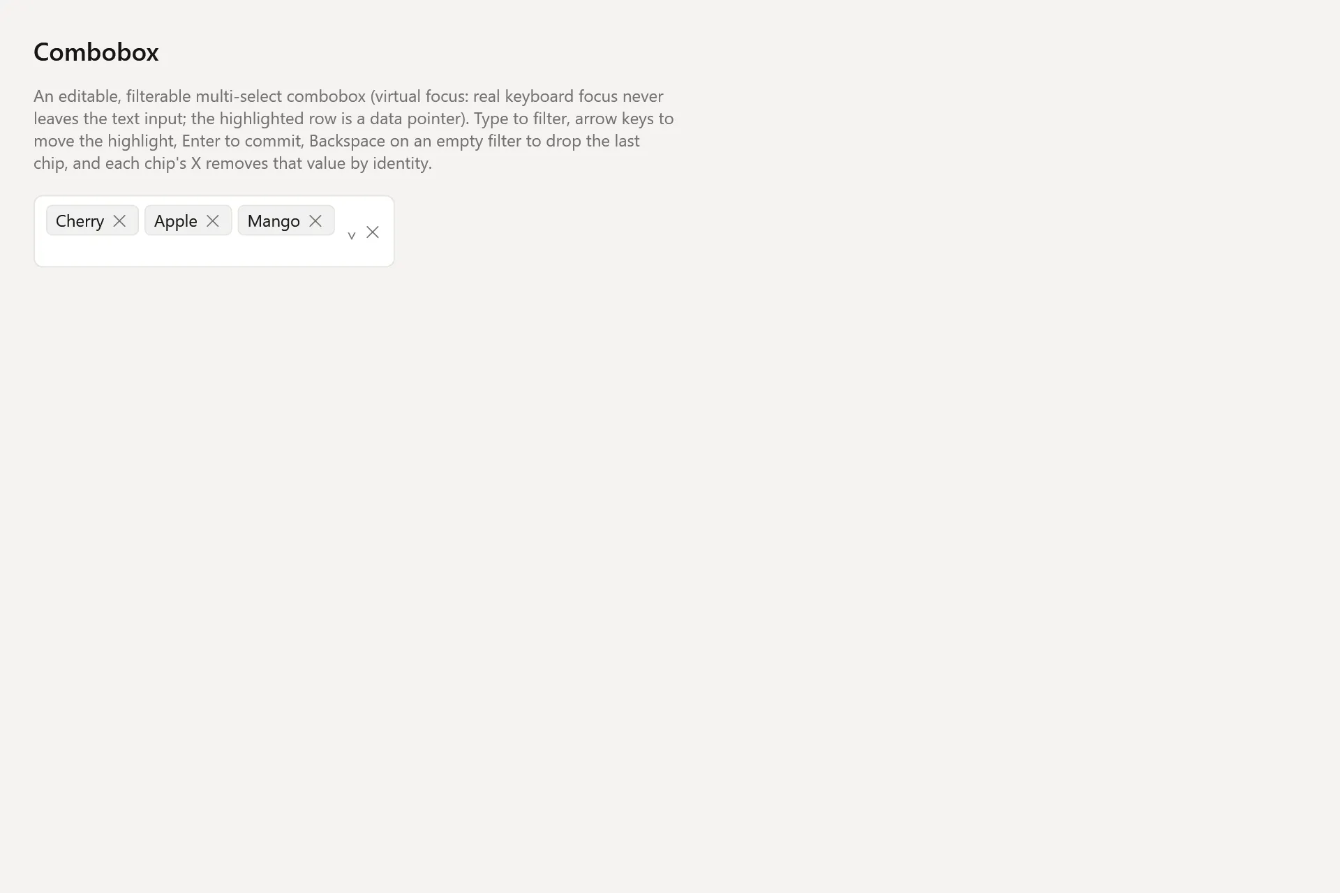
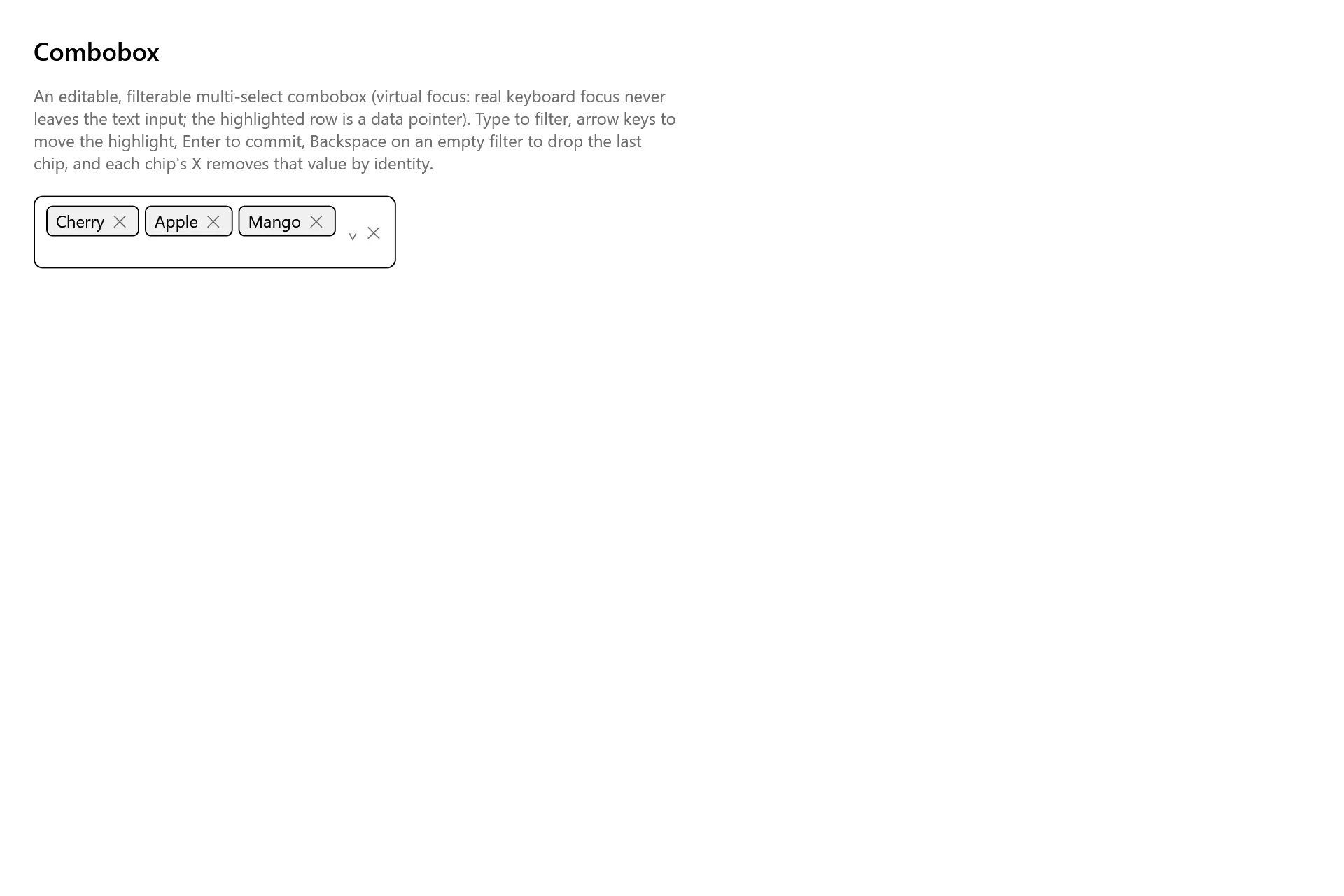
Section titled “Captures”The Combobox Gallery page rendered at the pinned commit, in each theme.