Drawer
Overview
Section titled “Overview”Drawer is a lookless ContentControl docked to one edge (Side) of the window and driven by the
same NaviusOverlaySurfaceBase state machine as Dialog and AlertDialog: open/close, Escape and
optional outside-click dismissal, and focus cycling through the shared OverlayStack. On top of
that it slides its panel in and out from the docked edge. This port is keyboard and button dismiss
only: drag-to-dismiss, snap points, and the web contract’s swipe-progress hooks are not
implemented.
xmlns:navius="clr-namespace:Navius.Wpf.Primitives.Controls;assembly=Navius.Wpf.Primitives"xmlns:overlay="clr-namespace:Navius.Wpf.Primitives.Controls.OverlaySurface;assembly=Navius.Wpf.Primitives"xmlns:drawer="clr-namespace:Navius.Wpf.Primitives.Controls.Drawer;assembly=Navius.Wpf.Primitives"
<Grid>    <!-- app content -->    <navius:NaviusButton Content="Open filters" Click="OnOpenDrawer" />
    <!-- one layer per window, stretched over the root -->    <overlay:NaviusOverlayLayer>        <drawer:NaviusDrawer x:Name="Filters"                              Side="Right"                              PanelWidth="420"                              Title="Filters"                              Description="Narrow the results.">            <StackPanel>                <TextBlock Text="Filter options go here." />                <navius:NaviusButton Content="Close"                                     Command="overlay:NaviusOverlaySurfaceBase.CloseCommand" />            </StackPanel>        </drawer:NaviusDrawer>    </overlay:NaviusOverlayLayer></Grid>
Like Dialog, a Drawer is declared as a direct XAML child of the layer and stays Collapsed until
opened; a window with no NaviusOverlayLayer still parses, but opening logs a
Trace.TraceWarning and reverts IsOpen to false. The default PART_Panel template part is
what slides; a custom template must name a panel element the same way for the slide animation to
find it (a 360px fallback extent applies if the panel has no explicit Width/Height set on its
offset axis).
Properties
Section titled “Properties”| Property | Type | Default | From | Description |
|---|---|---|---|---|
IsOpen |
bool |
false |
NaviusOverlaySurfaceBase |
Open state. Two-way bindable by default. A canceled Closing reverts it to true so the DP never desyncs from the live overlay. |
Title |
string? |
null |
NaviusOverlaySurfaceBase |
Accessible name. Applied via AutomationProperties.Name on engage. |
Description |
string? |
null |
NaviusOverlaySurfaceBase |
Accessible help text. Applied via AutomationProperties.HelpText on engage. |
Modal |
bool |
true |
NaviusDrawer |
When true: focus is trapped, outside interaction is blocked. When false: no trap, outside content stays interactive. |
CloseOnOutsideClick |
bool |
true |
NaviusDrawer |
Whether a press outside the panel dismisses the drawer. |
Side |
NaviusDrawerSide |
Bottom |
NaviusDrawer |
The edge the sheet docks to and slides from: Left | Right | Top | Bottom. An enum, replacing the web contract’s unvalidated free string. |
PanelWidth |
double |
360 |
NaviusDrawer |
Width used by left/right drawers. Top/bottom templates set the panel width to Auto so it stretches across the host. |
PanelHeight |
double |
280 |
NaviusDrawer |
Height used by top/bottom drawers. Left/right templates set the panel height to Auto so it stretches along the host. |
Content |
object |
- |
ContentControl |
The drawer body. |
Methods
Section titled “Methods”| Method | Description |
|---|---|
Open() |
Sets IsOpen to true via SetCurrentValue, preserving an existing two-way binding. |
Close() |
Sets IsOpen to false via SetCurrentValue, preserving an existing two-way binding. |
Commands
Section titled “Commands”| Command | Description |
|---|---|
NaviusOverlaySurfaceBase.CloseCommand |
Bind any element inside Content to request a close, mirroring the web’s NaviusDrawerClose part. |
Events
Section titled “Events”| Event | Signature | Fires when |
|---|---|---|
Opened |
EventHandler |
The overlay has engaged: pushed onto the OverlayStack, slide-and-fade enter animation started. |
Closing |
EventHandler<OverlayClosingEventArgs> |
A close was requested (Escape, outside press, CloseCommand, or IsOpen = false). Cancelable: set Cancel to keep the drawer open. |
Closed |
EventHandler |
The exit animation completed and the surface left its layer. |
Keyboard interactions
Section titled “Keyboard interactions”| Key | Behavior |
|---|---|
Escape |
Closes the drawer. Fixed on, not configurable. |
Tab / Shift + Tab |
Cycles focus among the drawer’s focusable descendants while Modal is true, via KeyboardNavigationMode.Cycle applied by the OverlayStack focus trap. |
UIA mechanism
Section titled “UIA mechanism”NaviusDrawerAutomationPeer (a FrameworkElementAutomationPeer) reports
AutomationControlType.Window and overrides IsDialogCore() to return true, the same mapping
as Dialog: a docked sheet is still, semantically, a dialog to assistive tech. Title/Description
are applied as AutomationProperties.Name/HelpText on engage, the same shared
NaviusOverlaySurfaceBase.Engage() behavior Dialog and AlertDialog use (applied uniformly across
all three families even though the web source’s own missing-title dev warning only exists on
Dialog’s Popup). The unit suite (DrawerTests.cs) exercises the shared canceled-Closing fix,
the Side enum, and DrawerGeometry.GetOffscreenOffset’s per-side offset math directly, without a
live visual tree or running Storyboard.
Web deltas
Section titled “Web deltas”- One control instead of eight parts, same shape as Dialog: the web’s Root/Trigger/Portal/
Backdrop/Popup/Title/Description/Close anatomy folds into
NaviusDrawerplusCloseCommand. Sideis theNaviusDrawerSide { Left, Right, Top, Bottom }enum, not a free string, resolving the web contract’s own open question about needing a proper type. The per-side offscreen offset is computed by the pure, unit-testedDrawerGeometry.GetOffscreenOffset(Side, panelSize).- Drag-to-dismiss (
createSheetSwipe), snap points, and thedata-swiping/--drawer-swipe-movement-x/yswipe-progress hooks are not implemented: this port is keyboard (Escape) and button (CloseCommand) dismiss only. NaviusOverlayLayerreplaces the web’s CSS-selectorContainerparameter, the same as Dialog.- Enter/exit is a 150ms
Opacityfade (inherited) plus aTranslateTransformslide ofPART_PanelbetweenDrawerGeometry.GetOffscreenOffset(Side, extent)and(0, 0), driven by plainDoubleAnimations;Navius.Wpf.Primitivesdoes not referenceNavius.Wpf.Motion. - The web source’s dev-time “missing title” warning exists only on Dialog’s Popup; the WPF port
closes that inconsistency by applying the same
AutomationProperties.SetName/SetHelpTexttreatment uniformly to Dialog, AlertDialog, and Drawer via the shared base’sEngage(). - Known residual (M6 audit): a non-modal Drawer (
Modal="false") does not restore focus to the previously focused element on close, the same root cause as Dialog’s residual (OverlayStackonly captures a restore target whenTrapFocusis true, which tracks modality for every current consumer). Left for the Overlays owner.
Captures
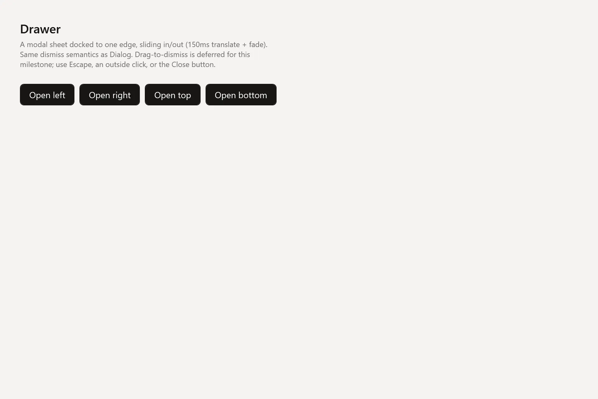
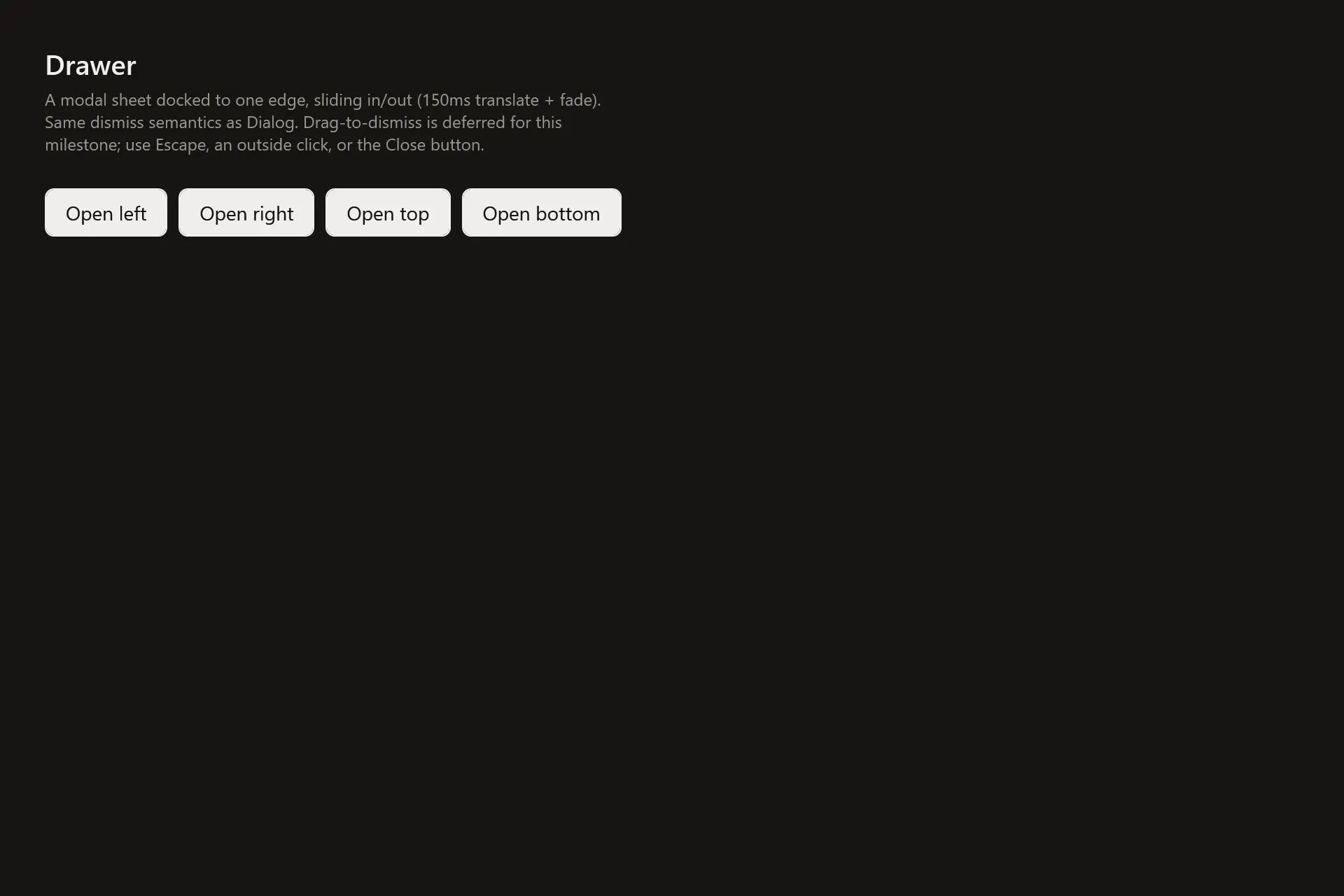
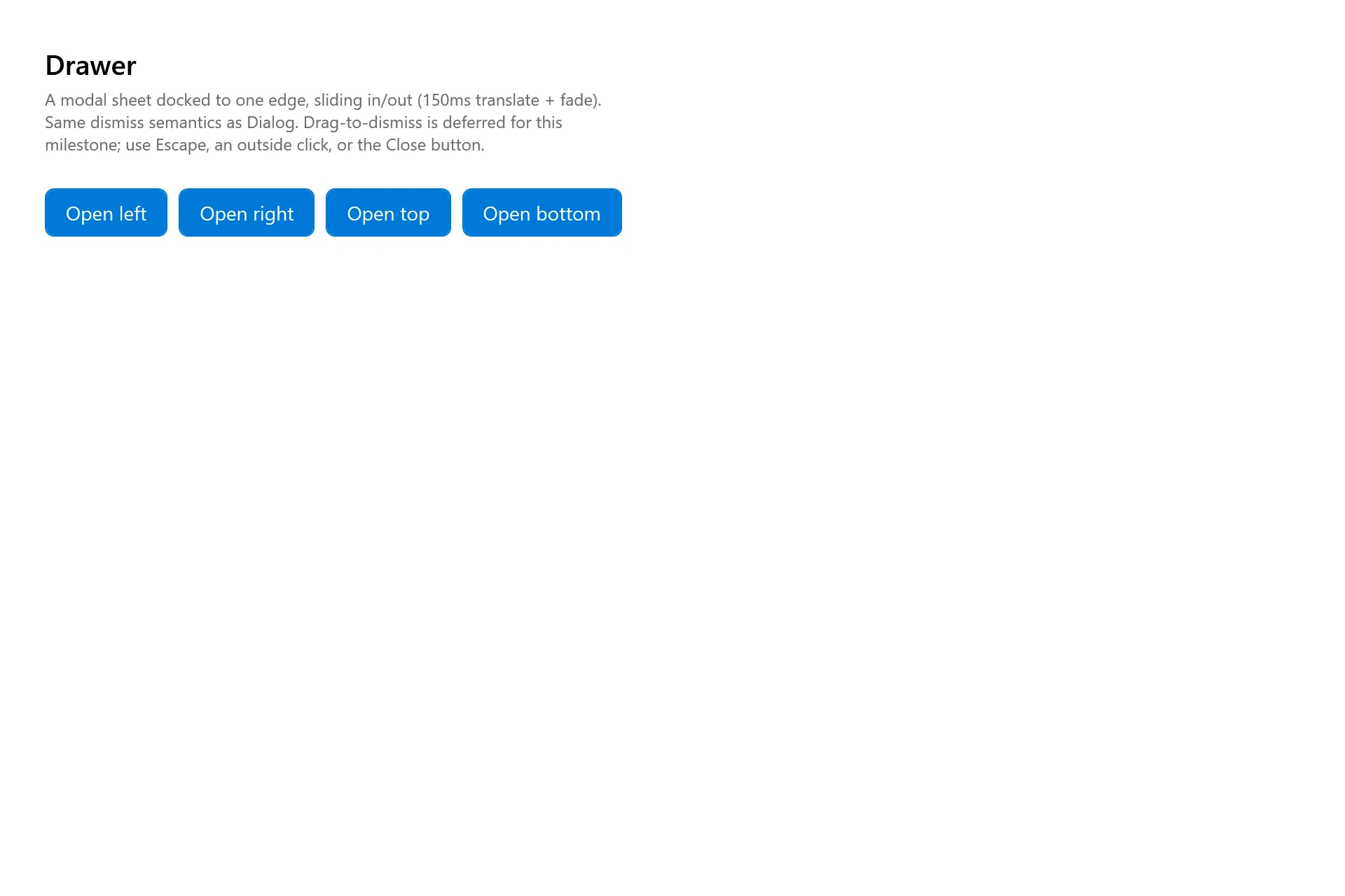
Section titled “Captures”The Drawer Gallery page rendered at the pinned commit, in each theme.