Collapsible
Overview
Section titled “Overview”Collapsible is a lookless ContentControl root (NaviusCollapsible) that owns a single Open
boolean and discovers its NaviusCollapsibleTrigger/NaviusCollapsiblePanel descendants through
the logical tree, the same “root owns state, discovers descendants” shape as NaviusAccordion and
NaviusRadioGroup. WPF’s native Expander was rejected as a base because it fuses header and
content into one control and cannot preserve the contract’s separately addressable Trigger/Panel
parts.
xmlns:navius="clr-namespace:Navius.Wpf.Primitives.Controls;assembly=Navius.Wpf.Primitives"xmlns:collapsible="clr-namespace:Navius.Wpf.Primitives.Controls.Collapsible;assembly=Navius.Wpf.Primitives"
<collapsible:NaviusCollapsible x:Name="Details">    <StackPanel>        <collapsible:NaviusCollapsibleTrigger Content="Show details" />        <collapsible:NaviusCollapsiblePanel>            <TextBlock Text="Hidden content revealed when open." />        </collapsible:NaviusCollapsiblePanel>    </StackPanel></collapsible:NaviusCollapsible>
Properties
Section titled “Properties”| Property | Type | Default | From | Description |
|---|---|---|---|---|
Open |
bool |
false |
NaviusCollapsible |
Open/closed state. Bindable via standard WPF binding; OpenChanged fires on every change. |
IsPanelOpen |
bool |
false |
NaviusCollapsibleTrigger |
Mirrors Open; set by the ancestor NaviusCollapsible, not by the trigger itself. |
IsOpen |
bool |
false |
NaviusCollapsiblePanel |
Mirrors Open; set by the ancestor NaviusCollapsible. |
KeepMounted |
bool |
false |
NaviusCollapsiblePanel |
Keeps Content cached and only toggles Visibility instead of clearing Content on close. |
Content |
object |
- |
ContentControl |
Body content on the root, Trigger, and Panel. |
Events
Section titled “Events”| Event | Signature | Fires when |
|---|---|---|
OpenChanged |
RoutedEventHandler |
Open changes (a trigger click or a direct Open write). |
Keyboard interactions
Section titled “Keyboard interactions”| Key | Behavior |
|---|---|
Space / Enter |
Toggles the panel; native Button.Click behavior on the focused NaviusCollapsibleTrigger, no custom key handler. |
UIA mechanism
Section titled “UIA mechanism”NaviusCollapsibleAutomationPeer reports AutomationControlType.Group on the root and carries no
expand/collapse state of its own, matching the contract’s asymmetry where the root exposes no
data-* state attribute at all. NaviusCollapsibleTriggerAutomationPeer reports
AutomationControlType.Button and implements both IInvokeProvider (native Button behavior) and
IExpandCollapseProvider (ExpandCollapseState from IsPanelOpen), the same dual-pattern shape
WPF’s own ExpanderAutomationPeer uses. IInvokeProvider.Invoke queues activation onto the
trigger’s dispatcher (DispatcherPriority.Input) per the UIA Invoke contract’s requirement to
return immediately; IExpandCollapseProvider.Expand/Collapse run synchronously, reaching the
requested open/closed state before returning, per the ExpandCollapse provider contract. Both paths
route through ButtonBase.OnClick rather than a bare RaiseEvent, so a bound Command executes
and not just Click. A disabled trigger throws ElementNotEnabledException from all three members.
CollapsibleTests.cs exercises the root-owns-state shape, the dual trigger patterns, the
async-Invoke/synchronous-ExpandCollapse split, command execution through UIA, the disabled-throws
behavior, and the IsEnabled cascading described below.
Web deltas
Section titled “Web deltas”HiddenUntilFound(the web’s browser in-page-find integration) is dropped entirely; there is no WPF “find in page” affordance to hook a reveal callback into.- WPF’s
IsEnableddoes not automatically cascade through aContentControl’s logicalContent;SyncDescendantsexplicitly pushes it onto the Trigger, matching “Disabled blocks toggling.” - The enter/exit height transition is a plain
DoubleAnimationvia a sharedPanelHeightAnimatorhelper (also used byNaviusAccordionPanel), not the web’s JS-measured natural-size CSS variables or two-phase “starting-style” mount frame; Height animates from a hard 0 instead. - Logical open/closed state (
Open,IsPanelOpen,IsOpen, and the peer’sExpandCollapseState) flips synchronously and independently of the animation clock, so it stays correct in a headless test host where nothing pumps the animation to completion; only the cosmetic Height/Visibility transition is asynchronous. KeepMounted=false(default) additionally caches and clearsContentonce the close animation’sCompletedcallback fires, approximating DOM removal; the web’sKeepMountedonly toggles visibility/hidden state, since Blazor content isn’t cached/cleared the same way.
Captures
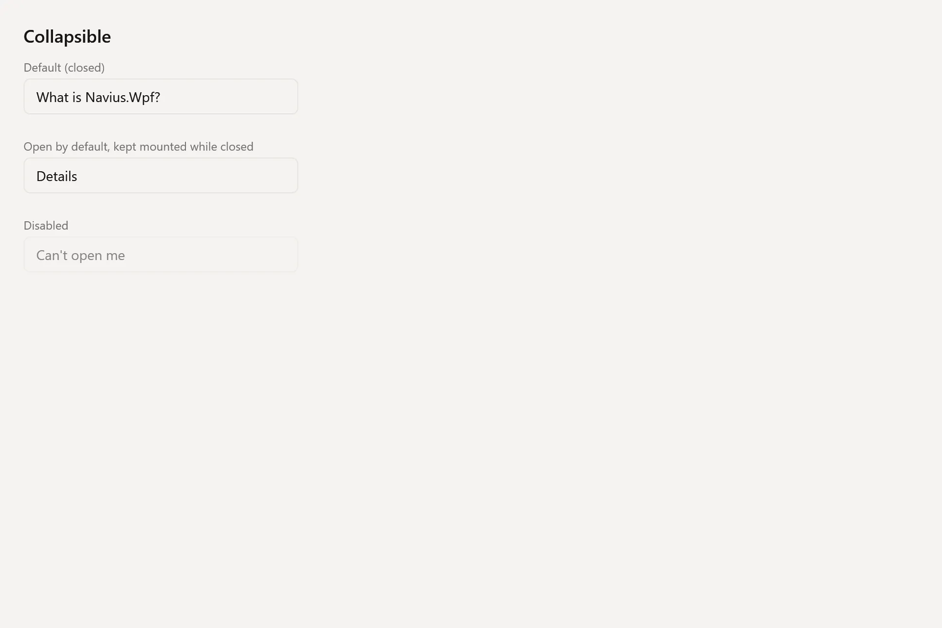
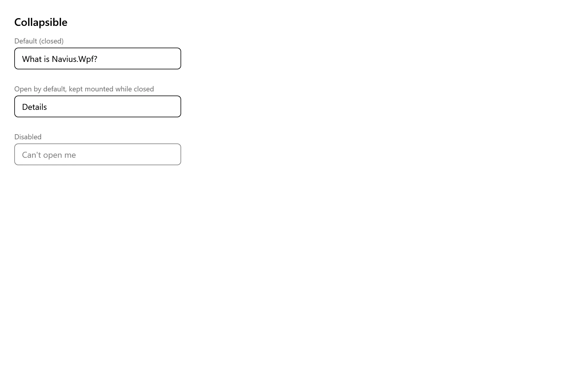
Section titled “Captures”The Collapsible Gallery page rendered at the pinned commit, in each theme.