Switch
Overview
Section titled “Overview”Switch derives directly from the native ToggleButton (IsThreeState forced false), with a
mandatory PART_Thumb template part styled off the same IsChecked/IsEnabled triggers as the
track, and an OnToggle() override that no-ops while ReadOnly rather than exposing a separate
lock property.
xmlns:navius="clr-namespace:Navius.Wpf.Primitives.Controls;assembly=Navius.Wpf.Primitives"
<navius:NaviusSwitch x:Name="Notifications"                      IsChecked="{Binding NotificationsEnabled, Mode=TwoWay}"                      Content="Email notifications" />
Properties
Section titled “Properties”| Property | Type | Default | From | Description |
|---|---|---|---|---|
IsChecked |
bool? |
false |
System.Windows.Controls.Primitives.ToggleButton |
On/off state. IsThreeState is forced false in the constructor. Two-way bindable by default. |
ReadOnly |
bool |
false |
NaviusSwitch |
Focusable but the value cannot change; enforced by an OnToggle() override that no-ops (skips base.OnToggle()) without touching IsEnabled/Focusable. Programmatic IsChecked changes still work. |
Required |
bool |
false |
NaviusSwitch |
Exposed for API parity; no enforcement behavior in this port. |
Events
Section titled “Events”| Event | Signature | Fires when |
|---|---|---|
Checked / Unchecked (inherited) |
RoutedEventHandler |
IsChecked flips via user click (blocked while ReadOnly or Disabled) or programmatic set. |
Keyboard interactions
Section titled “Keyboard interactions”| Key | Behavior |
|---|---|
| Space | Native ButtonBase press-on-key-down/click-on-key-up activation toggles IsChecked; verified via real routed KeyDown/KeyUp events (SwitchTests.SpaceKey_TogglesCheckedState). |
| Enter | Native ButtonBase click-on-key-down activation (via KeyboardNavigation.AcceptsReturn, metadata-overridden to true by ButtonBase) toggles IsChecked; verified the same way (SwitchTests.EnterKey_TogglesCheckedState). |
Both keys are blocked while ReadOnly (EnterKey_BlockedWhenReadOnly); a disabled element never
receives the key events at all.
UIA mechanism
Section titled “UIA mechanism”NaviusSwitch ships no custom AutomationPeer; it inherits ToggleButtonAutomationPeer,
exposing UIA TogglePattern, the closest native mapping to role="switch"/aria-checked
available in WPF. PART_Thumb is a template part only, with no dedicated CLR type, styled
directly off the same IsChecked/IsEnabled triggers as the track. The unit suite exercises the
inherited peer (AutomationPeer_IsToggleButtonAutomationPeer_WithTogglePattern), the mandatory
PART_Thumb part, ReadOnly’s focusable-but-immutable guard, and both Space and Enter via real
routed key events on an HwndSource-hosted control.
Web deltas
Section titled “Web deltas”- Form-submission mirroring (
Name,Value,Form) is dropped entirely; no WPF form model. ReadOnlyhas no native WPFToggleButtonequivalent; implemented via anOnToggle()override, the same pattern used byNaviusCheckbox/NaviusRadioGroupItem.NaviusSwitchThumb(a cascaded-context component on the web) becomesPART_Thumb, a mandatory template part with no CLR type, styled directly byStyletriggers instead of mirroring state through a shared context object.- Thumb slide is a 120ms
DoubleAnimationon aTranslateTransform, driven byTrigger.EnterActions/ExitActionsinThemes/Switch.xaml(plain WPFStoryboard, no motion-library dependency). Attributessplat is dropped.- An earlier audit draft briefly added a custom
OnKeyDownoverride after misreading Enter as dead (a test-harness artifact: invokingOnKeyDowndirectly bypassesButtonBase’se.OriginalSource == thisgate); the override was removed once real routed-key tests proved nativeButtonBasealready activates on both Space and Enter, soNaviusSwitch.csships with no custom key handling at all.
Captures
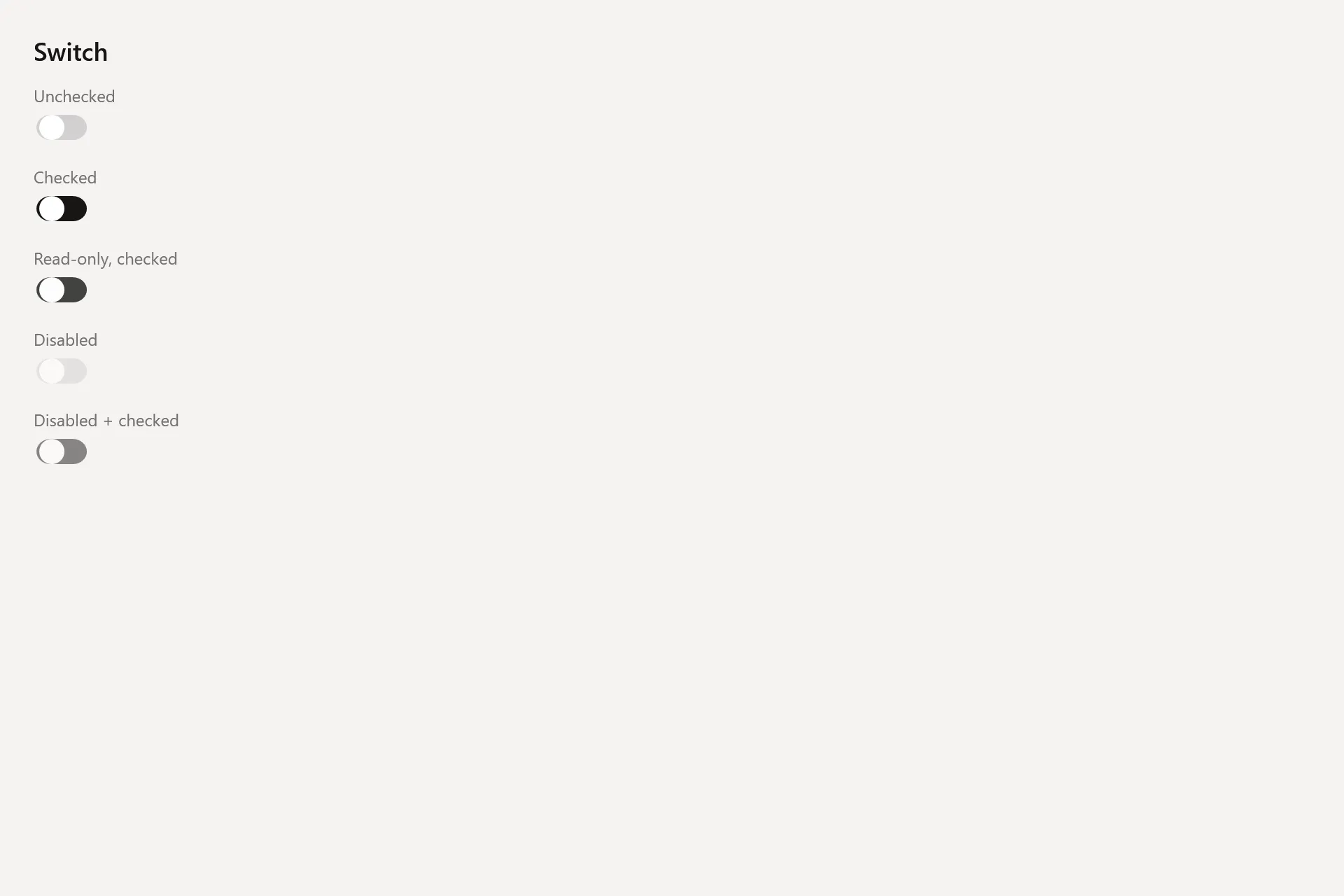
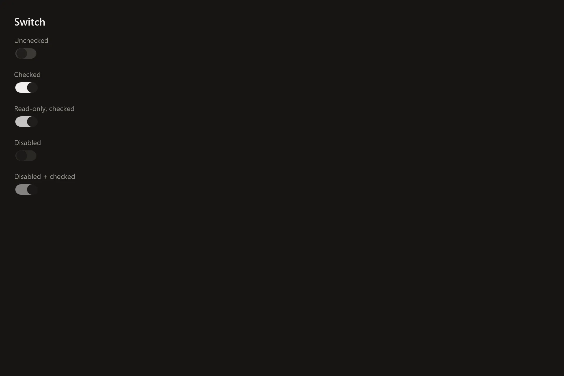
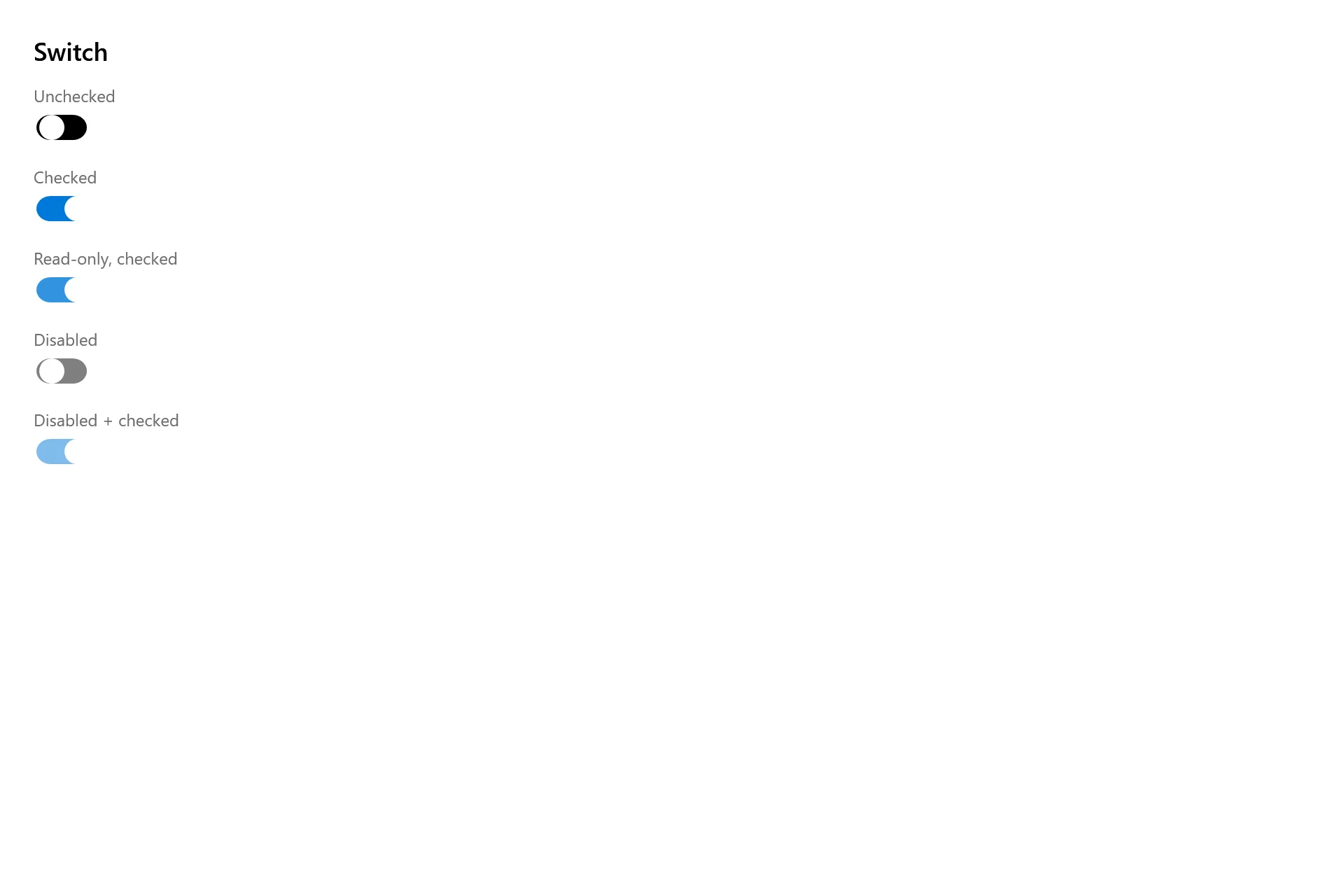
Section titled “Captures”The Switch Gallery page rendered at the pinned commit, in each theme.