Checkbox
Overview
Section titled “Overview”Checkbox derives directly from the native CheckBox, which already models tri-state via
IsThreeState plus a nullable IsChecked. The constructor forces IsThreeState = true so
indeterminate is reachable programmatically, but an OnToggle() override replaces the native
three-value click cycle with a binary one: a click always lands on checked or unchecked, never
indeterminate. NaviusCheckboxIndicator is a composable glyph part, and NaviusCheckboxGroup is
a separate lookless container that coordinates a set of checkboxes for a select-all roll-up.
xmlns:checkbox="clr-namespace:Navius.Wpf.Primitives.Controls.Checkbox;assembly=Navius.Wpf.Primitives"
<checkbox:NaviusCheckboxGroup AllValues="{Binding AllNames}"                               Value="{Binding Selected, Mode=TwoWay}">    <StackPanel>        <checkbox:NaviusCheckbox IsSelectAll="True" Content="Select all" />        <checkbox:NaviusCheckbox GroupValue="a" Content="Option A" />        <checkbox:NaviusCheckbox GroupValue="b" Content="Option B" />    </StackPanel></checkbox:NaviusCheckboxGroup>
<checkbox:NaviusCheckbox x:Name="Standalone"                          Content="Accept terms"                          IsChecked="{Binding Accepted, Mode=TwoWay}" />
Properties
Section titled “Properties”| Property | Type | Default | From | Description |
|---|---|---|---|---|
IsChecked |
bool? |
false |
System.Windows.Controls.Primitives.ToggleButton |
Tri-state value; null = indeterminate. IsThreeState is forced true in the constructor, but user clicks always binary-toggle via OnToggle(); indeterminate is reachable only by setting IsChecked = null in code. Two-way bindable by default. |
ReadOnly |
bool |
false |
NaviusCheckbox |
Focusable but the value cannot change, enforced inside OnToggle() (no IsEnabled change). |
Required |
bool |
false |
NaviusCheckbox |
Exposed for API parity; no enforcement behavior in this port. |
GroupValue |
string? |
null |
NaviusCheckbox |
Identity used by an ancestor NaviusCheckboxGroup to track this checkbox’s checked-ness. Replaces the web contract’s Name, which collides with FrameworkElement.Name. |
IsSelectAll |
bool |
false |
NaviusCheckbox |
Marks this checkbox as the group’s roll-up select-all checkbox. Replaces the contract’s Parent, which collides with the read-only Visual.Parent. |
IsChecked (indicator) |
bool? |
false |
NaviusCheckboxIndicator |
Mirrors the owning checkbox’s state via a TemplateBinding; drives the indicator’s own Visibility. |
KeepMounted (indicator) |
bool |
false |
NaviusCheckboxIndicator |
Keeps the indicator mounted (visible) even when unchecked. |
Value (group) |
IReadOnlyList<string> |
[] |
NaviusCheckboxGroup |
The set of checked descendant GroupValues, synced against every non-select-all NaviusCheckbox in the logical tree. |
AllValues (group) |
IReadOnlyList<string> |
[] |
NaviusCheckboxGroup |
Every member name in the group; required to drive an IsSelectAll checkbox’s tri-state roll-up. |
Events
Section titled “Events”| Event | Signature | Fires when |
|---|---|---|
Checked / Unchecked (inherited) |
RoutedEventHandler |
IsChecked flips to true/false via user click or programmatic set. |
Indeterminate (inherited) |
RoutedEventHandler |
IsChecked becomes null; only reachable programmatically (e.g. the group’s roll-up), never via a click. |
ValueChanged (group) |
RoutedEventHandler |
A descendant checkbox’s checked state changes the group’s Value (a member added or removed, or the select-all checkbox’s roll-up recomputed). |
Keyboard interactions
Section titled “Keyboard interactions”| Key | Behavior |
|---|---|
| Space | Native ButtonBase press-on-key-down/click-on-key-up activation toggles IsChecked through the binary OnToggle() override; no custom key handling exists in NaviusCheckbox itself. |
UIA mechanism
Section titled “UIA mechanism”NaviusCheckbox ships no custom AutomationPeer; it inherits CheckBoxAutomationPeer, which
already reports ToggleState.Indeterminate for a null IsChecked and exposes UIA TogglePattern,
matching role="checkbox"/aria-checked without extra code. NaviusCheckboxGroup does get a
minimal custom NaviusCheckboxGroupAutomationPeer (AutomationControlType.Group), since its
ContentControl base has no group semantics at all; it does not implement a full
ISelectionProvider wired to child peers. The unit suite exercises the binary OnToggle()
override, ReadOnly’s focusable-but-immutable behavior, and the group’s routed-event-bubbling
roll-up (guarded against reentrancy) against real control instances; it does not include a real
routed-key (Space/Enter) simulation for this family the way the sibling Toggle/Switch/ToggleGroup
M6 passes did.
Web deltas
Section titled “Web deltas”- The hidden
<input type="checkbox">bubble input (form submission mirror) is dropped entirely; no WPF form-submission model. Attributessplat is dropped.Name/Parentare renamed toGroupValue/IsSelectAll:Namecollides with the reservedFrameworkElement.Name, andParentcollides with the read-onlyVisual.Parent.Disabledis not a new property: it maps onto the inheritedIsEnabled, which WPF already cascades to descendants, soNaviusCheckboxGroup.Disabledneeded no extra code.- No custom
AutomationPeersurfacesaria-readonly/aria-requiredforNaviusCheckbox; this is a documented gap, not built, to keep scope proportional. NaviusCheckboxGroupwraps arbitrary XAML content and discovers descendant checkboxes via a logical-tree walk rather than anItemsControl/items-source model, mirroring the web’sdivwrapping an arbitraryRenderFragment.
Captures
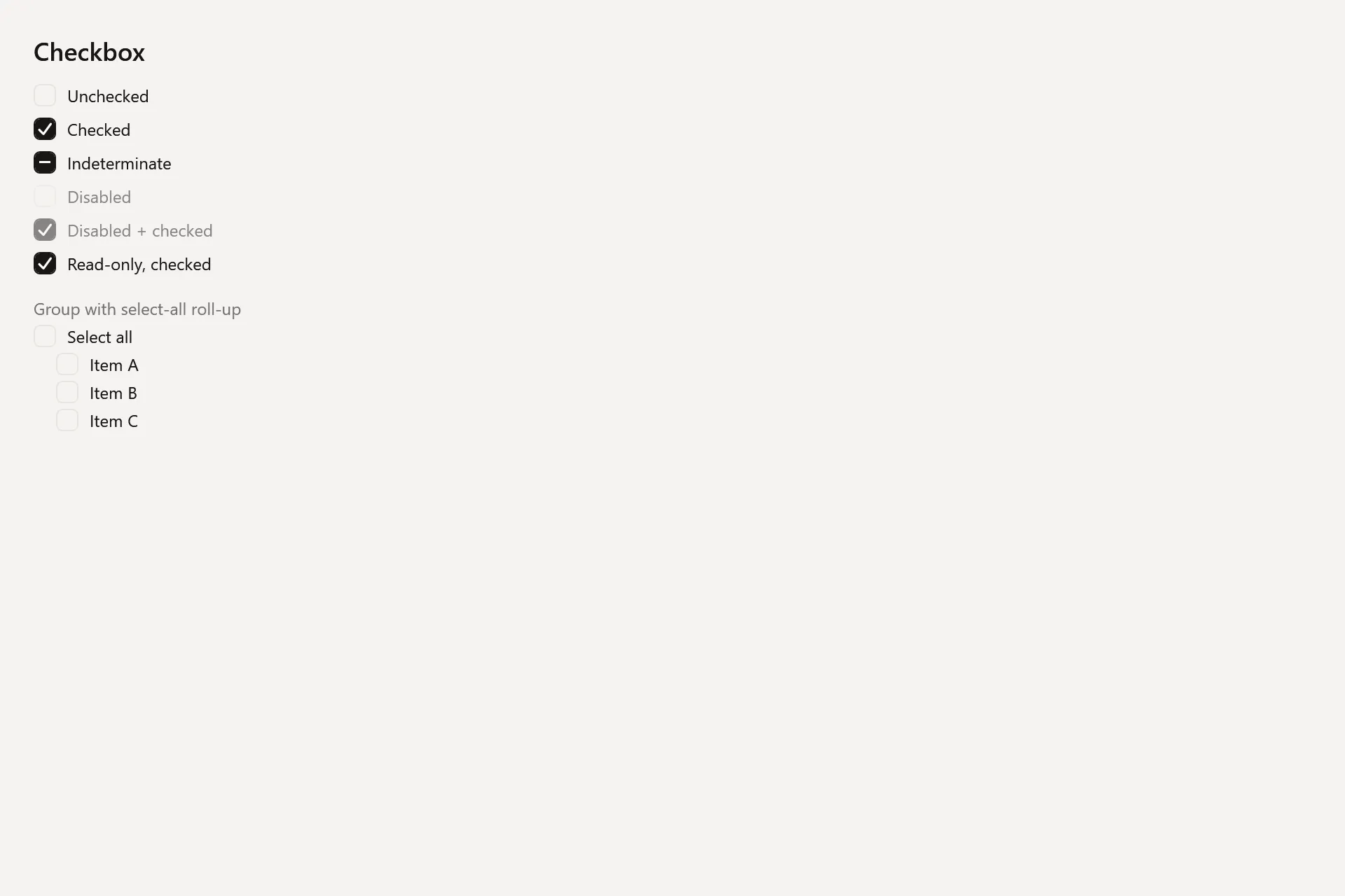
Section titled “Captures”The Checkbox Gallery page rendered at the pinned commit, in each theme.