Toggle
Overview
Section titled “Overview”Toggle is one of the most direct Tier A mappings in the primitives set: a plain ToggleButton
subclass with IsThreeState forced false in the constructor and no other members added.
IsChecked is used directly as the contract’s Pressed.
xmlns:navius="clr-namespace:Navius.Wpf.Primitives.Controls;assembly=Navius.Wpf.Primitives"
<navius:NaviusToggle x:Name="Bold"                      IsChecked="{Binding IsBold, Mode=TwoWay}"                      Content="B" />
Properties
Section titled “Properties”| Property | Type | Default | From | Description |
|---|---|---|---|---|
IsChecked |
bool? |
false |
System.Windows.Controls.Primitives.ToggleButton |
Pressed state. IsThreeState is forced false in the constructor (the contract’s Toggle is strictly two-state, unlike Checkbox). Two-way bindable by default. |
Events
Section titled “Events”| Event | Signature | Fires when |
|---|---|---|
Checked / Unchecked (inherited) |
RoutedEventHandler |
IsChecked flips via user click (blocked when Disabled) or programmatic set. |
Keyboard interactions
Section titled “Keyboard interactions”| Key | Behavior |
|---|---|
| Space | Native ButtonBase press-on-key-down/click-on-key-up activation flips IsChecked; verified via real routed key events (ToggleTests.SpaceKey_ActivatesToggle). |
| Enter | Native ButtonBase click-on-key-down activation flips IsChecked; verified the same way (ToggleTests.EnterKey_ActivatesToggle). A hypothesized “only default buttons get Enter” disparity was tested and disproven with an experimental handler disabled. |
UIA mechanism
Section titled “UIA mechanism”No custom AutomationPeer: NaviusToggle inherits ToggleButtonAutomationPeer, reporting
AutomationControlType.Button with UIA TogglePattern, matching the contract’s aria-pressed
semantics without extra code. The unit suite verifies this
(AutomationPeer_IsToggleButtonAutomationPeer_WithTogglePattern), IsThreeState=false, and both
Space and Enter activation via a real HwndSource-hosted control, plus a non-activation-key
control test confirming the harness isn’t spuriously flipping state.
Web deltas
Section titled “Web deltas”Attributessplat is dropped;ChildContentmaps onto the inheritedContent.- No web-only form-mirroring parameters exist on this family to drop (Toggle has none).
- The web contract detects controlled-ness via
PressedChanged.HasDelegate(unlike most sibling families, which check parameter presence inSetParametersAsync); this distinction collapses onto WPF’s single bindableIsChecked, so the difference is moot in the port: aBindingcovers controlled use, a plain set covers uncontrolled use.
Captures
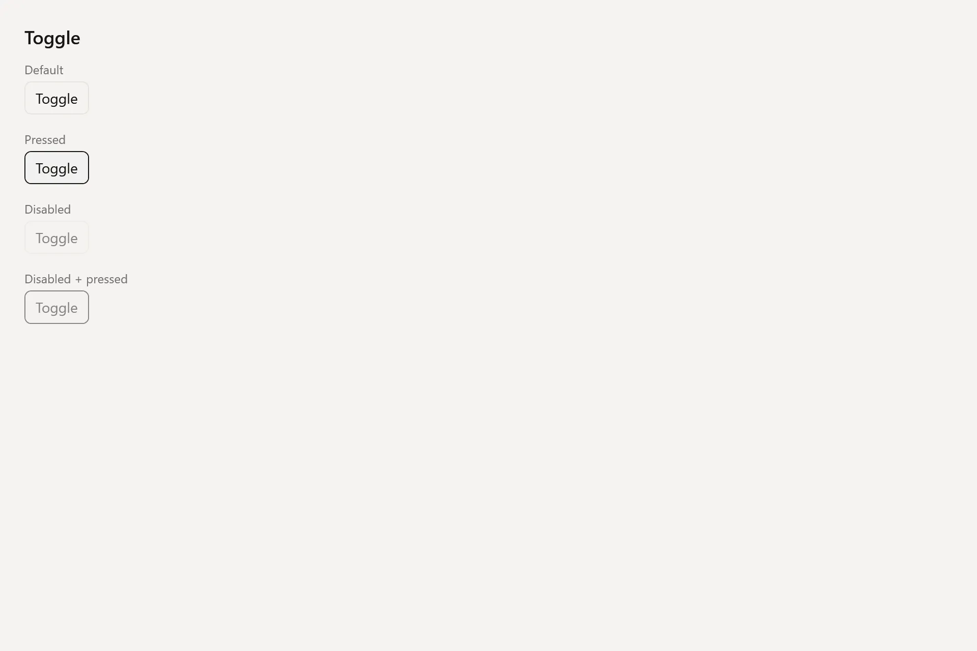
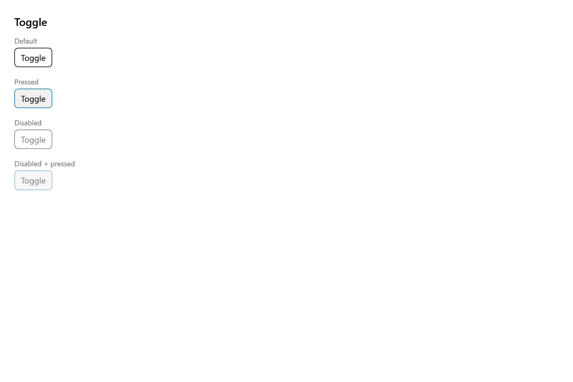
Section titled “Captures”The Toggle Gallery page rendered at the pinned commit, in each theme.