Radio Group
Overview
Section titled “Overview”RadioGroup is a lookless ContentControl that owns the authoritative selected value, the
roving tabindex, and an explicit arrow/Home/End keyboard model, discovering
NaviusRadioGroupItem descendants (a native RadioButton subclass) through the logical tree.
Native GroupName exclusion and WPF’s own directional navigation are both deliberately switched
off so they cannot compete with the group’s own selection and keyboard logic.
xmlns:radio="clr-namespace:Navius.Wpf.Primitives.Controls.RadioGroup;assembly=Navius.Wpf.Primitives"
<radio:NaviusRadioGroup x:Name="Plan" Value="{Binding SelectedPlan, Mode=TwoWay}">    <StackPanel>        <radio:NaviusRadioGroupItem Value="free" Content="Free" />        <radio:NaviusRadioGroupItem Value="pro" Content="Pro" />        <radio:NaviusRadioGroupItem Value="enterprise" Content="Enterprise" />    </StackPanel></radio:NaviusRadioGroup>
Properties
Section titled “Properties”| Property | Type | Default | From | Description |
|---|---|---|---|---|
Value |
string? |
null |
NaviusRadioGroup |
The selected item’s Value. Setting it syncs every descendant item’s IsChecked and the roving tab stop. |
Required |
bool |
false |
NaviusRadioGroup |
Exposed for API parity; no enforcement behavior in this port. |
Orientation |
string? |
null |
NaviusRadioGroup |
Kept for API parity; inert. Arrow mapping (Down/Right = next, Up/Left = prev) is unconditional, and WPF has no aria-orientation equivalent to drive from it. |
Loop |
bool |
true |
NaviusRadioGroup |
Arrow/Home/End movement wraps at the ends when true; clamps (no-ops past an end) when false. |
Dir |
string? |
null |
NaviusRadioGroup |
"rtl" (case-insensitive) mirrors horizontal arrows; falls back to FlowDirection == FlowDirection.RightToLeft when unset. |
Value (item) |
string |
"" |
NaviusRadioGroupItem |
Identifies the item; equality against the group’s Value determines checked state. |
ReadOnly (item) |
bool |
false |
NaviusRadioGroupItem |
Focusable but selection cannot change, enforced in an OnToggle() override that skips the base call. |
Required (item) |
bool |
false |
NaviusRadioGroupItem |
Exposed for API parity. |
IsChecked (inherited) |
bool? |
false |
System.Windows.Controls.Primitives.ToggleButton |
Native RadioButton.OnToggle() already only ever sets true, never unchecks on its own click, matching the contract’s “Space selects, there is no deselect” rule for free. |
IsChecked (indicator) |
bool |
false |
NaviusRadioGroupIndicator |
Mirrors the owning item’s state via TemplateBinding; drives the indicator’s own Visibility. |
KeepMounted (indicator) |
bool |
false |
NaviusRadioGroupIndicator |
Keeps the indicator mounted even when unchecked. |
Events
Section titled “Events”| Event | Signature | Fires when |
|---|---|---|
ValueChanged |
RoutedEventHandler |
The group’s Value changes because a descendant item’s checked state changed (click, Space, or arrow/Home/End navigation). |
Checked (inherited, item) |
RoutedEventHandler |
The item becomes checked; bubbles to the group, which owns Value sync. |
Keyboard interactions
Section titled “Keyboard interactions”| Key | Behavior |
|---|---|
| ArrowDown | Select and focus the next enabled item. |
ArrowRight (ArrowLeft under rtl) |
Same as ArrowDown, horizontal-next mirrored by direction. |
| ArrowUp | Select and focus the previous enabled item. |
ArrowLeft (ArrowRight under rtl) |
Same as ArrowUp, horizontal-prev mirrored by direction. |
| Home | Select and focus the first enabled item. |
| End | Select and focus the last enabled item. |
| Space (on the focused item) | Selects the focused radio via native ButtonBase/RadioButton activation; the group’s PreviewKeyDown leaves Space unhandled so it tunnels to the item’s own key handling. Enter is not an activation key. |
Arrow/Home/End skip disabled items; all keyboard handling no-ops when Disabled.
UIA mechanism
Section titled “UIA mechanism”NaviusRadioGroup ships NaviusRadioGroupAutomationPeer (a FrameworkElementAutomationPeer)
reporting AutomationControlType.Group, deliberately minimal (it does not implement a full
ISelectionProvider wired to child peers). NaviusRadioGroupItem needs no custom peer: the
native RadioButtonAutomationPeer already implements ISelectionItemProvider and reports
AutomationControlType.RadioButton, matching role="radio"/aria-checked. The unit suite
exercises the arrow/Home/End dispatch (including RTL mirroring), the native Space-activation path
(confirmed under adversarial re-check not to reproduce the “Space is dead” bug class seen
elsewhere), roving tabindex recomputation, and ReadOnly’s focusable-but-immutable guard, against
real control instances.
Web deltas
Section titled “Web deltas”- Selection is fully owned by
NaviusRadioGroupvia routed-event bubbling plus an explicitPreviewKeyDownhandler; nativeGroupName-based mutual exclusion is deliberately left unset, and WPF’s ownKeyboardNavigation.DirectionalNavigationis switched off (None) so it cannot compete with the custom handler. Diris an explicit string property ("rtl", case-insensitive) bridging the contract’sDir/cascaded-NaviusDirectionstring to WPF’sFlowDirection, falling back toFlowDirection.RightToLeftwhen unset.Orientationis kept as an inertstring?property: noaria-orientationequivalent exists, and the keyboard table’s Down/Right = next, Up/Left = prev mapping is unconditional regardless of orientation; child layout is entirely up to how the consumer arranges its content.- The hidden native radio-input form mirror (the web’s
NaviusBubbleInput) is dropped; no WPF form-submission model. Attributessplat is dropped.- No custom peer surfaces
aria-readonly/aria-requiredfor the item;ReadOnly/Requiredare plain dependency properties a consumer can read/bind, not surfaced to automation. - Descendant discovery (keyboard nav, roving tabindex, value sync) walks the logical tree, not the
visual tree, so items are discoverable immediately after
Contentis assigned without requiring a layout pass or a livePresentationSource.
Captures
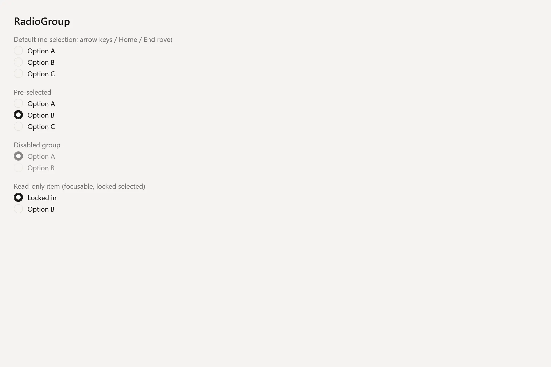
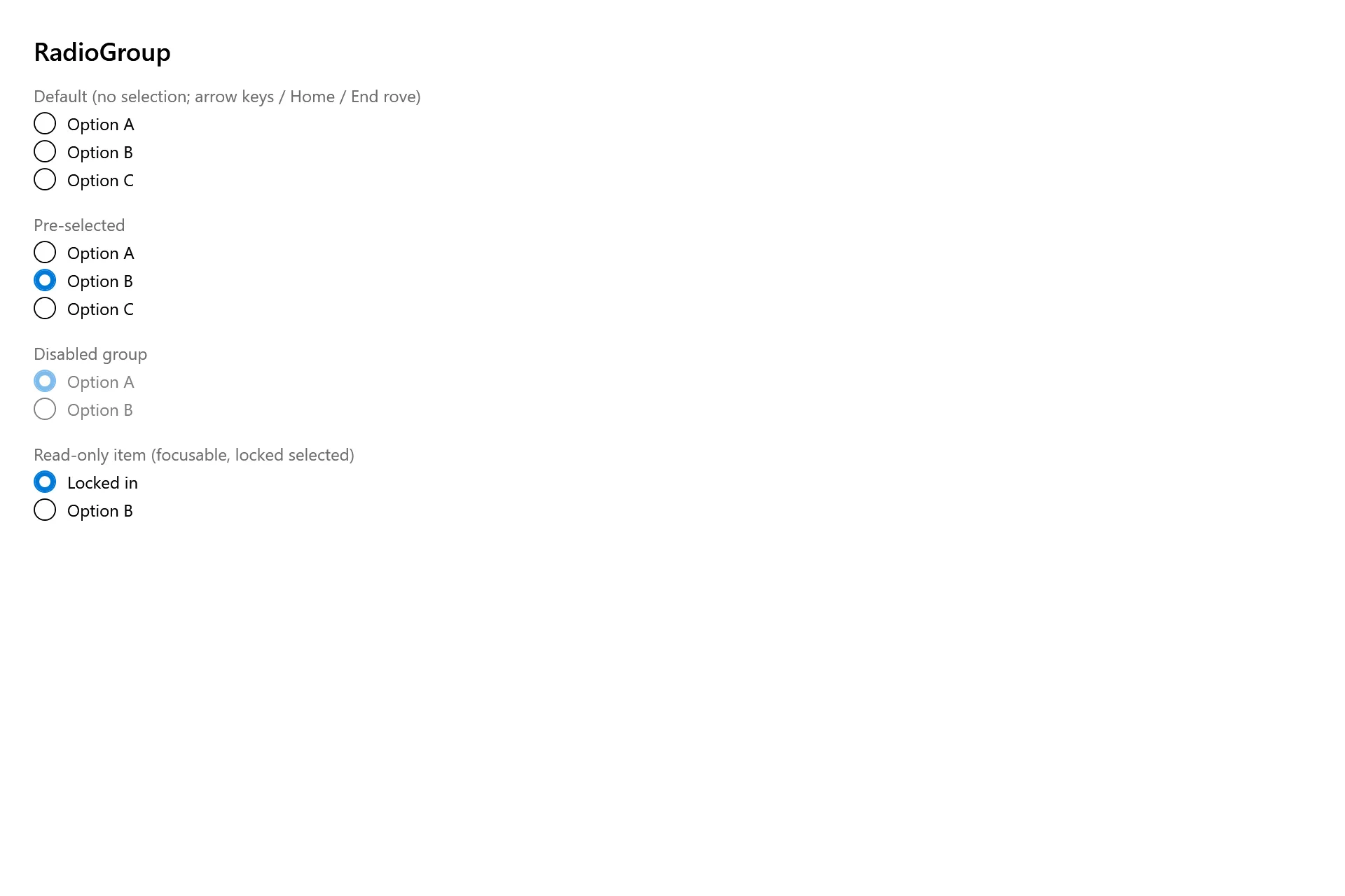
Section titled “Captures”The Radio Group Gallery page rendered at the pinned commit, in each theme.