Tooltip
Overview
Section titled “Overview”Tooltip is a lookless ContentControl whose Content is the trigger and whose TooltipContent is
the bubble. It is built entirely custom on the shared NaviusAnchoredPopup, not on WPF’s native
ToolTipService, so it can implement the web contract’s hover-intent delay, cross-tooltip
skip-delay grace window, and hoverable-content bridging exactly. App-wide timing defaults live on
the static NaviusTooltipService, the WPF analogue of the web’s NaviusTooltipProvider.
xmlns:navius="clr-namespace:Navius.Wpf.Primitives.Controls;assembly=Navius.Wpf.Primitives"
<navius:NaviusTooltip TooltipContent="Saves the current document.">    <navius:NaviusButton Content="Save" /></navius:NaviusTooltip>
No NaviusOverlayLayer is required: Tooltip hosts its bubble through a native Popup
(NaviusAnchoredPopup) and pushes directly onto OverlayStack.GetFor(window). App-wide defaults
are set once, anywhere, via the static companion: NaviusTooltipService.DelayDuration = 500;.
Properties
Section titled “Properties”| Property | Type | Default | From | Description |
|---|---|---|---|---|
TooltipContent |
object? |
null |
NaviusTooltip |
Content of the tooltip bubble. |
Side |
PlacementSide |
Top |
NaviusTooltip |
Which side of the trigger the bubble is placed against. |
Align |
PlacementAlign |
Center |
NaviusTooltip |
Cross-axis alignment relative to the trigger. |
SideOffset |
double |
6 |
NaviusTooltip |
Gap, in DIPs, between the trigger and the bubble along Side. |
AlignOffset |
double |
0 |
NaviusTooltip |
Offset, in DIPs, along the cross axis. |
DelayDuration |
int? |
null |
NaviusTooltip |
Per-instance hover-intent delay override, in ms. Falls back to NaviusTooltipService.DelayDuration when unset; collapses the web’s DelayDuration/legacy OpenDelay pair into one property. |
DisableHoverableContent |
bool |
false |
NaviusTooltip |
When true, leaving the trigger closes the tooltip even if the pointer moves toward the bubble; skips the hover-bridge grace timer. |
IsOpen |
bool |
false |
NaviusTooltip |
Open state. Two-way bindable by default. |
IsInstant |
bool |
false |
NaviusTooltip (read-only) |
True when the tooltip opened without its hover-intent delay (keyboard focus, or the cross-tooltip skip-delay window). Mirrors the web’s data-instant. |
Content |
object |
- |
ContentControl |
The trigger. |
DelayDuration (static) |
int |
700 |
NaviusTooltipService |
App-wide default hover-intent delay, in ms, used by every NaviusTooltip instance that leaves its own DelayDuration unset. |
SkipDelayDuration (static) |
int |
300 |
NaviusTooltipService |
App-wide grace window, in ms, after any tooltip closes during which the next one to open skips its delay entirely. |
Methods
Section titled “Methods”| Method | Description |
|---|---|
NaviusTooltipService.ShouldSkipDelay() |
Static: true if a tooltip closed recently enough (within SkipDelayDuration) that the next one should open instantly. |
NaviusTooltipService.NotifyClosed() |
Static: records that a tooltip just closed, (re)starting the skip-delay window. Called by NaviusTooltip itself on close. |
NaviusTooltipService.Reset() |
Static: test/reset hook that clears the skip-delay window. |
Keyboard interactions
Section titled “Keyboard interactions”| Key / Event | Behavior |
|---|---|
| Focus (keyboard) | Opens instantly, no delay, and marks IsInstant = true. WPF exposes no built-in way to distinguish Tab-driven from mouse-click-driven focus, so both open instantly (a deliberate, documented approximation, not a regression). |
| Blur | Starts the close-grace timer, or closes immediately if DisableHoverableContent. |
Escape (trigger focused, tooltip open) |
Force-closes immediately, bypassing the hoverable grace window. |
Space / Enter (trigger focused, tooltip open) |
Force-closes immediately, so the tooltip doesn’t linger over the activated control. |
| Pointer enter (trigger) | Opens after DelayDuration (falling back to NaviusTooltipService.DelayDuration), or instantly if NaviusTooltipService.ShouldSkipDelay() is true. |
| Pointer leave (trigger) | Starts a 60ms hover-bridge grace timer before closing, to bridge the trigger-to-bubble gap without flicker; closes immediately if DisableHoverableContent. |
| Pointer down (trigger, while open) | Force-closes immediately. |
| Pointer enter (bubble content) | Cancels a pending close-grace timer, unless DisableHoverableContent. |
| Pointer leave (bubble content) | Force-closes immediately, unless DisableHoverableContent. |
UIA mechanism
Section titled “UIA mechanism”NaviusTooltip does not override OnCreateAutomationPeer, so it ships no custom automation peer
or role="tooltip"-equivalent mapping; the bubble is non-modal and never receives focus
(TrapFocus = false, RestoreFocus = false when the session is pushed). The unit suite
(TooltipTests.cs) exercises the focus-path open, which is always instant via
OnTriggerGotKeyboardFocus and marks IsInstant, the DelayDuration default-value assertion, the
Escape and pointer-down force-close paths, the hoverable-content grace window with
DisableHoverableContent both on (no synchronous close on MouseLeave) and off (immediate
close), and NaviusTooltipService’s skip-delay grace window. There is no test that drives the
MouseEnter hover path itself, so the hover-intent open delay (DelayDuration actually elapsing
before the tooltip opens on a real pointer hover) has no direct test coverage.
Web deltas
Section titled “Web deltas”- Built entirely custom on
NaviusAnchoredPopuprather than nativeToolTipService, for full control over the hover-intent/skip-delay/hoverable-content timing the web contract specifies. - The web’s
NaviusTooltipProvidercollapses into the staticNaviusTooltipService: there is no provider scope, matching WPF’s ownToolTipServiceconvention rather than a cascading-parameter tree. AllNaviusTooltipinstances in the process share one delay and one skip-delay window. DelayDurationand the web’s legacyOpenDelayalias collapse into one nullableDelayDurationthat falls back to the service default.- No arrow glyph in the default template:
NaviusAnchoredPopupdoes not currently surfaceArrowOffsetfor this control to consume (owned by another agent/wave). - Keyboard-focus detection cannot distinguish Tab-driven from mouse-click-driven focus in WPF, so
both open the tooltip instantly; documented as a deliberate honest approximation, not a
regression (native
ToolTipmakes the same non-distinction). - No exit animation:
IsOpen = falsehides the underlyingPopupsynchronously, keeping the close path deterministic and unit-testable without pumping a dispatcher timer, at the cost of an asymmetric enter/exit (the web drives both fromdata-starting-style/data-ending-style). - No cancelable dismiss callbacks are exposed as public events;
OverlaySession.Closing/Closedremain available internally but are not surfaced onNaviusTooltipitself.
Captures
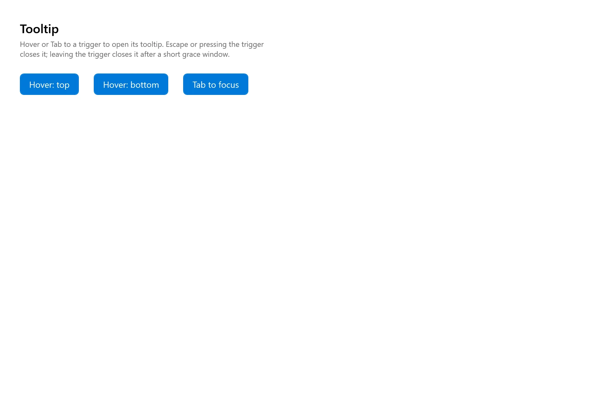
Section titled “Captures”The Tooltip Gallery page rendered at the pinned commit, in each theme.