Meter
Overview
Section titled “Overview”Meter derives from native System.Windows.Controls.ProgressBar (NaviusMeter), restyled as a
static, determinate readout rather than a progress operation: IsIndeterminate is coerced to always
false, and Value is genuinely clamped into [Minimum, Maximum] by RangeBase’s own default
coercion, unlike NaviusProgress’s deliberate “validate, don’t clamp” behavior.
xmlns:navius="clr-namespace:Navius.Wpf.Primitives.Controls;assembly=Navius.Wpf.Primitives"
<StackPanel>    <navius:NaviusMeterLabel x:Name="DiskLabel" Text="Disk usage" />    <navius:NaviusMeter x:Name="Disk"                         Value="72"                         Minimum="0"                         Maximum="100"                         AutomationProperties.LabeledBy="{Binding ElementName=DiskLabel}" />    <navius:NaviusMeterValue Source="{Binding ElementName=Disk}" /></StackPanel>
Properties
Section titled “Properties”| Property | Type | Default | From | Description |
|---|---|---|---|---|
Value |
double |
0.0 |
ProgressBar (RangeBase) |
Current value, clamped into [Minimum, Maximum] by the inherited default coercion (no override). |
Minimum |
double |
0.0 |
ProgressBar (RangeBase) |
Minimum value. |
Maximum |
double |
100.0 |
NaviusMeter (overrides RangeBase) |
A value <= Minimum falls back to Minimum + 100. |
IsIndeterminate |
bool |
false (locked) |
NaviusMeter (overrides ProgressBar) |
Always coerced to false; setting it true is silently rejected. Meter is contractually always a static, determinate readout. |
GetValueLabel |
Func<double, string?>? |
null |
NaviusMeter |
Builds the value text for the current value. Defaults to the rounded percentage plus "%". |
Fraction |
double |
computed | NaviusMeter |
Read-only, not a DP. 0..1, min-aware: (Value - Minimum) / (Maximum - Minimum). |
Percentage |
double |
computed | NaviusMeter |
Read-only, not a DP. Fraction * 100. |
Source |
NaviusMeter? |
null |
NaviusMeterValue |
The meter instance whose formatted value text this element renders. |
TextOverride |
string? |
null |
NaviusMeterValue |
When set, overrides the default rounded-percentage text. |
Methods
Section titled “Methods”| Method | Description |
|---|---|
FormatValueText() |
Returns GetValueLabel or the default rounded percentage plus "%". Always non-null (unlike NaviusProgress.FormatValueText()), since Meter is never indeterminate. |
Events
Section titled “Events”| Event | Signature | Fires when |
|---|---|---|
StateChanged |
RoutedEventHandler |
Value, Minimum, or Maximum changes; consumed by NaviusMeterValue to refresh its text. |
UIA mechanism
Section titled “UIA mechanism”NaviusMeterAutomationPeer (derives ProgressBarAutomationPeer) overrides GetItemStatusCore() to
return FormatValueText(), mirroring NaviusProgressAutomationPeer. AutomationControlType stays
the inherited ProgressBar value, since WPF has no distinct Meter automation type; this is an
acknowledged platform gap, not an attempt to spoof a different control type. The inherited
ProgressBarAutomationPeer’s IRangeValueProvider is already read-only (SetValue throws),
matching the contract’s “no keyboard, no focus management.” The unit suite covers the clamping
behavior (Value_IsClampedIntoRange_UnlikeProgress, Value_Negative_IsClampedToMinimum), the
IsIndeterminate lock (IsIndeterminate_AlwaysCoercedToFalse), the Maximum <= Minimum fallback,
default values, and the automation peer’s ItemStatus text.
Web deltas
Section titled “Web deltas”- Value is genuinely clamped into
[Minimum, Maximum]viaRangeBase’s own defaultCoerceValueCallback(no override needed), the opposite choice fromNaviusProgress’s “validate, don’t clamp” deviation. IsIndeterminateis locked tofalsevia aCoerceValueCallbackoverride, so the indeterminate-pulse visual/behavior fromNaviusProgressis unreachable here; this also resolves the parity doc’s own concern about a screen reader announcing a static Meter as an active progress operation.Maximum <= Minimumfalls back toMinimum + 100(Meter’s own rule, distinct from Progress’sMaximum <= 0 -> 100).GetValueLabelisFunc<double, string?>?(single parameter), matching the web contract exactly; no deviation here, unlikeNaviusProgress’s two-parameter signature.AutomationControlTypehas no distinct “Meter” UIA value and stays the inheritedProgressBarvalue; disclosed platform gap, not a false claim.aria-labelledbywiring uses the sameAutomationProperties.LabeledByidiom asNaviusProgress, not a push-based context registration.
Captures
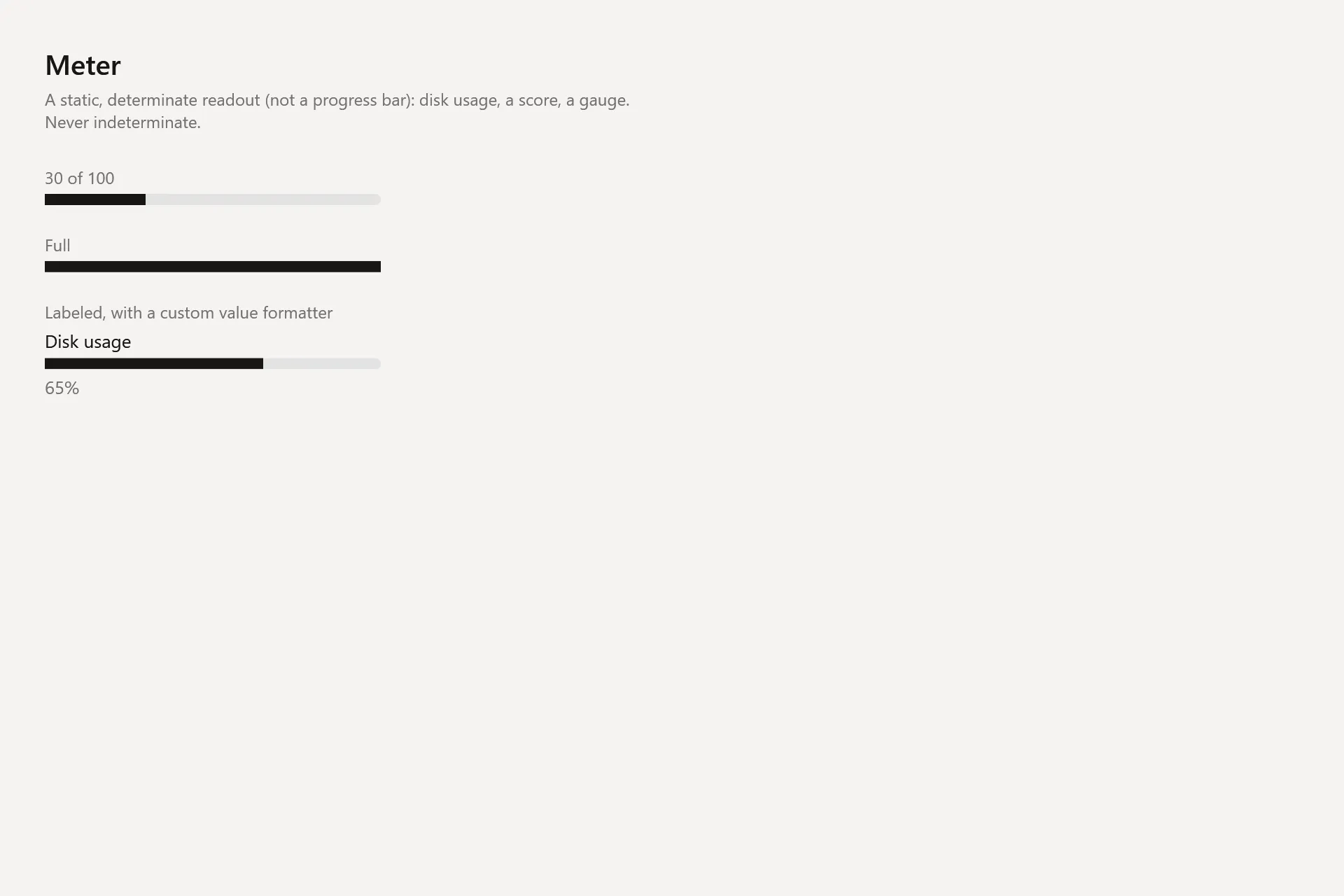
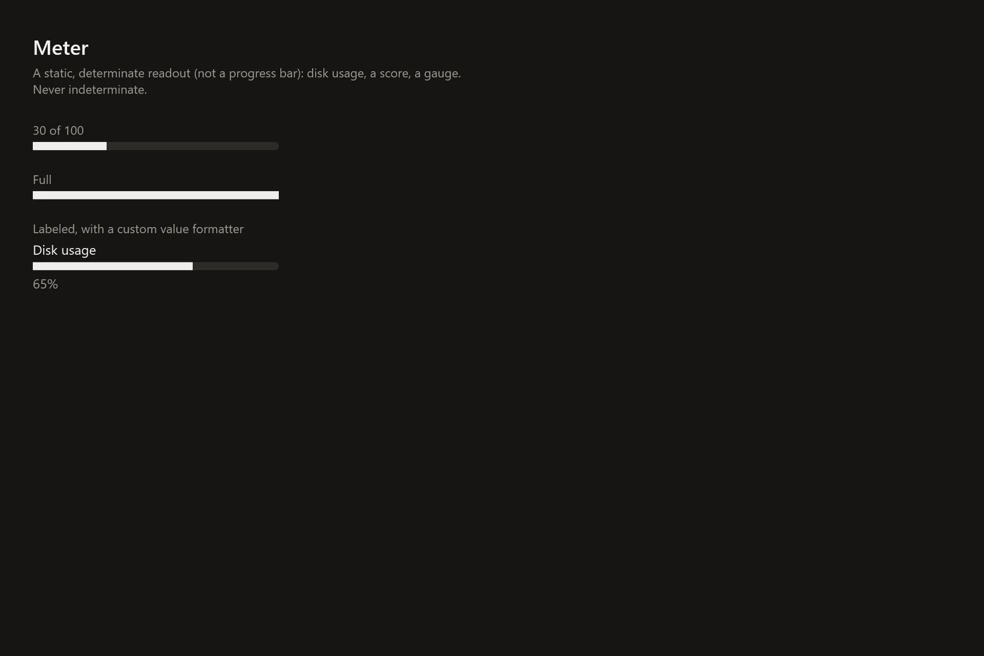
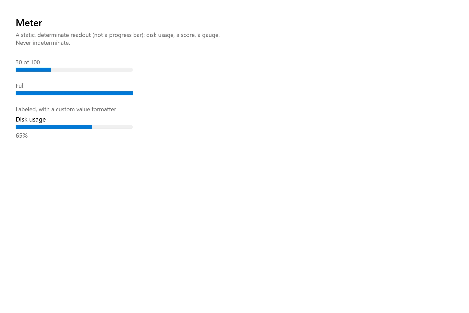
Section titled “Captures”The Meter Gallery page rendered at the pinned commit, in each theme.