Tabs
Overview
Section titled “Overview”Tabs derives from native System.Windows.Controls.TabControl (NaviusTabs) and TabItem
(NaviusTabItem), collapsing the web contract’s four parts (Root/List/Tab/Panel) into these two
types since TabItem.Header/Content already live together. Because native TabControl navigation
doesn’t know about activation mode, loop, or RTL mirroring, NaviusTabs switches off
KeyboardNavigation.DirectionalNavigation and reimplements arrow/Home/End/Enter/Space itself.
xmlns:tabs="clr-namespace:Navius.Wpf.Primitives.Controls.Tabs;assembly=Navius.Wpf.Primitives"
<tabs:NaviusTabs ActivationMode="automatic" Loop="True">    <tabs:NaviusTabItem Value="account" Header="Account">        <TextBlock Text="Account settings." />    </tabs:NaviusTabItem>    <tabs:NaviusTabItem Value="billing" Header="Billing">        <TextBlock Text="Billing settings." />    </tabs:NaviusTabItem></tabs:NaviusTabs>
Properties
Section titled “Properties”| Property | Type | Default | From | Description |
|---|---|---|---|---|
Value |
string? |
null |
NaviusTabs |
Controlled/uncontrolled selected tab value; also driven by native selection (click). One Value DP covers both controlled and uncontrolled use, since TabControl already selects its first item on load. |
ActivationMode |
string |
"automatic" |
NaviusTabs |
"automatic": focusing a tab via keyboard also selects it. "manual": arrows move focus only; Enter/Space/click selects. |
Loop |
bool |
true |
NaviusTabs |
Arrow navigation wraps at edges when true; clamps at first/last when false. |
Dir |
string? |
null |
NaviusTabs |
"ltr"/"rtl"; falls back to FlowDirection when unset. |
Orientation |
string |
"horizontal" |
NaviusTabs |
"horizontal" or "vertical"; drives arrow-key axis (no native TabControl equivalent). |
ActivationDirection |
string |
"none" |
NaviusTabs |
Read-only. One of "none"/"left"/"right"/"up"/"down", recomputed on every selection change from the old/new selected index and Orientation. |
Value |
string |
"" |
NaviusTabItem |
Identifies this tab; NaviusTabs uses it to derive/sync its own Value. |
Header / Content |
object |
- |
TabItem |
Trigger content and panel content respectively, unified on one NaviusTabItem object. |
Events
Section titled “Events”| Event | Signature | Fires when |
|---|---|---|
ValueChanged |
RoutedEventHandler |
The selected tab value changes (click or keyboard activation). |
Keyboard interactions
Section titled “Keyboard interactions”| Key | Behavior |
|---|---|
ArrowRight (horizontal, ltr) / ArrowLeft (horizontal, rtl) |
Moves to the next enabled tab. |
ArrowLeft (horizontal, ltr) / ArrowRight (horizontal, rtl) |
Moves to the previous enabled tab. |
ArrowDown (vertical) |
Moves to the next enabled tab. |
ArrowUp (vertical) |
Moves to the previous enabled tab. |
Home / End |
Moves to the first/last enabled tab. |
Enter / Space |
Selects the focused tab (required in manual mode; a harmless re-select in automatic mode). |
In "automatic" mode, moving focus with an arrow key also selects the target and moves keyboard
focus to it. In "manual" mode, arrows move roving focus only; selection requires Enter, Space, or
a click. Loop=true (default) wraps at edges; Loop=false clamps (no movement past the first/last
enabled tab). Disabled tabs are skipped entirely.
UIA mechanism
Section titled “UIA mechanism”NaviusTabs/NaviusTabItem ship no custom AutomationPeer; they inherit TabControl’s
TabControlAutomationPeer/TabItemAutomationPeer, which report native SelectionPattern and
role="tab"/role="tabpanel" semantics for free. ActivationMode, Loop, RTL mirroring, and
ActivationDirection are hand-rolled state with no UIA pattern equivalent, since WPF’s built-in
navigation and automation model doesn’t represent them. The unit suite (TabsTests.cs) exercises
automatic vs. manual activation, Loop wrap vs. clamp, RTL arrow mirroring, Home/End, disabled-tab
skipping, and ActivationDirection recomputation; the M6 audit added
ManualMode_SpaceOnFocusedTab_Selects to confirm Space activates a focused tab exactly like Enter
(both share one activation branch in HandlePreviewKeyDown).
Web deltas
Section titled “Web deltas”- Four web parts collapse to two WPF types:
NaviusTabs(which also owns the List’s arrow-key navigation, since WPF’s internalTabPanelisn’t a separately addressable public part) andNaviusTabItem(unifying Tab trigger and Panel content, sinceTabItem.Header/Contentalready live on one object). KeepMountedon the Panel is dropped: nativeTabControlonly ever instantiates one sharedContentPresenterbound to the selected item’s content, so there is no per-item persistent panel to keep hidden-but-mounted without a much larger custom-template rewrite. Documented Tier A tradeoff, not an oversight.DefaultValuecollapses intoValue: likeNaviusRadioGroup, oneValueDP is used both controlled and uncontrolled.data-navius-tabs/data-orientation/dirmarker attributes are dropped; the equivalent state is queryable via native/added DPs (IsSelected,IsEnabled,Orientation,ActivationDirection) consumed directly byStyletriggers.- Disabled tabs map straight to
TabItem.IsEnabled; there is no separateDisabledDP. - M6 residual (not fixed): vertical-orientation arrow focus movement is exercised only indirectly
by the unit suite, which asserts
ActivationDirectionrather than actual Up/Down focus traversal. Low risk since the same internalMove()method drives both axes, but a dedicated vertical focus-traversal test does not yet exist.
Captures
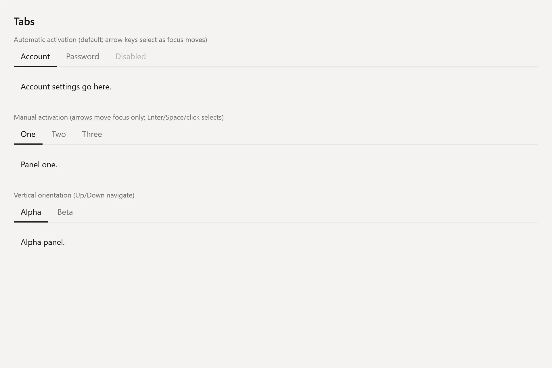
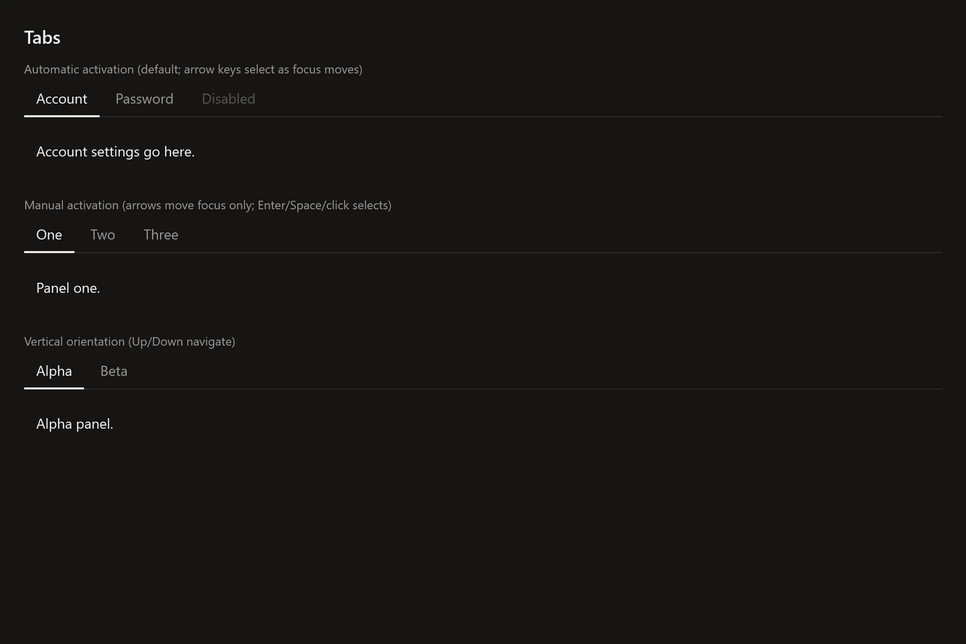
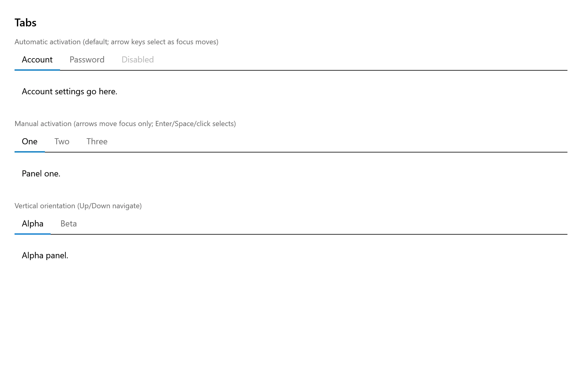
Section titled “Captures”The Tabs Gallery page rendered at the pinned commit, in each theme.