Toggle Group
Overview
Section titled “Overview”ToggleGroup is a lookless ContentControl following the same root-owns-state,
discover-descendants-via-logical-tree shape as NaviusRadioGroup. NaviusToggleGroupItem derives
ToggleButton directly as its own item type (not NaviusToggle), with an explicit OnKeyDown
override that activates deterministically on Space/Enter key-down rather than relying on native
ButtonBase timing, decoupled from the group’s own roving-focus PreviewKeyDown handler.
xmlns:togglegroup="clr-namespace:Navius.Wpf.Primitives.Controls.ToggleGroup;assembly=Navius.Wpf.Primitives"
<togglegroup:NaviusToggleGroup x:Name="Align" Value="{Binding Alignment, Mode=TwoWay}">    <StackPanel Orientation="Horizontal">        <togglegroup:NaviusToggleGroupItem Value="left" Content="Left" />        <togglegroup:NaviusToggleGroupItem Value="center" Content="Center" />        <togglegroup:NaviusToggleGroupItem Value="right" Content="Right" />    </StackPanel></togglegroup:NaviusToggleGroup>
Properties
Section titled “Properties”| Property | Type | Default | From | Description |
|---|---|---|---|---|
Multiple |
bool |
false |
NaviusToggleGroup |
true: many items can be pressed at once. false (default): single, radio-like; the group unchecks every other item when one becomes checked. |
Value |
IReadOnlyList<string> |
[] |
NaviusToggleGroup |
The pressed set of descendant item Values. |
Orientation |
string |
"horizontal" |
NaviusToggleGroup |
Axis for the roving-focus arrow keys, "horizontal" or "vertical". |
RovingFocus |
bool |
true |
NaviusToggleGroup |
true: single Tab stop, arrows move roving focus. false: every enabled item is independently a tab stop, and arrow handling is skipped entirely. |
Loop |
bool |
true |
NaviusToggleGroup |
Arrow navigation wraps past first/last when true; stops at the ends when false. |
Dir |
string? |
null |
NaviusToggleGroup |
"rtl" (case-insensitive) mirrors horizontal arrows; falls back to FlowDirection == FlowDirection.RightToLeft when unset. |
Value (item) |
string |
"" |
NaviusToggleGroupItem |
Identifies the item in the group’s pressed set. |
IsChecked (inherited) |
bool? |
false |
System.Windows.Controls.Primitives.ToggleButton |
Pressed state; IsThreeState forced false. |
Events
Section titled “Events”| Event | Signature | Fires when |
|---|---|---|
ValueChanged |
RoutedEventHandler |
The group’s Value changes because an item was checked or unchecked (click or Space/Enter). |
Keyboard interactions
Section titled “Keyboard interactions”| Key | Behavior |
|---|---|
| Space | NaviusToggleGroupItem.OnKeyDown explicitly calls OnClick() on key-down, skipped on auto-repeat to match a native web button firing Space once on key-up. |
| Enter | Same explicit OnKeyDown path; auto-repeat is allowed, matching native Enter behavior. |
ArrowRight / ArrowDown (axis and direction resolved from Orientation/Dir) |
Moves roving focus only, never selection, to the next enabled item (when RovingFocus=true). |
| ArrowLeft / ArrowUp | Moves roving focus to the previous enabled item. |
| Home / End | Moves roving focus to the first / last enabled item. |
Arrow/Home/End handling is skipped entirely when RovingFocus=false; every enabled item is
independently tabbable instead. All handling requires the group to be enabled.
UIA mechanism
Section titled “UIA mechanism”NaviusToggleGroup ships NaviusToggleGroupAutomationPeer (a FrameworkElementAutomationPeer)
reporting AutomationControlType.Group. NaviusToggleGroupItem needs no custom peer, inheriting
ToggleButtonAutomationPeer’s UIA TogglePattern. The unit suite exercises the full chain with
real KeyDown-driven tests: Space and Enter toggling the focused item and updating the group’s
Value (Space_TogglesFocusedItem, Enter_TogglesFocusedItem), single-mode deselect-to-empty,
RovingFocus=false tab-stop behavior, disabled state cascading from the group to every item, and
arrow keys moving focus without touching selection.
Web deltas
Section titled “Web deltas”- A11y-audit fix carried into the port: the 2026-07-09 web audit found Space dead on ToggleGroup
items even though the contract’s own keyboard table says Space/Enter should activate. This WPF
port explicitly wires both via
OnKeyDownrather than relying on nativeButtonBasetiming, so it cannot reproduce that regression. A held-Space auto-repeat flapping bug found during the same M6 pass (holding Space rapidly toggled the pressed state) was fixed by skippingOnClickon Space auto-repeat. data-multiple/data-orientation/data-disabledmarker attributes are dropped; the equivalent state is exposed directly as dependency properties (Multiple,Orientation,IsEnabled) forStyletriggers to read.Disabledis not a new property: the root’s nativeIsEnabledis explicitly pushed onto every item (WPF’sIsEnableddoes not auto-cascade through aContentControl’s logicalContent). Known simplification versus the contract’s independent per-itemDisabled || Context.Disabled: re-enabling the group re-enables every item, even one disabled for its own reasons.- Native
GroupName-based mutual exclusion is not used; the root owns selection fully via routed-event bubbling and an explicitPreviewKeyDownhandler, with WPF’s ownKeyboardNavigation.DirectionalNavigationswitched off. Attributessplat is dropped.
Captures
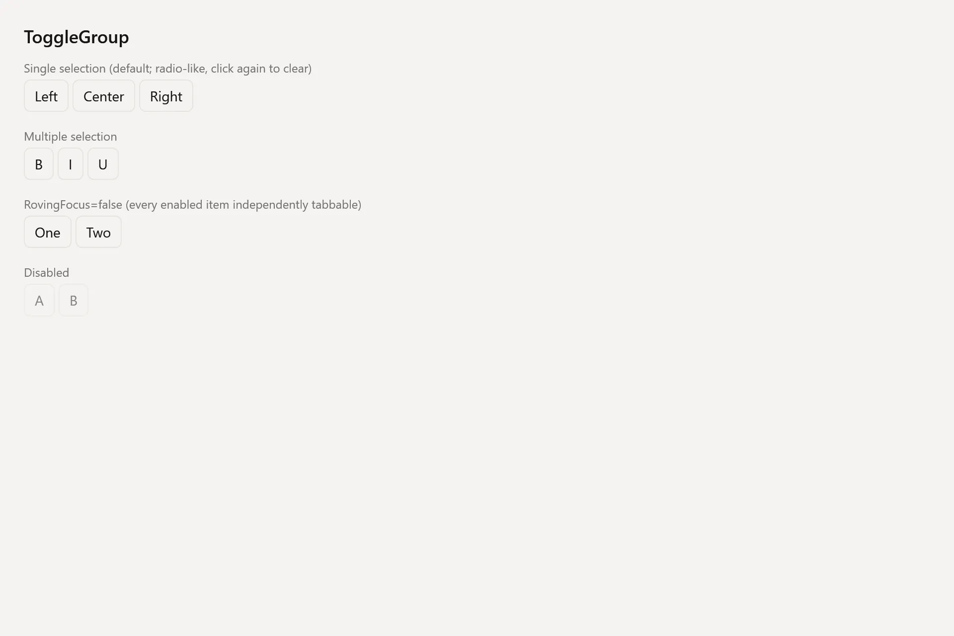
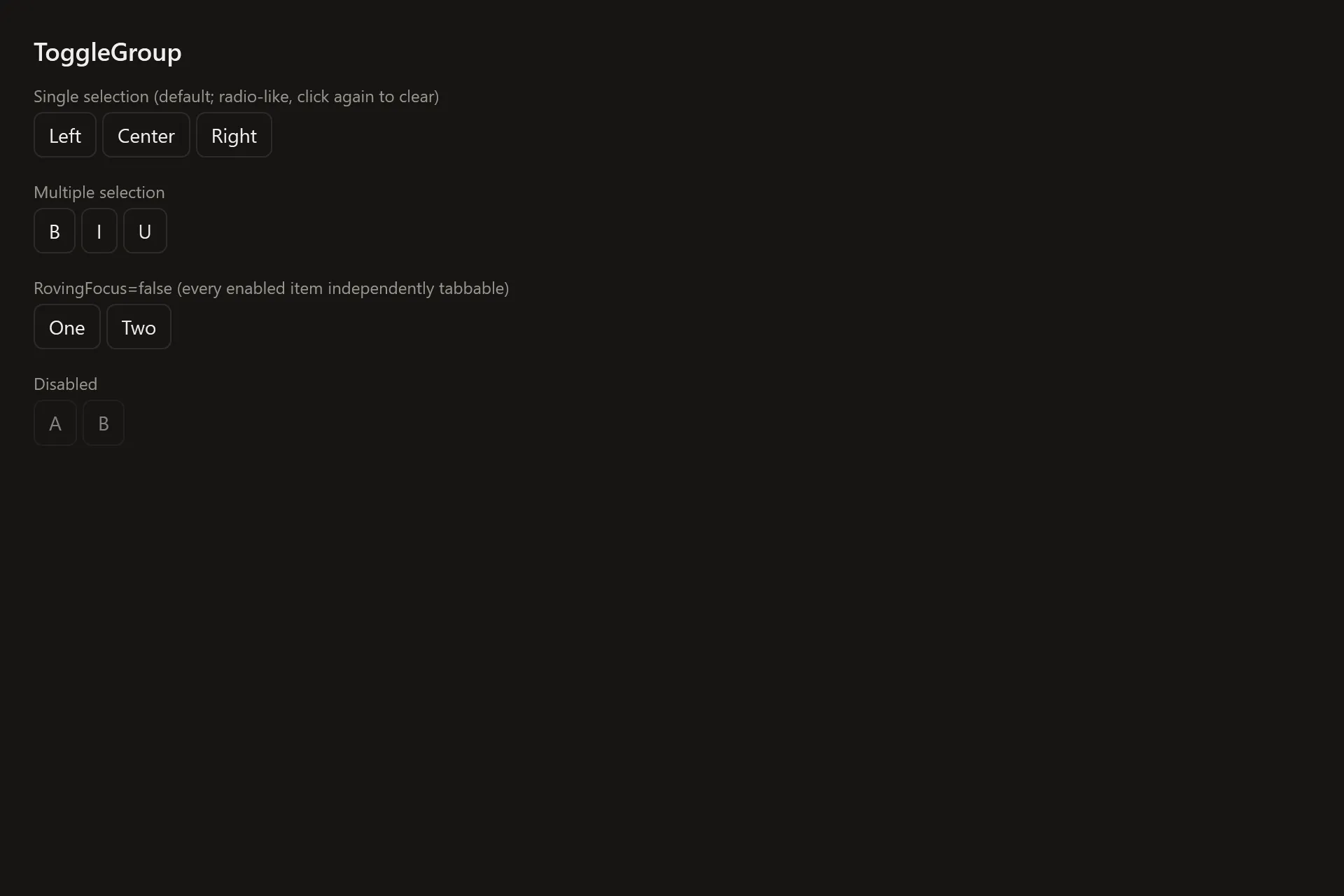
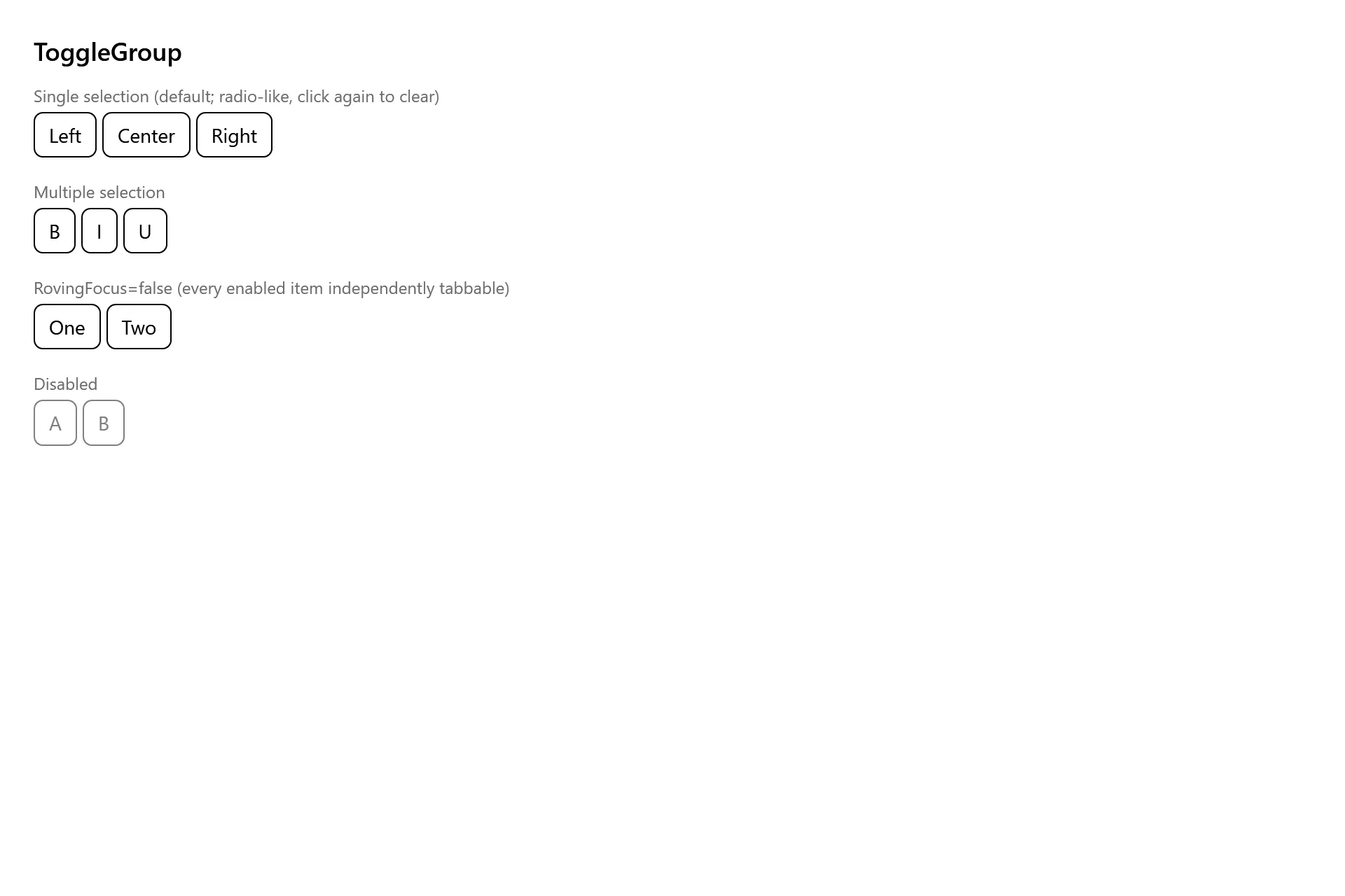
Section titled “Captures”The Toggle Group Gallery page rendered at the pinned commit, in each theme.