NumberField
Overview
Section titled “Overview”NumberField is a lookless Control folding the web family’s Root/Group/Input/Increment/Decrement
anatomy into one control: a text input showing a formatted numeric value, plus two
RepeatButton-backed stepper buttons. There is no native WPF NumberBox to derive from, so this is
a Tier B custom control with its own clamp/format/parse math (NaviusNumberFieldMath) and an
IRangeValueProvider automation peer reporting role="spinbutton" semantics.
xmlns:navius="clr-namespace:Navius.Wpf.Primitives.Controls;assembly=Navius.Wpf.Primitives"
<navius:NaviusNumberField Value="{Binding Quantity, Mode=TwoWay}"                          Minimum="0"                          Maximum="100"                          Step="1"                          LargeStep="10"                          SmallStep="0.1" />
Properties
Section titled “Properties”| Property | Type | Default | From | Description |
|---|---|---|---|---|
Value |
double? |
null |
NaviusNumberField |
Controlled value; null renders empty. The DP is registered without BindsTwoWayByDefault, so a binding needs an explicit Mode=TwoWay (see Usage); clamped to [Minimum, Maximum] on set. |
Minimum |
double? |
null |
NaviusNumberField |
Lower bound. null is unbounded. |
Maximum |
double? |
null |
NaviusNumberField |
Upper bound. null is unbounded. |
Step |
double |
1 |
NaviusNumberField |
Default step for the arrow keys and the increment/decrement buttons. Coerced upward if <= 0. |
LargeStep |
double |
10 |
NaviusNumberField |
Step for PageUp/PageDown and Shift+arrow. |
SmallStep |
double |
0.1 |
NaviusNumberField |
Step for Alt+arrow fine adjustments. |
ReadOnly |
bool |
false |
NaviusNumberField |
Focusable, but the value cannot be changed. |
Required |
bool |
false |
NaviusNumberField |
- |
Format |
string? |
null |
NaviusNumberField |
.NET numeric format string (e.g. "0.##"), formatted and parsed with InvariantCulture. |
CanIncrement |
bool |
true |
NaviusNumberField |
Read-only. False at Maximum, or when disabled/read-only. |
CanDecrement |
bool |
true |
NaviusNumberField |
Read-only. False at Minimum, or when disabled/read-only. |
Display |
string |
"" |
NaviusNumberField |
Read-only. The formatted display text for Value; empty when Value is null. |
DefaultValue (an uncontrolled initial value) appears in the web parameter table but is not
ported: there is no DefaultValue DP on NaviusNumberField. A consumer sets Value directly for
an initial value. Disabled is not a separate DP either; the control uses standard WPF
IsEnabled.
Methods
Section titled “Methods”| Method | Description |
|---|---|
StepBy(double delta) |
Adds delta (an already-effective step) to Value, clamped to bounds. No-op when disabled or ReadOnly. |
SetToBound(double? bound) |
Jumps Value to bound. No-op when bound is null, or when disabled or ReadOnly. |
CommitText(string text) |
Empty or whitespace-only text sets Value = null (clears) unconditionally, before the ReadOnly/IsEnabled guard runs, so this also fires on a read-only or disabled field. Otherwise, when not ReadOnly and enabled, parses and clamps the text into Value on success, or reverts the input’s displayed text back to Display on parse failure (“snap back on invalid text”). Called on LostFocus and Enter. |
Events
Section titled “Events”| Event | Signature | Fires when |
|---|---|---|
ValueChanged |
RoutedPropertyChangedEventHandler<double?> (bubbling RoutedEvent) |
Value changes, from stepping, a bound button click, or a committed text edit. |
Keyboard interactions
Section titled “Keyboard interactions”| Key | Behavior |
|---|---|
Up Arrow |
Steps up by the effective step (Step, or LargeStep with Shift, or SmallStep with Alt). |
Down Arrow |
Steps down by the effective step. |
Page Up |
Steps up by LargeStep, unconditionally. |
Page Down |
Steps down by LargeStep, unconditionally. |
Home |
Jumps to Minimum. No-op if Minimum is unset. |
End |
Jumps to Maximum. No-op if Maximum is unset. |
Enter |
Commits the input’s current text: parses and clamps on success, or snaps back to Display on parse failure. If the text is empty or whitespace-only, clears Value to null unconditionally, even when the field is ReadOnly or disabled. |
M6-authoritative wiring detail: the handler is attached to PART_Input.PreviewKeyDown (the
tunneling phase), not KeyDown. It was originally wired on KeyDown, but the hosted TextBox’s
own class handlers mark Home/End/PageUp/PageDown/arrow keys Handled during their
bubbling KeyDown phase for caret navigation, so the entire keyboard table was unreachable and
Value never moved; this was a confirmed M6 code bug, fixed by moving to PreviewKeyDown (proven
by real routed-event tests, Keyboard_*_ThroughRealRouting, that fail against the old wiring).
The increment/decrement RepeatButtons are Focusable="False" (the web’s tabindex="-1"), so
the input is the sole tab stop; pressing and holding either button auto-repeats natively, adopted
deliberately even though the web source tracks auto-repeat as a not-yet-implemented follow-up.
UIA mechanism
Section titled “UIA mechanism”NaviusNumberFieldAutomationPeer (FrameworkElementAutomationPeer) reports
AutomationControlType.Spinner and implements IRangeValueProvider
(Value/Minimum/Maximum/SmallChange=Step/LargeChange=LargeStep; unset
Minimum/Maximum surface as NegativeInfinity/PositiveInfinity). SetValue throws
ElementNotEnabledException when read-only or disabled, matching UIA’s read-only-provider
convention. M6-authoritative fix: the peer originally implemented IRangeValueProvider without
overriding GetPattern, so FrameworkElementAutomationPeer.GetPattern(RangeValue) returned null
and no UIA client could ever reach the pattern, a confirmed bug (pre-existing peer tests called
the provider members directly, never through GetPattern, so they missed it) fixed by adding the
GetPattern override (mirroring the FileUpload peer); AutomationPeer_ExposesRangeValuePattern_ViaGetPattern
pins it. The unit suite covers the keyboard table through real routed PreviewKeyDown events, the
GetPattern fix, clamp-to-bound behavior on set and on bound-shrink, and snap-back-on-invalid-text
commit semantics.
Web deltas
Section titled “Web deltas”- The web’s 5 parts (Root/Group/Input/Increment/Decrement) fold into one
Controlwith three template parts:PART_Input(aTextBox),PART_Increment/PART_Decrement(RepeatButtons).Grouphas no behavior beyond arole="group"wrapper in the web contract, so it stays a plainBorderinThemes/NumberField.xamlwith no dedicated CLR type, the same minimalismNaviusSliderandNaviusProgressuse for their own non-interactive template parts. DefaultValue(uncontrolled initial value) is documented on the web root but was dropped silently and undocumented in the original WPF port, unlikeNaviusMaskedInputwhich kept it; recorded here per the M6 audit. A consumer setsValuedirectly.Min/Maxon the web map toMinimum/Maximumin WPF (standard WPF naming; there is noMin/Maxalias).- Auto-repeat on the stepper buttons is adopted immediately via native
RepeatButton, even though the web source tracks press-and-hold auto-repeat as a not-yet-implemented follow-up; scrub-area pointer-lock dragging is not ported (no WPF analog attempted, out of scope for this wave). - Formatting and parsing stay
InvariantCulture-only on both sides (no deviation to current-culture), matching the web contract exactly. - No
aria-labelledby/label association is wired on the group or input, matching the web contract (which has none either); label association is left to a consumer-declared externalLabel/TextBlock, consistent with this codebase’sNaviusProgressLabel-style precedent elsewhere, though NumberField itself ships no dedicated label part. - “Snap back on invalid text” is implemented exactly as contracted (not “reject keystrokes
outright”):
CommitTextparses onLostFocus/Enter; on parse failure it reverts the display to the last valid formatted value. Keystrokes are never blocked while typing. - M6-confirmed and fixed: the entire keyboard table was previously dead (wired on the bubbling
KeyDowninstead of the tunnelingPreviewKeyDown, so the hostedTextBox’s own caret-navigation class handlers consumed every stepping key first) and theIRangeValueProviderpattern was unreachable viaGetPattern. Both are fixed as of this pass; see Keyboard interactions and UIA mechanism above for the specifics.
Captures
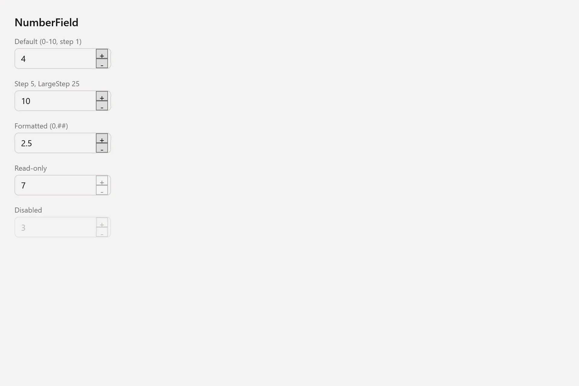
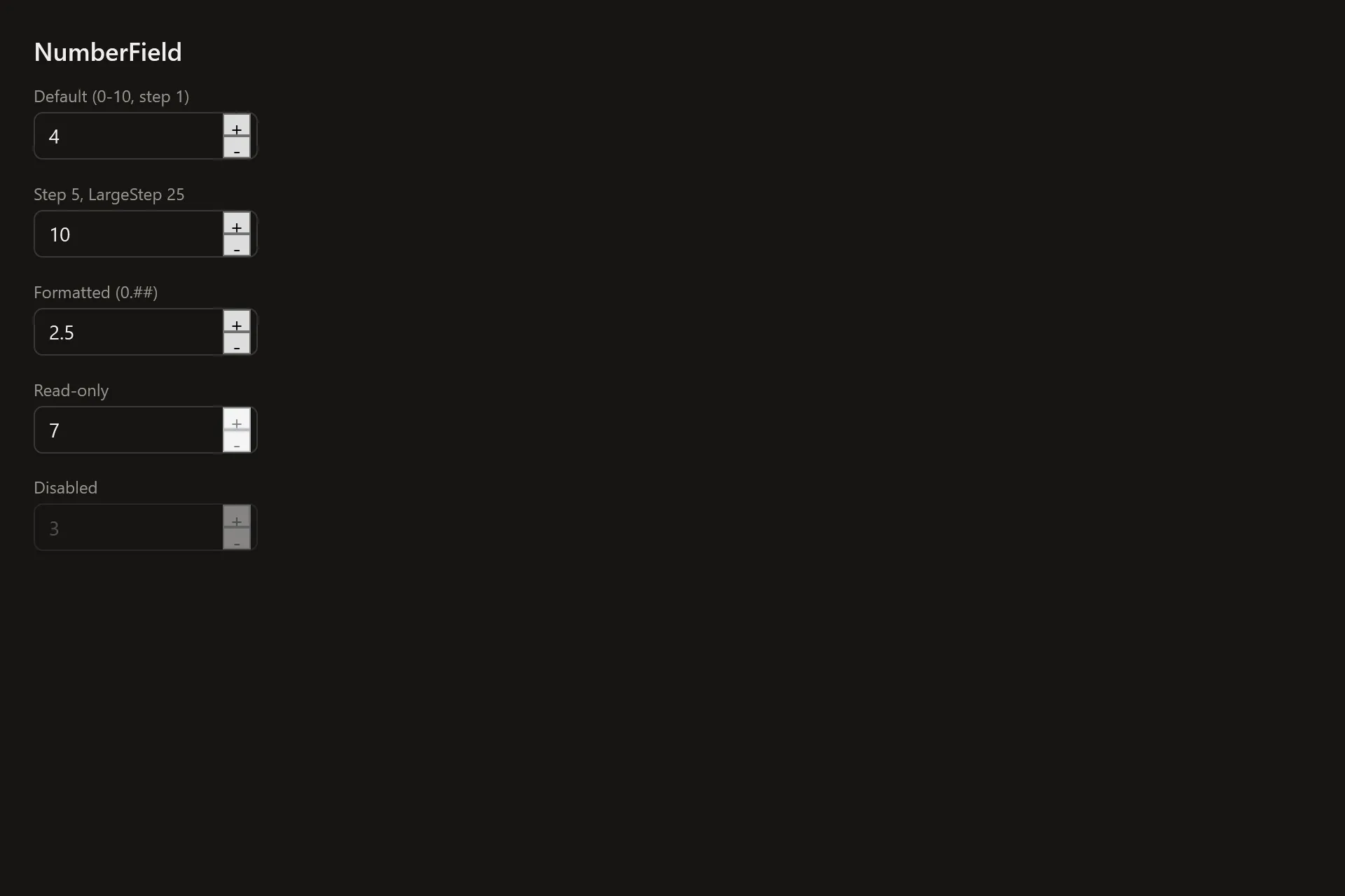
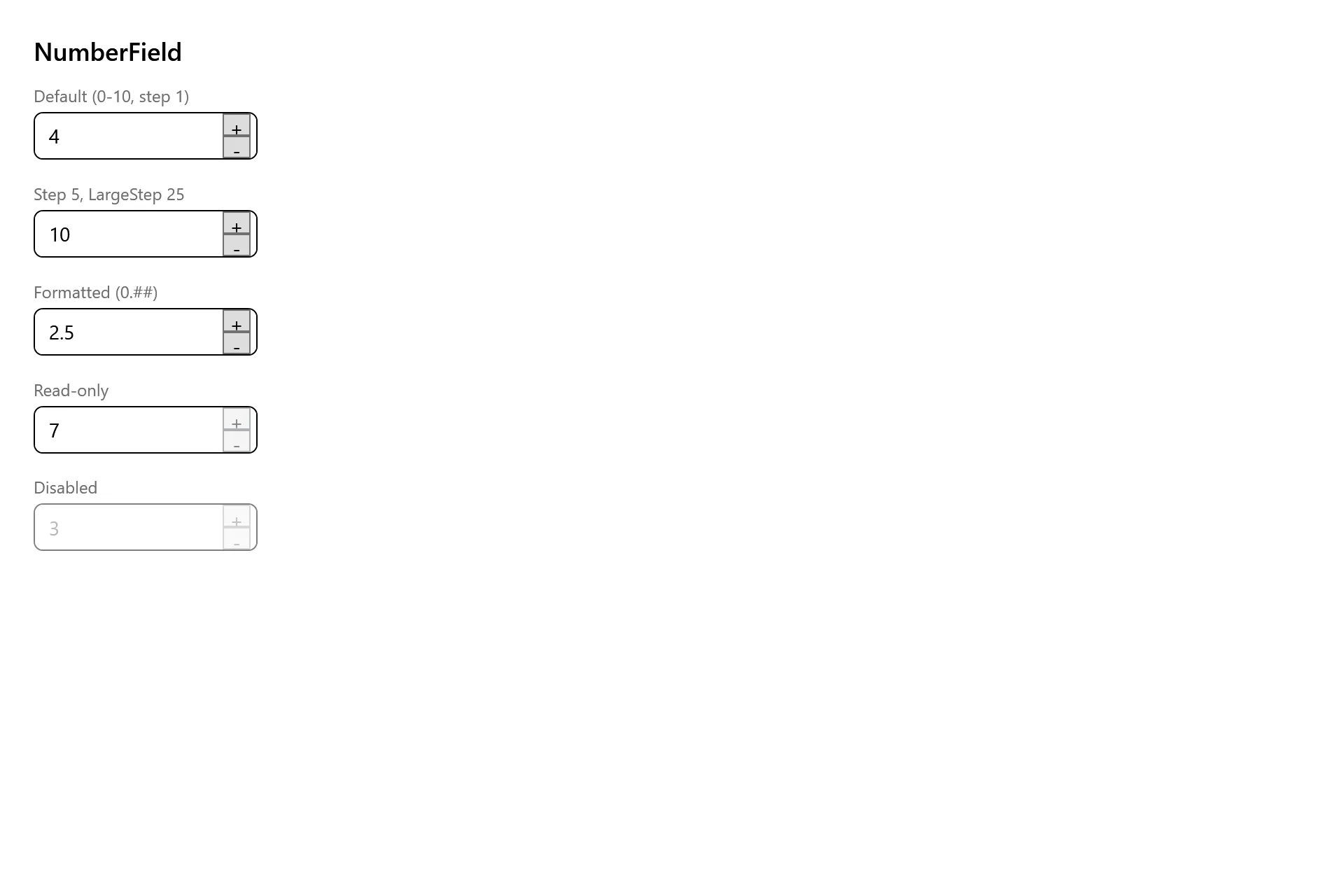
Section titled “Captures”The NumberField Gallery page rendered at the pinned commit, in each theme.