Navigation Menu
Overview
Section titled “Overview”NavigationMenu is a Tier B custom control set for a non-modal, hover/keyboard-disclosed
site-navigation row: no native WPF control models this pattern, so it is built on
ContentControl/ItemsControl with a NaviusAnchoredPopup-hosted content panel per open item.
This port implements only per-item popup mode; the web contract’s shared/morphing viewport (one
popup that resizes and re-anchors as the active item changes) is a stub that throws
NotSupportedException when requested.
xmlns:navigationmenu="clr-namespace:Navius.Wpf.Primitives.Controls.NavigationMenu;assembly=Navius.Wpf.Primitives"
<navigationmenu:NaviusNavigationMenu Value="{Binding OpenItem, Mode=TwoWay}">    <navigationmenu:NaviusNavigationMenuList>        <navigationmenu:NaviusNavigationMenuItem Value="products">            <navigationmenu:NaviusNavigationMenuTrigger Content="Products" />            <navigationmenu:NaviusNavigationMenuContent>                <StackPanel>                    <navigationmenu:NaviusNavigationMenuLink Content="Overview" Href="/products" />                    <navigationmenu:NaviusNavigationMenuLink Content="Pricing" Href="/pricing" />                </StackPanel>            </navigationmenu:NaviusNavigationMenuContent>        </navigationmenu:NaviusNavigationMenuItem>        <navigationmenu:NaviusNavigationMenuItem Value="docs">            <navigationmenu:NaviusNavigationMenuLink Content="Docs" Href="/docs" />        </navigationmenu:NaviusNavigationMenuItem>    </navigationmenu:NaviusNavigationMenuList></navigationmenu:NaviusNavigationMenu>
NaviusNavigationMenuSub (nested submenu-in-a-panel) shares the same Value/Orientation/
Delay/CloseDelay host surface as the root (both derive from NavigationMenuHostBase), but
defaults Orientation to "vertical" and renders as a plain ContentControl, not a <nav>
landmark equivalent.
Properties
Section titled “Properties”| Property | Type | Default | From | Description |
|---|---|---|---|---|
Value |
string? |
null |
NavigationMenuHostBase |
Value of the currently open item; two-way bindable. null = nothing open. |
Orientation |
string |
"horizontal" |
NavigationMenuHostBase |
"horizontal" or "vertical"; drives the List’s roving-focus axis. NaviusNavigationMenuSub defaults this to "vertical" in its constructor. |
Delay |
int |
50 |
NavigationMenuHostBase |
Milliseconds before hover opens an item’s content. |
CloseDelay |
int |
50 |
NavigationMenuHostBase |
Milliseconds before leaving the menu closes open content. |
UseSharedViewport |
bool |
false |
NaviusNavigationMenu |
Requests the shared/morphing-viewport layout; not implemented, throws NotSupportedException when set true. |
Value |
string |
"" |
NaviusNavigationMenuItem |
Matched against the ambient host’s open Value. |
NativeButton |
bool |
true |
NaviusNavigationMenuTrigger |
Render-contract parity flag only; this is always a native Button, so it has no behavioral effect. |
IsOpen |
bool |
- |
NaviusNavigationMenuIcon |
Read-only. Mirrors the owning item’s open state for a template trigger (rotate chevron). |
Href |
string? |
null |
NaviusNavigationMenuLink |
Link target; informational only, no navigation side effect authored here. |
Active |
bool |
false |
NaviusNavigationMenuLink |
Marks the current page: sets AutomationProperties.ItemStatus="page". |
ForceMount |
bool |
false |
NaviusNavigationMenuContent |
Keep the panel mounted while closed; accepted for API parity, no exit-animation phase exists to preserve. |
Side |
PlacementSide |
Bottom |
NaviusNavigationMenuContent |
Positioning knob forwarded to the hosted NaviusAnchoredPopup. |
Align |
PlacementAlign |
Center |
NaviusNavigationMenuContent |
- |
SideOffset |
double |
0 |
NaviusNavigationMenuContent |
- |
AlignOffset |
double |
0 |
NaviusNavigationMenuContent |
- |
IsOpen |
bool |
- |
NaviusNavigationMenuContent |
Read-only. True while this panel is the open one. |
Width / Height |
double |
10 / 5 |
NaviusNavigationMenuArrow |
Reuses FrameworkElement’s own Width/Height, metadata-overridden. |
KeepMounted |
bool |
false |
NaviusNavigationMenuBackdrop |
Keep the backdrop mounted while closed. |
ForceMount |
bool |
false |
NaviusNavigationMenuViewport |
Accepted for API parity only; inert stub, only meaningful in shared-viewport mode (not implemented). |
Methods
Section titled “Methods”| Method | Description |
|---|---|
RequestOpen(string value) |
Opens the given item if it is not already open. |
RequestClose(string value) |
Closes the given item if it is the currently open one. |
Toggle(string value) |
Opens the item if closed, closes it if already open. |
RequestOpenViaKeyboard(string value) |
Opens the item and marks it for the APG “enter content” pattern: its Content panel moves focus to its first focusable descendant once open. |
All four live on NavigationMenuHostBase, shared by NaviusNavigationMenu and
NaviusNavigationMenuSub.
Events
Section titled “Events”| Event | Signature | Fires when |
|---|---|---|
ValueChanged |
EventHandler<string?> |
Value changes, for any reason. |
OpenChangeComplete |
EventHandler<bool> |
Fires synchronously right after Value changes; this port has no separate presence-transition phase to wait for. |
Select |
EventHandler<NaviusNavigationMenuSelectEventArgs> |
NaviusNavigationMenuLink is activated, before the native click; cancelable via PreventDefault() (Click still raises). |
Keyboard interactions
Section titled “Keyboard interactions”| Key | Behavior |
|---|---|
Tab |
The trigger row is a single roving-tabindex seat: only the open item’s trigger (or the first) is in the Tab order. |
ArrowLeft/ArrowRight (horizontal) or ArrowUp/ArrowDown (vertical) |
NaviusNavigationMenuList’s own PreviewKeyDown roves focus across Trigger/Link descendants. |
Home / End |
Moves focus to the first/last rovable trigger or link. |
Space / Enter (on Trigger) |
Toggles this item’s content. |
ArrowDown (Trigger, orientation=horizontal) / ArrowRight (Trigger, orientation=vertical) |
“Enter content”: opens the item and moves focus to the first focusable descendant of its panel. |
Escape |
Closes the open item via a window-level PreviewKeyDown hook, or NaviusNavigationMenuContent’s own local handler when focus is inside that specific popup; focus returns to the trigger. |
UIA mechanism
Section titled “UIA mechanism”NaviusNavigationMenuTrigger ships a custom NaviusNavigationMenuTriggerAutomationPeer
(a ButtonAutomationPeer implementing IExpandCollapseProvider), reflecting and driving the
host’s Value; test-exercised. Expand()/Collapse() now guard on the trigger’s IsEnabled
(Disabled maps onto the inherited IsEnabled for this control, per its type remarks), throwing
ElementNotEnabledException for a disabled trigger instead of opening or closing its content.
NaviusNavigationMenuBackdrop reuses OverlayBackdrop but
registers its own DefaultStyleKey (a subclass that skips this does not reliably resolve the
base type’s implicit style). The root (NaviusNavigationMenu/Sub) and the Content panel ship
no custom automation peer; their AutomationControlType is left as the default
FrameworkElementAutomationPeer inference, pending a cross-family consistency decision.
NaviusNavigationMenuLink maps Active to AutomationProperties.ItemStatus="page" as an
approximation of aria-current (no exact UIA equivalent).
Web deltas
Section titled “Web deltas”- Scope: only per-item popup mode is implemented.
UseSharedViewport=truethrowsNotSupportedExceptionimmediately rather than faking the morph animation;NaviusNavigationMenuViewportis a present-but-inert stub, only meaningful in that unimplemented mode. - The contract’s
NaviusNavigationMenuPopup/Positioner/Portalcollapse ontoNaviusNavigationMenuContentdirectly: its default template hosts aNaviusAnchoredPopup, withSide/Align/SideOffset/AlignOffsetas the only positioning knobs the substrate exposes. Not implemented:Flip/AvoidCollisionsas independent toggles (the substrate always flips and shifts),CollisionPadding,Sticky,HideWhenDetached,ArrowPadding,Container(moot; WPF’sPopupalready renders outside the normal visual flow). - Captured unmatched attributes (
Attributes) are not ported anywhere in this family. data-activation-direction(a directional enter-animation cue) is not implemented.- Known residual (M6 audit): dismissal is window-hook-based (
PreviewMouseDown/PreviewKeyDown), which cannot see presses landing inside another host’s own open Content panel (a separate, transparent child HWND); a press inside one host’s popup while a different host’s (or a nested Sub’s) popup is open will not auto-close the other. Traces intoNaviusAnchoredPopup’s separate-HWND rendering, outside this family’s edit boundary. NaviusNavigationMenuLink.Activemaps toAutomationProperties.ItemStatus="page"as a defensible but approximate stand-in foraria-current="page"(no exact UIA equivalent); noted for cross-family consistency review.
Captures
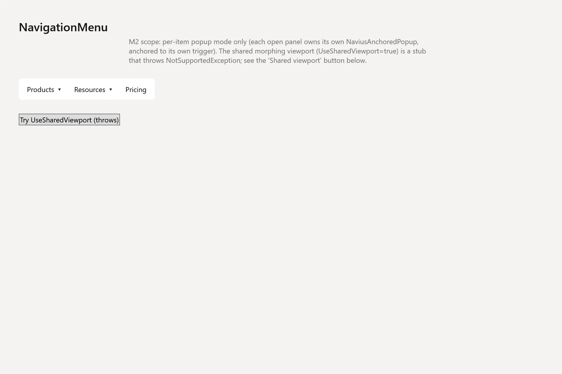
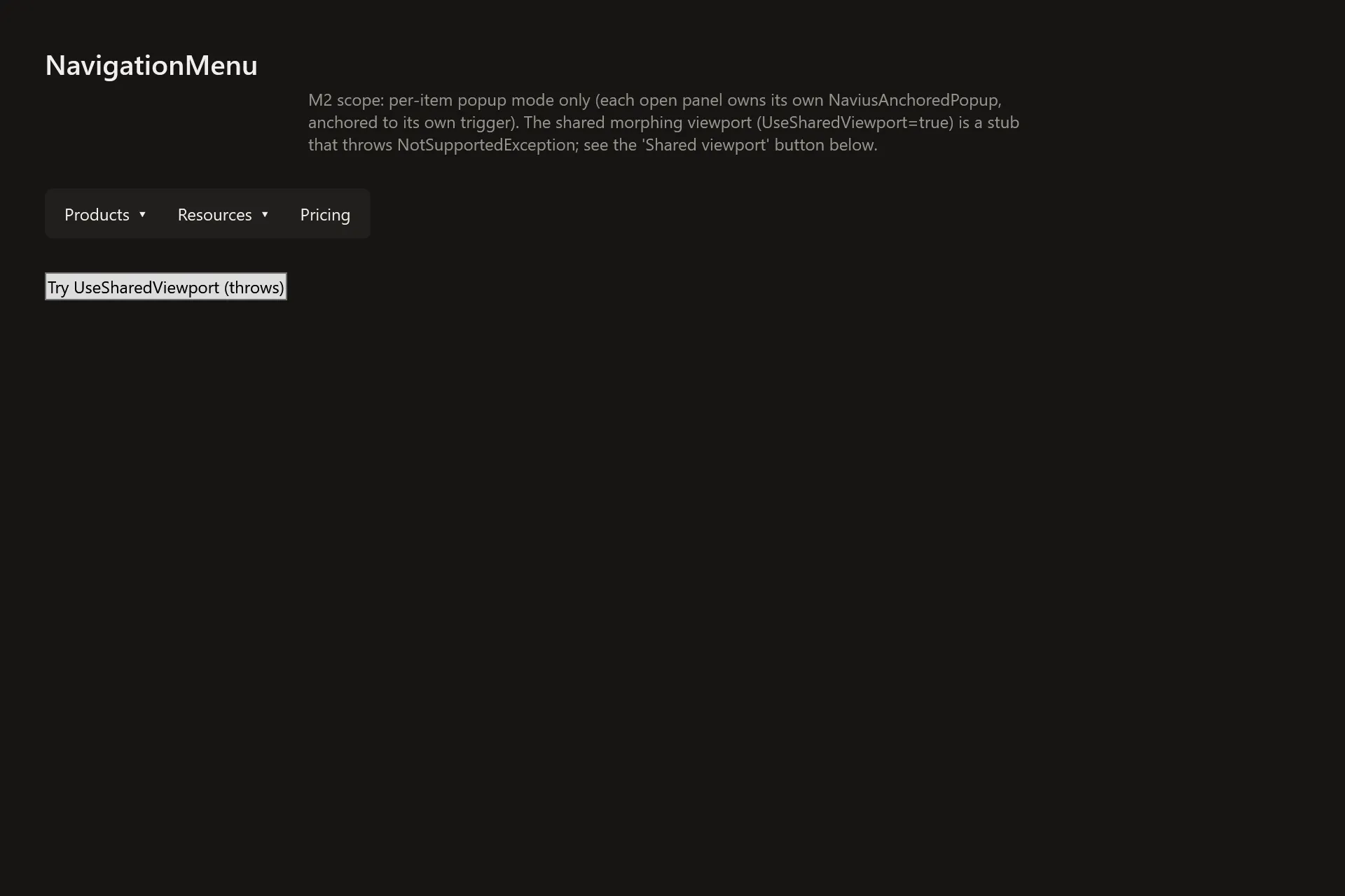
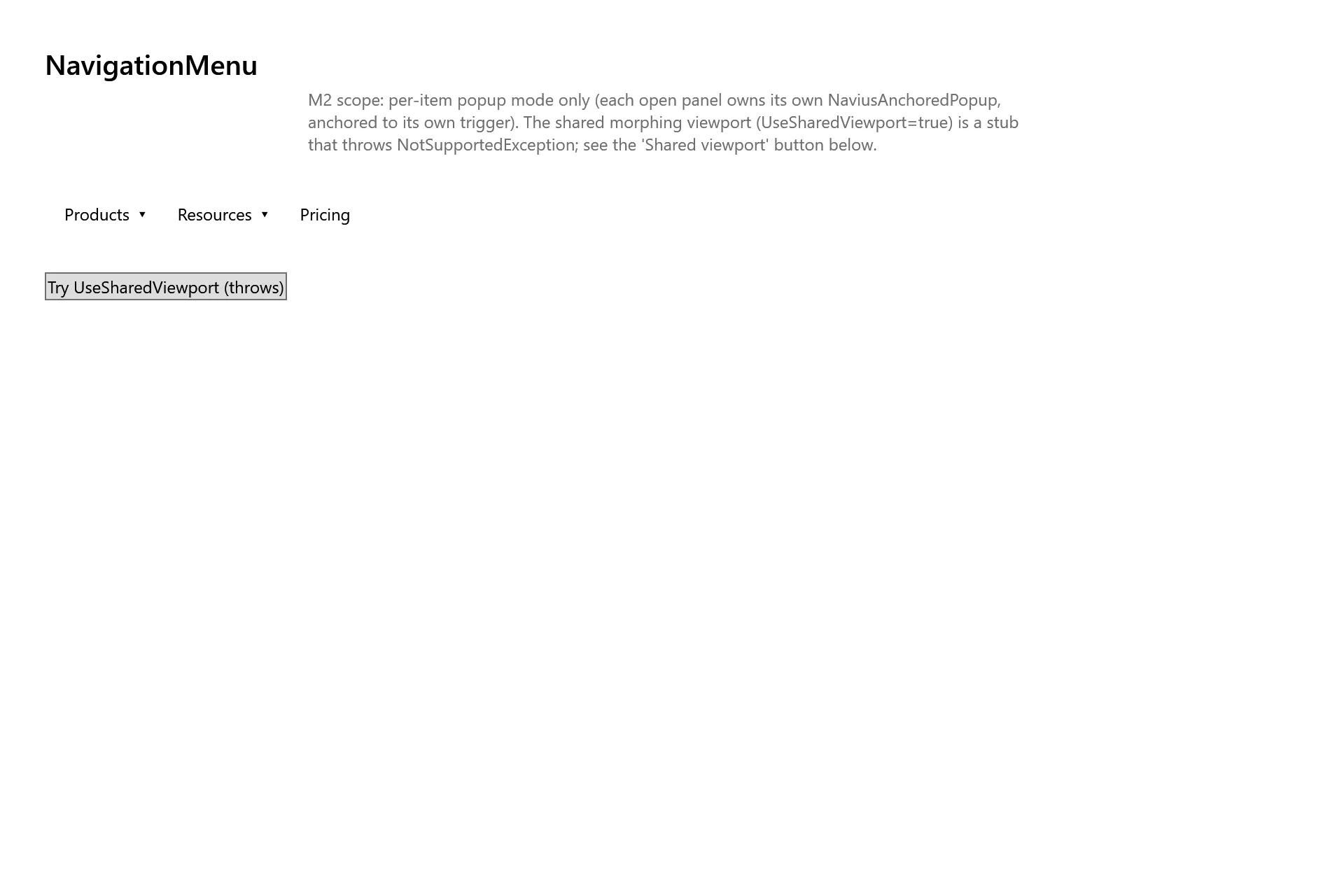
Section titled “Captures”The Navigation Menu Gallery page rendered at the pinned commit, in each theme.