Select
Overview
Section titled “Overview”Select is a Tier B, fully custom lookless ItemsControl (not ComboBox-derived), because
ComboBox’s built-in keyboard/selection internals fight the web contract’s exact semantics
(open-on-ArrowUp lands on the last option, Loop default false, multi-select toggle-and-stay-open
with no native equivalent). NaviusSelect<TItem> is generic over the item type; all
template-bound state lives on the non-generic NaviusSelectBase so every closed generic
instantiation can share one style, and the generic subclass adds only TItem-typed wrappers over
the base’s object-typed storage.
xmlns:select="clr-namespace:Navius.Wpf.Primitives.Controls.Select;assembly=Navius.Wpf.Primitives"
<ContentControl x:Name="SelectHost" />
var select = new NaviusSelect<string> { Placeholder = "Pick a fruit" };select.Items.Add(new NaviusSelectItem { Value = "apple", TextValue = "Apple" });select.Items.Add(new NaviusSelectItem { Value = "banana", TextValue = "Banana" });SelectHost.Content = select;NaviusSelect<TItem> is generic, and WPF’s compiled-XAML compiler rejects x:TypeArguments on
any element other than the document’s root, so a closed NaviusSelect<T> cannot be declared
inline inside a larger XAML tree. It is built in code-behind instead and dropped into a plain
placeholder host, the same pattern this repo’s own Gallery page uses (SelectPage.xaml/
SelectPage.xaml.cs): code-behind construction is less fragile than x:TypeArguments markup. WPF
resolves DefaultStyleKey per closed generic type, so the control points it at the non-generic
NaviusSelectBase. The style lives in Themes/Select.xaml, merged into the assembly’s
Generic.xaml, so default styles resolve with no consumer action.
Properties
Section titled “Properties”| Property | Type | Default | From | Description |
|---|---|---|---|---|
Value |
object? |
null |
NaviusSelectBase |
Two-way bindable single-select value DP, kept in sync with RawValue in both directions. Registered on the base, so Value="{Binding ...}" resolves on the object-typed NaviusSelect root and every closed NaviusSelect<TItem>; the generic subclass hides it with a TItem-typed accessor. |
Values |
IReadOnlyList<object> |
[] |
NaviusSelectBase |
Two-way bindable controlled multi-select DP, mirroring RawValues the same way; hidden on NaviusSelect<TItem> by a TItem-typed accessor. |
SelectedValues |
IReadOnlyList<TItem> |
[] |
NaviusSelect<TItem> |
Read-only. The current multi-select set, materialised as TItem from the base’s RawValues. |
RawValue |
object? |
null |
NaviusSelectBase |
Two-way bindable single-select storage; Value mirrors it. |
RawValues |
IReadOnlyList<object> |
[] |
NaviusSelectBase |
Two-way bindable multi-select storage; Values mirrors it, SelectedValues materialises it as TItem. |
IsOpen |
bool |
false |
NaviusSelectBase |
Two-way bindable open state. |
Multiple |
bool |
false |
NaviusSelectBase |
Enables multi-select: clicking toggles the value in the set and keeps the popup open. |
Placeholder |
string? |
null |
NaviusSelectBase |
Shown as the trigger label when nothing is selected. |
Loop |
bool |
false |
NaviusSelectBase |
When true, highlight navigation wraps at the ends; false (default) clamps. |
Side |
PlacementSide |
Bottom |
NaviusSelectBase |
Forwarded to the hosted NaviusAnchoredPopup. |
Align |
PlacementAlign |
Start |
NaviusSelectBase |
- |
SideOffset |
double |
6 |
NaviusSelectBase |
- |
AlignOffset |
double |
0 |
NaviusSelectBase |
- |
Name |
string? |
null |
NaviusSelectBase |
Marker only; no native-form mirror wiring. Declared new, shadowing FrameworkElement.Name. |
Required |
bool |
false |
NaviusSelectBase |
Marker only; no native validation wiring. |
DisplayText |
string? |
- |
NaviusSelectBase |
Read-only. The resolved trigger label: the selected item’s text (joined for multi-select), else Placeholder. |
HasSelection |
bool |
- |
NaviusSelectBase |
Read-only. True when something is selected. |
Value |
object? |
null |
NaviusSelectItem |
The opaque value key this option commits. |
TextValue |
string? |
null |
NaviusSelectItem |
Display/type-ahead text; falls back to Value’s string form when null. |
Disabled |
bool |
false |
NaviusSelectItem |
Skipped by highlight navigation and selection. |
IsSelectedValue |
bool |
false |
NaviusSelectItem |
Owner-set selected flag, not Selector.IsSelected. |
IsHighlightedValue |
bool |
false |
NaviusSelectItem |
Owner-set roving-highlight flag; visual only, the item is never focused. |
The NaviusSelectBase theme style sets a 200px MinWidth, a 36px MinHeight, a 14px FontSize,
and a 12,6 content margin on the trigger, so a collapsed select and a NaviusInput share one
36px collapsed height on a row (a Primitives 1.0.0-preview.5 fix; the trigger’s vertical inset was
previously 8px against the input’s 6px, and neither control set a MinHeight). Covered by
FieldTests.InputAndSelect_HaveMatchingCollapsedHeight.
Events
Section titled “Events”| Event | Signature | Fires when |
|---|---|---|
ValueChanged |
RoutedEventHandler |
Every single-select commit. |
ValuesChanged |
RoutedEventHandler |
Every multi-select toggle. |
ValueSelected |
EventHandler<TItem?> |
Typed wrapper over ValueChanged, on NaviusSelect<TItem>. |
ValuesSelected |
EventHandler<IReadOnlyList<TItem>> |
Typed wrapper over ValuesChanged, on NaviusSelect<TItem>. |
Select |
RoutedEventHandler |
An option is activated (click or Enter/Space), on NaviusSelectItem. Cancelable: PreventDefault() skips applying the value and keeps the listbox open; the owner commits only when not prevented. |
Keyboard interactions
Section titled “Keyboard interactions”| Key | Behavior |
|---|---|
Enter / Space / ArrowDown (closed trigger) |
Opens the listbox, highlight lands on the first option. |
ArrowUp (closed trigger) |
Opens the listbox, highlight lands on the last option. |
ArrowDown / ArrowUp (open) |
Moves highlight to the next/previous option; clamps at the ends unless Loop=true. |
Home / End |
Jumps highlight to the first/last option. |
A-Z, digit, or numpad-digit key |
Type-ahead: jumps to the next option whose DisplayText starts with that character (single-character match, no multi-key buffer). |
Enter / Space (on the highlighted option) |
Commits the highlighted option: single-select closes the popup, multi-select toggles and stays open. |
Escape |
Closes the popup, handled directly in the control’s own key handler (the single source of truth for Escape). |
| Click outside | Closes the popup, delegated to OverlayStack since the popup lives in a separate HwndSource. |
On reopen, highlight lands on the currently-selected option, else the first.
UIA mechanism
Section titled “UIA mechanism”Because NaviusSelectBase is not ComboBox-derived, the free ComboBoxAutomationPeer/
ComboBoxItemAutomationPeer are unavailable. NaviusSelectAutomationPeer (a
FrameworkElementAutomationPeer) reports AutomationControlType.ComboBox and implements two
patterns: a read-only IValueProvider surfacing DisplayText, and IExpandCollapseProvider over
IsOpen (both test-verified by AutomationPeer_ExposesReadOnlyValuePattern_SurfacingDisplayText
and AutomationPeer_ExposesExpandCollapsePattern_TrackingOpenState). NaviusSelectItem ships
NaviusSelectItemAutomationPeer, reporting AutomationControlType.ListItem; its name is the
base-resolved name (e.g. an explicit AutomationProperties.Name) when non-empty, else falls back
to the item’s DisplayText. Disabled Select roots reject both Expand() and Collapse() with
ElementNotEnabledException rather than silently changing or ignoring popup state.
ISelectionProvider/ISelectionItemProvider are not implemented: a UIA reader cannot
enumerate which items are selected, or query an individual item’s selection state, over
automation. This is a stated M6 residual, not fixed in this wave; the M6 audit’s own finding was
that an earlier draft of this doc understated the peer (claiming no patterns at all were
implemented, when IValueProvider and IExpandCollapseProvider already were), while confirming
selection-pattern support genuinely remains absent.
Web deltas
Section titled “Web deltas”- Tier B custom
ItemsControlinstead ofComboBox:ComboBox’s built-in keyboard/selection internals fight the contract’s exact semantics (open-on-ArrowUp lands on the last option,Loopdefault false, multi-select toggle-and-stay-open with no nativeComboBoxequivalent), so selection is owned directly byNaviusSelectBase(a plainIsSelectedValueflag per item) rather thanSelector.IsSelected/ComboBoxItemplumbing. - Real keyboard focus never moves into the popup: the popup is a separate
HwndSource, so items are non-focusable and highlight is visual-only (IsHighlightedValue), with every key tunneling throughNaviusSelectBase’s ownPreviewKeyDownhandler. This is the one deliberate deviation from the web contract’s keyboard model (which moves real DOM focus onto the highlighted option); behavior is otherwise faithful. - 14 web parts collapse onto 3 WPF types (
NaviusSelectBaseabsorbing Root/Trigger/Value/Icon/ Portal/Positioner/Popup/Viewport;NaviusSelectItemabsorbing Item/ItemText/ItemIndicator).NaviusSelectArrowand the ScrollUp/ScrollDown buttons are not ported (a plainScrollViewersupplies scrolling; those buttons are decorative in the web contract too). Group/Label/ Separator sub-parts are out of scope for this wave. - The three-way trigger-label priority chain (
ItemText.Text>Item.TextValue> raw value key) is resolved to a simpler two-step convention:DisplayText = TextValue ?? Value?.ToString(). - Captured unmatched attributes,
Class, and native-form mirroring (hidden<input>mirrors for form submission) are dropped per this repo’s precedent;NameandRequiredare kept as inert marker properties only. Dir/RTL,DefaultValue/DefaultOpenuncontrolled seeds, and the four-callback dismiss superset (OnEscapeKeyDown/OnPointerDownOutside/OnFocusOutside/OnInteractOutside) are not ported in this wave; open/value state is controlled entirely via the two-wayIsOpen/Value/ValuesDPs (or theirRawValue/RawValuesstorage twins).- Known residual (M6 audit):
ISelectionProvider/ISelectionItemProviderare not implemented on the automation peer. A UIA reader can read the trigger’sDisplayText(IValueProvider) and drive/observeIsOpen(IExpandCollapseProvider), but cannot enumerate selected items over automation. Stated plainly as an open gap, not rounded up to a broader accessibility claim.
Captures
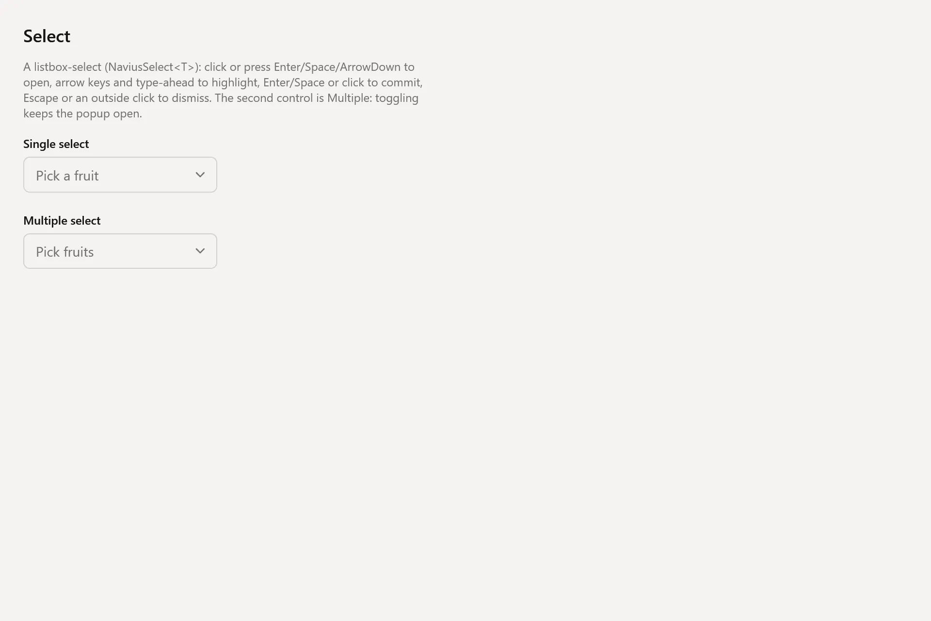
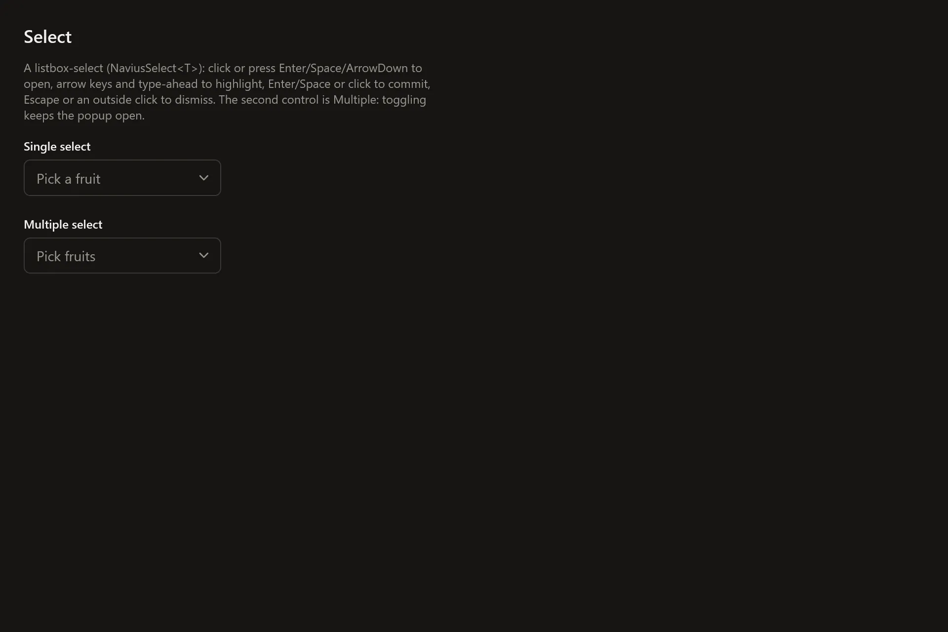
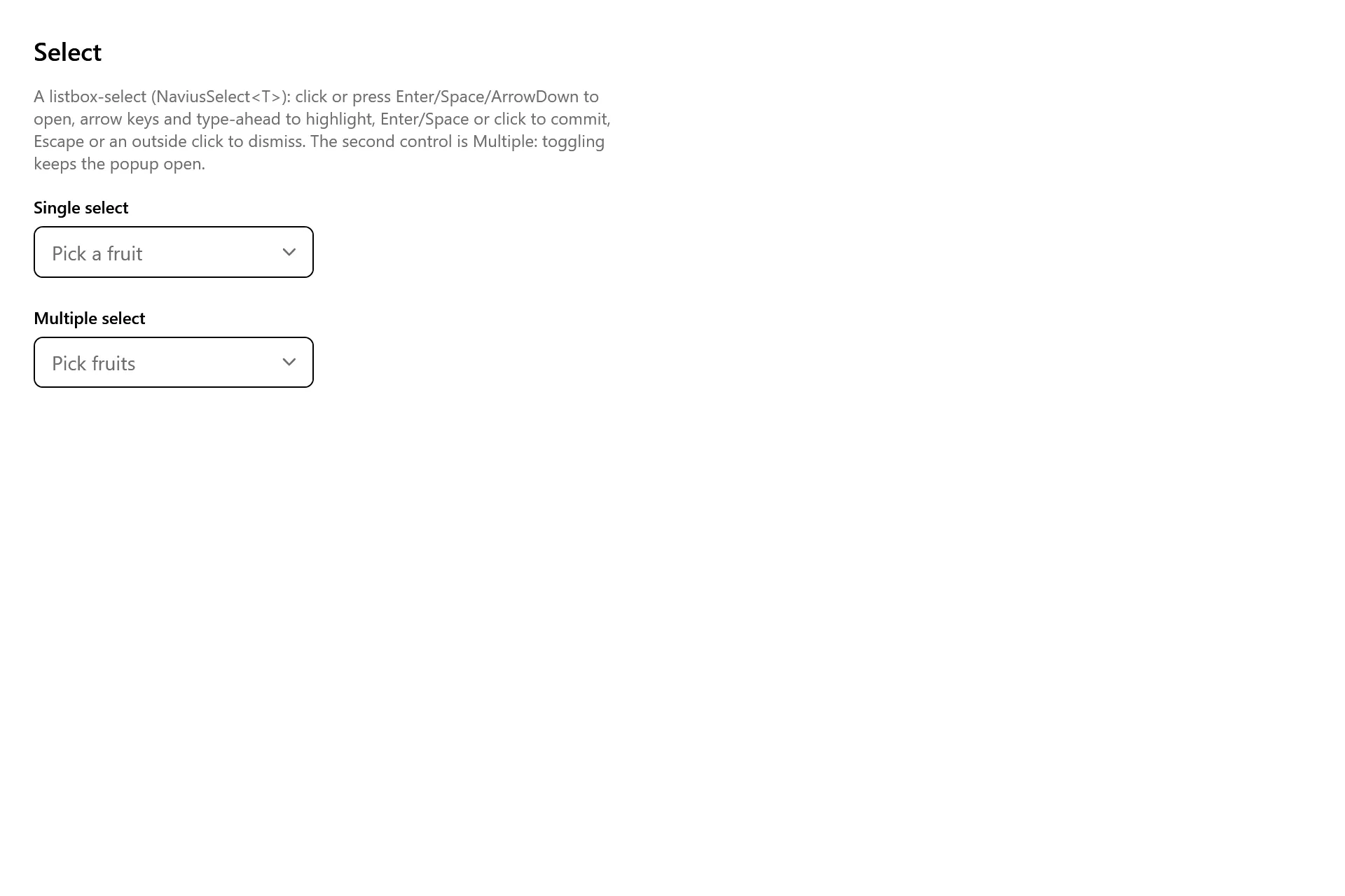
Section titled “Captures”The Select Gallery page rendered at the pinned commit, in each theme.