Accordion
Overview
Section titled “Overview”Accordion is a lookless ContentControl root (NaviusAccordion) that owns either a single
Value string or a Values list, discovering its NaviusAccordionItem/NaviusAccordionHeader/
NaviusAccordionTrigger/NaviusAccordionPanel descendants through the logical tree rather than an
explicit registration step. It drives single-or-multiple open state, per-item disabled cascading,
and arrow-key roving focus across triggers.
xmlns:navius="clr-namespace:Navius.Wpf.Primitives.Controls;assembly=Navius.Wpf.Primitives"xmlns:accordion="clr-namespace:Navius.Wpf.Primitives.Controls.Accordion;assembly=Navius.Wpf.Primitives"
<accordion:NaviusAccordion Type="single" Collapsible="True">    <accordion:NaviusAccordionItem Value="item-1">        <accordion:NaviusAccordionHeader>            <accordion:NaviusAccordionTrigger Content="Section one" />        </accordion:NaviusAccordionHeader>        <accordion:NaviusAccordionPanel>            <TextBlock Text="Section one body." />        </accordion:NaviusAccordionPanel>    </accordion:NaviusAccordionItem>    <accordion:NaviusAccordionItem Value="item-2">        <accordion:NaviusAccordionHeader>            <accordion:NaviusAccordionTrigger Content="Section two" />        </accordion:NaviusAccordionHeader>        <accordion:NaviusAccordionPanel>            <TextBlock Text="Section two body." />        </accordion:NaviusAccordionPanel>    </accordion:NaviusAccordionItem></accordion:NaviusAccordion>
Properties
Section titled “Properties”| Property | Type | Default | From | Description |
|---|---|---|---|---|
Type |
string |
"single" |
NaviusAccordion |
"single" or "multiple"; selects whether Value or Values holds the open state. |
Value |
string? |
null |
NaviusAccordion |
Open item id in single mode. |
Values |
IReadOnlyList<string> |
[] |
NaviusAccordion |
Open item ids in multiple mode. |
Collapsible |
bool |
false |
NaviusAccordion |
Single mode only. When false, the sole open item cannot close itself. |
Orientation |
string |
"vertical" |
NaviusAccordion |
"vertical" or "horizontal"; drives arrow-key axis. |
Dir |
string? |
null |
NaviusAccordion |
"ltr"/"rtl"; falls back to FlowDirection when unset, reversing horizontal arrow mapping under rtl. |
Value |
string |
"" |
NaviusAccordionItem |
Unique identifier for this section. |
Index |
int |
0 |
NaviusAccordionItem |
Zero-based order index; recomputed and set by the ancestor NaviusAccordion on every sync, not intended to be set directly. |
Level |
int |
3 |
NaviusAccordionHeader |
Heading level 1-6, clamped; drives AutomationProperties.HeadingLevel (WPF has no document-outline element to swap between h1-h6). |
IsPanelOpen |
bool |
false |
NaviusAccordionTrigger |
Mirrors the item’s open state; set by the ancestor NaviusAccordion, not by the trigger itself. |
IsOpen |
bool |
false |
NaviusAccordionPanel |
Mirrors the item’s open state; set by the ancestor NaviusAccordion. |
KeepMounted |
bool |
false |
NaviusAccordionPanel |
Keeps Content cached and only toggles Visibility instead of clearing Content on close. |
Content |
object |
- |
ContentControl |
Body content; applies to Item, Header, Trigger, and Panel (each is a lookless ContentControl/Button). |
Events
Section titled “Events”| Event | Signature | Fires when |
|---|---|---|
ValueChanged |
RoutedEventHandler |
Single mode: the open item changes (a trigger click or a direct Value write). |
ValuesChanged |
RoutedEventHandler |
Multiple mode: the open id set changes. |
Keyboard interactions
Section titled “Keyboard interactions”| Key | Behavior |
|---|---|
ArrowUp / ArrowDown (vertical orientation) |
Moves focus to the previous/next enabled trigger, wrapping. |
ArrowLeft / ArrowRight (horizontal orientation) |
Moves focus to the previous/next enabled trigger in visual order, reversed under Dir="rtl" or FlowDirection.RightToLeft, wrapping. |
Home / End |
Moves focus to the first/last enabled trigger. |
Space / Enter |
Toggles the focused trigger’s item; handled by the native Button Click, not a custom key handler. |
Arrow navigation always wraps: there is no Loop property (unlike NaviusTabs), since the
contract’s own keyboard table has no non-looping accordion variant. Disabled triggers are skipped
when computing arrow/Home/End targets and cannot receive focus via these keys.
UIA mechanism
Section titled “UIA mechanism”NaviusAccordionAutomationPeer reports AutomationControlType.Group on the root. Each
NaviusAccordionHeader publishes its Level via AutomationProperties.HeadingLevel
(AutomationHeadingLevel.Level1-Level6). NaviusAccordionTriggerAutomationPeer reports
AutomationControlType.Button and implements both IInvokeProvider (native Button behavior) and
IExpandCollapseProvider (ExpandCollapseState from IsPanelOpen), the same dual-pattern shape as
ExpanderAutomationPeer. IInvokeProvider.Invoke queues activation onto the trigger’s dispatcher
(DispatcherPriority.Input) per the UIA Invoke contract’s requirement to return immediately;
IExpandCollapseProvider.Expand/Collapse run synchronously, reaching the requested open/closed
state before returning, per the ExpandCollapse provider contract. Both paths route through
ButtonBase.OnClick rather than a bare RaiseEvent, so a bound Command executes and not just
Click. A disabled trigger throws ElementNotEnabledException from all three members.
NaviusAccordionPanelAutomationPeer approximates role="region" as AutomationControlType.Group,
since WPF’s AutomationControlType enum has no direct region value; this is disclosed as a known
gap, not a claim of an exact landmark match. The unit suite exercises disabled-cascading
(Disabled_CascadesFromItem_BlocksToggle), the keyboard table, the dual trigger patterns, the
async-Invoke/synchronous-ExpandCollapse split, command execution through UIA, and the
disabled-throws behavior.
Web deltas
Section titled “Web deltas”- One lookless root instead of a per-item
Expandercomposition:NaviusAccordionownsValue/Valuesdirectly, following the same “root owns state, discovers descendants” shape asNaviusRadioGroup/NaviusCheckboxGroup/NaviusCollapsible, rather than wrapping per-itemExpanders. role="region"on the Panel is approximated asAutomationControlType.Group; WPF has no exact region UIA type.- The dynamic
<h1>-<h6>heading element swap has no WPF equivalent;Levelinstead drivesAutomationProperties.HeadingLevelonly, with no document-outline effect. Loopis not exposed: the contract’s own keyboard table always wraps for Accordion, so arrow navigation here wraps unconditionally with no non-looping variant.- WPF’s
IsEnableddoes not automatically cascade through aContentControl’s logicalContent;SyncDescendantsexplicitly pushes each Item’sIsEnabledonto its Trigger and re-subscribes toIsEnabledChangedso later toggles keep propagating. data-indexis implemented literally as anIndexint property onNaviusAccordionItem, recomputed by the root on every open-state sync rather than a DOM-order read.- Height animation (open/close) is shared with
NaviusCollapsiblePanelvia an internalPanelHeightAnimatorhelper rather than the two families composing one control, since Accordion’s panel additionally needs region-ish automation semantics and per-item disabled/index cascading.
Captures
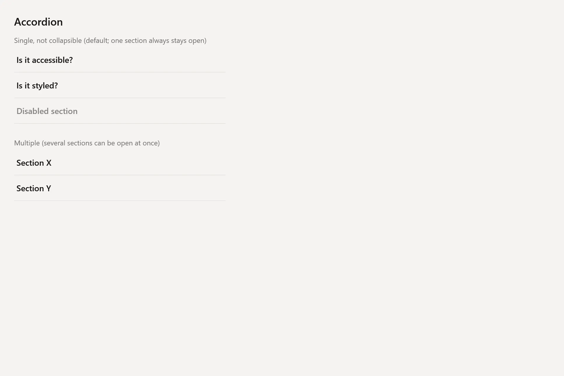
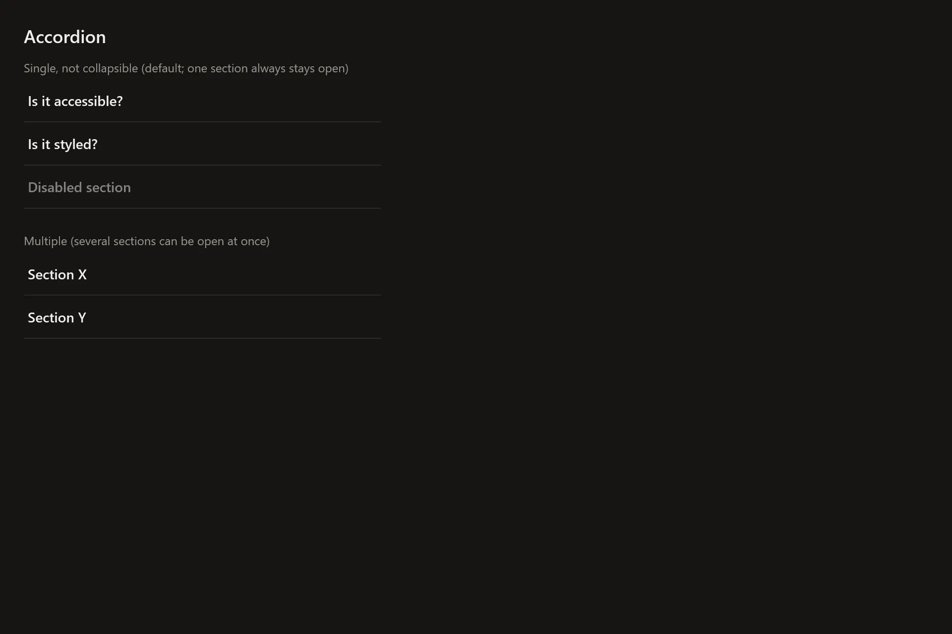
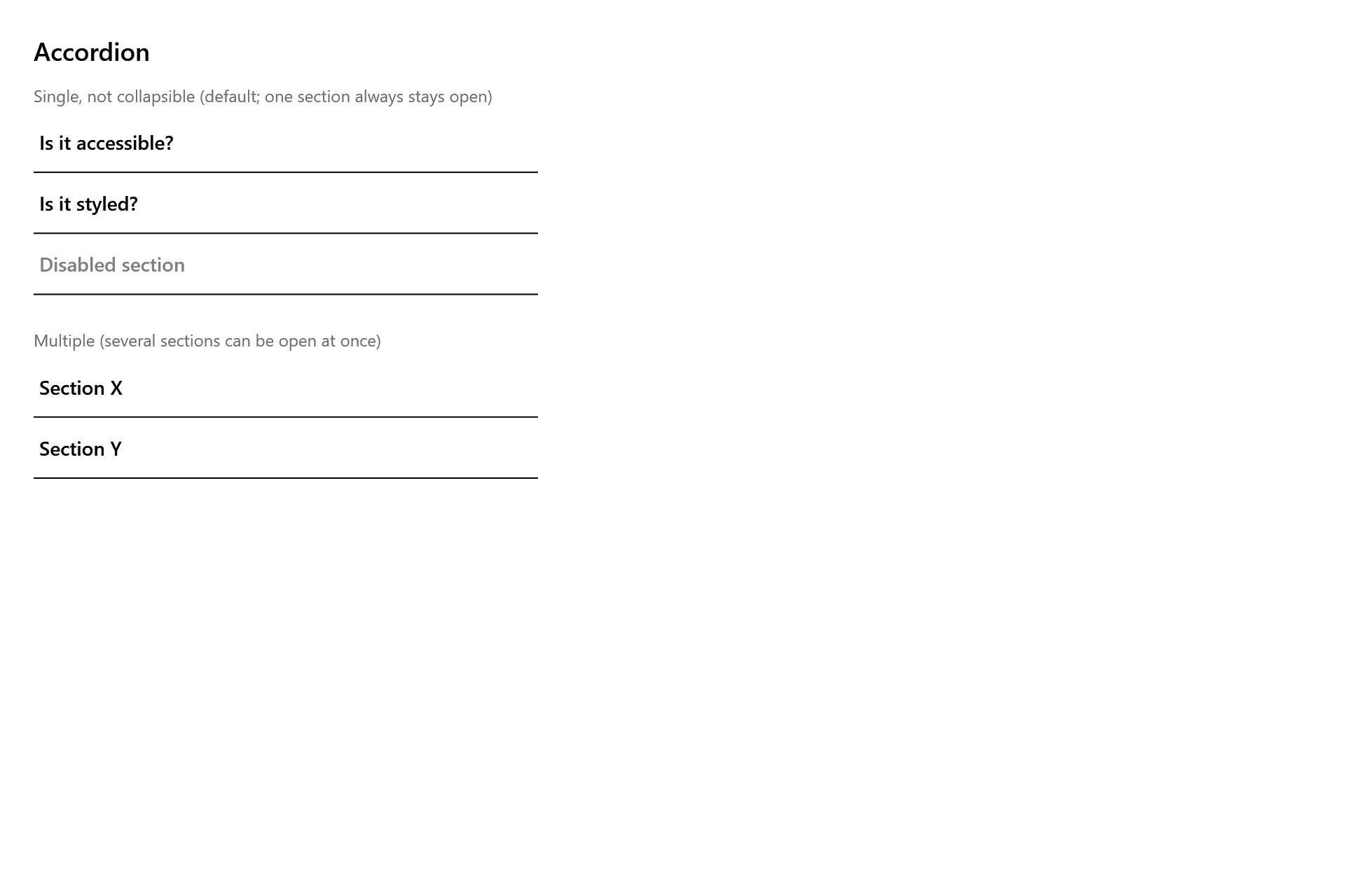
Section titled “Captures”The Accordion Gallery page rendered at the pinned commit, in each theme.