PasswordToggleField
Overview
Section titled “Overview”PasswordToggleField composes a password input with a button that reveals or hides it, mirroring
the web family’s Root/Input/Toggle/Icon/Slot parts as separate ContentControl/Control
subclasses rather than one folded control (WPF has no cascading-parameter mechanism, so the root
pushes revealed state down to descendants instead). Because WPF’s PasswordBox.Password is
deliberately non-bindable, NaviusPasswordToggleFieldInput overlays two real controls,
PART_PasswordBox (authoritative while hidden) and PART_TextBox (authoritative while revealed),
copying the value across only at the moment the state flips, so the plaintext never lives in a
bindable dependency property.
xmlns:pw="clr-namespace:Navius.Wpf.Primitives.Controls.PasswordToggleField;assembly=Navius.Wpf.Primitives"
<pw:NaviusPasswordToggleField x:Name="Field">    <StackPanel Orientation="Horizontal">        <pw:NaviusPasswordToggleFieldInput Width="220" />        <pw:NaviusPasswordToggleFieldToggle>            <pw:NaviusPasswordToggleFieldIcon>                <pw:NaviusPasswordToggleFieldIcon.HiddenContent>                    <TextBlock Text="Show" />                </pw:NaviusPasswordToggleFieldIcon.HiddenContent>                <pw:NaviusPasswordToggleFieldIcon.VisibleContent>                    <TextBlock Text="Hide" />                </pw:NaviusPasswordToggleFieldIcon.VisibleContent>            </pw:NaviusPasswordToggleFieldIcon>        </pw:NaviusPasswordToggleFieldToggle>    </StackPanel></pw:NaviusPasswordToggleField>
NaviusPasswordToggleField finds its NaviusPasswordToggleFieldInput descendant via a logical
tree walk from OnContentChanged, so the input can sit anywhere inside Content. Read the
plaintext only when genuinely needed, via Field.GetPassword().
Properties
Section titled “Properties”| Property | Type | Default | From | Description |
|---|---|---|---|---|
Visible |
bool |
false |
NaviusPasswordToggleField |
Controlled revealed state. Two-way bindable by default. Covers both the controlled and uncontrolled roles; there is no separate DefaultVisible. |
VisibleContent |
object? |
null |
PasswordToggleFieldSlotBase |
Content shown by NaviusPasswordToggleFieldIcon/NaviusPasswordToggleFieldSlot while the password is revealed. |
HiddenContent |
object? |
null |
PasswordToggleFieldSlotBase |
Content shown while the password is hidden. |
ContentFactory |
Func<bool, object>? |
null |
NaviusPasswordToggleFieldSlot |
Fully custom per-state content factory, receiving the current revealed state. Takes precedence over VisibleContent/HiddenContent when set. |
Methods
Section titled “Methods”| Method | Description |
|---|---|
NaviusPasswordToggleField.GetPassword() |
Opt-in plaintext read of whichever control (PasswordBox or TextBox) currently holds the authoritative value. Same trust boundary as reading PasswordBox.Password directly; the value is never mirrored to a bindable DP. |
NaviusPasswordToggleField.ToggleVisible() |
Flips Visible. |
Events
Section titled “Events”| Event | Signature | Fires when |
|---|---|---|
VisibleChanged |
RoutedEventHandler (bubbling RoutedEvent) |
Visible changes, from a toggle click or a direct set. |
PasswordChanged |
RoutedEventHandler (bubbling RoutedEvent), on NaviusPasswordToggleFieldInput |
The authoritative control’s value changes (typing in whichever of PART_PasswordBox/PART_TextBox is currently active). Carries no plaintext. |
Keyboard interactions
Section titled “Keyboard interactions”| Key | Behavior |
|---|---|
Enter / Space (toggle focused) |
Activates the toggle via native ButtonBase semantics; no custom key handler exists in this family. |
No component-specific PreviewKeyDown/KeyDown handling exists anywhere in this family; the
input parts rely entirely on native PasswordBox/TextBox text-editing keys.
UIA mechanism
Section titled “UIA mechanism”Neither NaviusPasswordToggleField (a plain ContentControl) nor NaviusPasswordToggleFieldInput
(a plain Control overlaying the two real edit controls) overrides OnCreateAutomationPeer, so
UIA sees the stock ContentControlAutomationPeer for the root and, for the input, whichever of
PART_PasswordBox/PART_TextBox is currently visible reporting its own native automation
surface. While hidden, the authoritative PasswordBox reports IsPassword() == true and never
surfaces plaintext through the Value pattern; while revealed, the TextBox surfaces its text
normally. NaviusPasswordToggleFieldToggle is a plain Button, not a ToggleButton, so its
ButtonAutomationPeer exposes no pressed/Toggle-pattern state, deliberately matching the web
contract’s omission of aria-pressed; AutomationProperties.Name flips between “Show password”
and “Hide password” as Visible changes. aria-controls is dropped: this WPF runtime’s
AutomationPeer has no overridable GetControllerForCore extensibility point (only the
non-virtual GetControllerForProviderArray). The M6 audit treated the plaintext-leak question as
its priority and confirmed, via regression tests that assert directly on the peer/Value-pattern
surface rather than DP types (HiddenState_DoesNotLeakPlaintextThroughTheAutomationSurface,
RevealThenHide_LeavesNoPlaintextInTheAutomationSurface), that the masked password never reaches
UIA while hidden.
Web deltas
Section titled “Web deltas”- WPF’s
PasswordBox.Passwordis deliberately non-bindable (security-by-design) andPasswordBoxhas notype="text"reveal mode, unlike the web<input>flipping itstypeattribute. The port overlays two real controls (PART_PasswordBox,PART_TextBox), copying the value across only at the momentVisibleflips, and clears theTextBoximmediately on hide so plaintext never lingers in a loaded-but-collapsed control. A fully custom maskedTextBox(never usingPasswordBox) was considered and rejected: it would trade away OS-levelSecureStringprotections the contract does not actually require. - No cascading-parameter mechanism exists in WPF, so the root pushes
Visibledown to descendants (fromOnContentChangedand everyVisiblechange) instead of parts pulling a shared context; this also keeps everything working headlessly, whereFrameworkElement.Loadednever fires. - The toggle is a plain
Button, notToggleButton: aButtonAutomationPeerhas no pressed-state exposure, achieving the same “noaria-pressed” outcome as the web’s deliberate omission, for free, rather than needing to suppress aToggleButtonAutomationPeer’s Toggle pattern. aria-controlsis dropped entirely: there is no supported extensibility point (GetControllerForCore) to wire a ControllerFor relationship from a custom peer in this WPF runtime.- The form submit/reset auto-hide safeguard does not port (no HTML form model, per
docs/adr/0001-web-form-participation-params.md); a consumer or a containingNaviusFormcan setVisible = falsein its own submit handler to reproduce it. - The web’s pointer-vs-keyboard focus-return distinction (
MouseEventArgs.Detail > 0vs== 0) is not ported; WPF button activation keeps focus on the toggle in both cases, matching the web’s keyboard path and avoiding a browser-specific heuristic. NaviusPasswordToggleFieldIcon/NaviusPasswordToggleFieldSlotbecameContentControls swappingVisibleContent/HiddenContent(a native content swap, not aDataTemplateSelector); Slot addsContentFactorymirroring the web’sRenderrender-prop, taking precedence when set.DefaultVisible(uncontrolled initial revealed state) is not a separate parameter:Visiblealready covers both the controlled and uncontrolled roles (defaultfalse, matching the contract’sDefaultVisibledefault). This was an M6-confirmed doc-completeness gap (the original WPF notes omitted recording the drop); now recorded here.- M6 audit result: the security check (no plaintext leak through a bindable DP or the automation surface) held up fully, and no other confirmed or plausible disparities were found for this family.
Captures
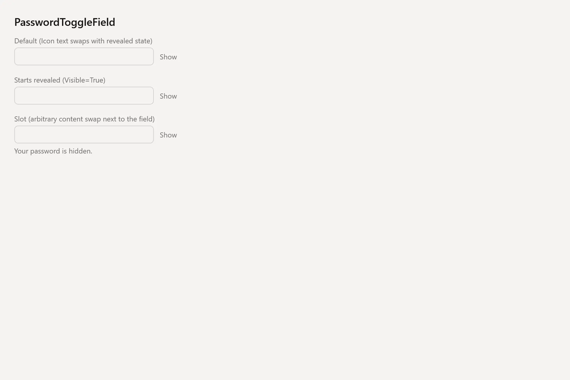
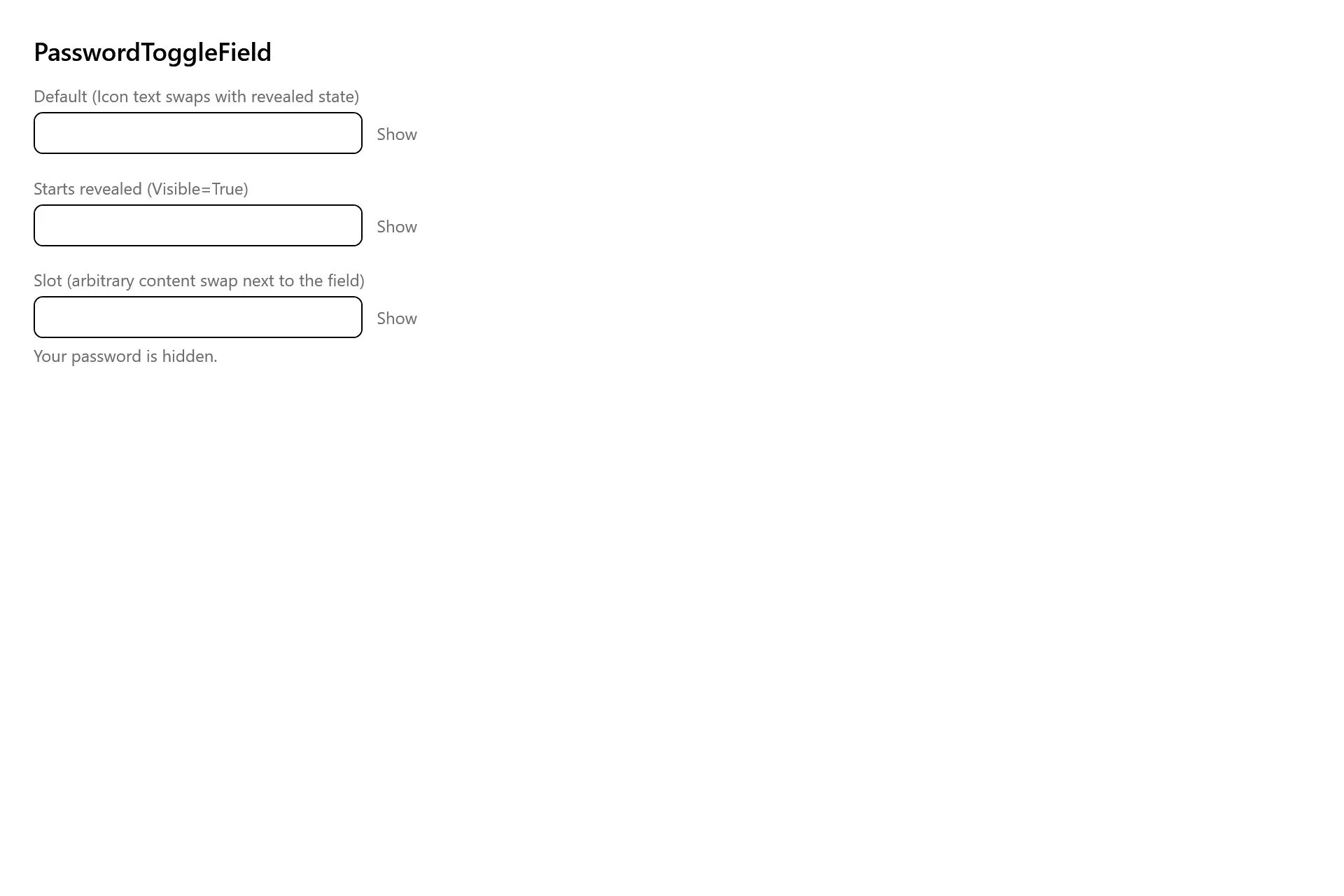
Section titled “Captures”The PasswordToggleField Gallery page rendered at the pinned commit, in each theme.