Autocomplete
Overview
Section titled “Overview”Autocomplete is a lookless Control pairing an editable textbox with a suggestion popup: the
web family’s 19-part Root/Input/Trigger/Value/Clear/Portal/Popup/List/Item/Group/Status anatomy
folds into one templated NaviusAutocomplete<TItem> (generic over the item type) built on the
non-generic NaviusAutocompleteBase. Unlike Combobox, Value is both the live input text and
the committed value: there is no separate query/commit distinction. It preserves the web’s
strict virtual-focus model, real keyboard focus never leaves the input, and the highlighted row
is a data pointer, not a WPF focus target.
xmlns:autocomplete="clr-namespace:Navius.Wpf.Primitives.Controls.Autocomplete;assembly=Navius.Wpf.Primitives"
<ContentControl x:Name="AutocompleteHost" />
var autocomplete = new NaviusAutocomplete<string>{ Items = Cities, Placeholder = "Search a city...",};AutocompleteHost.Content = autocomplete;NaviusAutocomplete<TItem> is generic, and WPF’s compiled-XAML compiler rejects x:TypeArguments
on any element other than the document’s root, so a closed NaviusAutocomplete<T> cannot be
declared inline inside a larger XAML tree. It is built in code-behind instead and dropped into a
plain placeholder host, the same pattern this repo’s own Gallery page uses
(AutocompletePage.xaml/AutocompletePage.xaml.cs): this avoids the fragility of
x:TypeArguments in classic WPF XAML. WPF resolves default styles per closed generic type, so the
control overrides DefaultStyleKeyProperty onto the non-generic NaviusAutocompleteBase. Its
style lives in Themes/Autocomplete.xaml, which is merged into the assembly’s Generic.xaml (so
default styles resolve with no consumer action). Because WPF’s implicit-style lookup keys on the
concrete (closed generic) type rather than the base type, NaviusAutocompleteBase still resolves
the shared style itself explicitly, by base-type key, at Initialized/Loaded
(TryFindResource(typeof(NaviusAutocompleteBase))); a locally set Style always wins.
Properties
Section titled “Properties”| Property | Type | Default | From | Description |
|---|---|---|---|---|
IsOpen |
bool |
false |
NaviusAutocompleteBase |
Popup open state. Two-way bindable by default. |
Value |
string? |
null |
NaviusAutocompleteBase |
Input text and committed value in one. Two-way bindable by default. |
Placeholder |
string? |
null |
NaviusAutocompleteBase |
- |
HighlightedIndex |
int |
-1 |
NaviusAutocompleteBase |
Highlighted-row pointer. Virtual focus: this never moves WPF keyboard focus. |
Side |
PlacementSide |
Bottom |
NaviusAutocompleteBase |
Popup placement side. |
Align |
PlacementAlign |
Start |
NaviusAutocompleteBase |
Popup placement alignment. |
SideOffset |
double |
4 |
NaviusAutocompleteBase |
- |
AlignOffset |
double |
0 |
NaviusAutocompleteBase |
- |
ItemTemplate |
DataTemplate? |
null |
NaviusAutocompleteBase |
Row template; falls back to the theme’s default row template when null. |
FilteredRows |
ObservableCollection<AutocompleteRow> |
empty | NaviusAutocompleteBase |
Read-only. The rows PART_List binds to; updated in place so the list refreshes incrementally. |
IsEmpty |
bool |
true |
NaviusAutocompleteBase |
Read-only. True when there are no filtered rows. |
StatusText |
string |
"" |
NaviusAutocompleteBase |
Read-only. "{n} result(s)" text, also pushed via the automation peer’s notification event. |
Items |
IReadOnlyList<TItem>? |
null |
NaviusAutocomplete<TItem> |
Full item set to filter. |
ItemToString |
Func<TItem, string>? |
null |
NaviusAutocomplete<TItem> |
Item to display/match text. Defaults to x?.ToString(). |
Filter |
Func<TItem, string, bool>? |
null |
NaviusAutocomplete<TItem> |
Custom (item, query) => keep predicate. Defaults to a case-insensitive substring match. |
Keyboard interactions
Section titled “Keyboard interactions”| Key | Behavior |
|---|---|
ArrowDown |
Opens the popup if closed. If open, moves the highlight down by one row (clamped, no wrap). |
ArrowUp |
Opens the popup and highlights the last row if closed. If open, moves the highlight up by one row (clamped, no wrap). |
Enter |
Commits the highlighted row into Value and closes the popup, if a row is highlighted. |
Escape |
Closes the popup. |
Tab |
Closes the popup without marking the key handled, so normal Tab focus navigation still proceeds. |
Home / Page Up |
Highlights the first row, if the popup is open and rows exist. |
End / Page Down |
Highlights the last row, if the popup is open and rows exist. |
All handled by a single PreviewKeyDown hook on PART_Input. Because setting IsOpen = true
synchronously runs Recompute() (which resets HighlightedIndex to -1) before the ArrowUp
branch’s own assignment runs, “opens and highlights the last row” lands correctly rather than
being clobbered. PART_List and its rows are never focusable, so no row has its own key handler.
UIA mechanism
Section titled “UIA mechanism”NaviusAutocompleteAutomationPeer (a FrameworkElementAutomationPeer) reports
AutomationControlType.ComboBox and exposes the current Value as its accessible name when no
explicit name is set. It deliberately does not model the web’s aria-activedescendant virtual
focus (no IExpandCollapseProvider/ISelectionProvider wired to HighlightedIndex): WPF/UIA has
no first-class virtual-focus primitive, and the parity doc’s own open questions flag this as the
biggest translation gap, left explicitly deferred rather than half-built. GetClassNameCore()
returns the literal nameof(NaviusAutocompleteBase) for every closed generic instantiation, the
same fixed-base-name pattern documented as a residual on Combobox’s peer, though the M6 audit did
not separately flag it as a disparity for this family. The result-count announcement
(StatusText) is instead delivered via AutomationPeer.RaiseNotificationEvent (Other,
CurrentThenMostRecent) whenever the filtered rows change while open, following the same pattern
as Toast. The unit suite verifies the keyboard table, that PART_List/PART_PopupContent/its
ScrollViewer are non-focusable (so real focus never leaves the input), and that the overlay
session is pushed with TrapFocus=false/RestoreFocus=false.
Web deltas
Section titled “Web deltas”- The web’s 19 rendering parts (Root/Input/Trigger/Icon/Value/Clear/Portal/Positioner/Popup/
Arrow/Collection/List/Row/Item/Group/GroupLabel/Separator/Empty/Status) collapse into one
lookless
NaviusAutocomplete<TItem>with template partsPART_Input,PART_Popup,PART_PopupContent,PART_List. - No separate Trigger, Icon, Clear, Arrow, or Backdrop parts: the input itself opens the popup
(
ArrowDown/ArrowUpor typing), clearing is just emptying the text, there is no chevron or arrow glyph in this wave’s hairline-border aesthetic, and dismissal (non-modal, no scroll lock) is handled entirely by the overlay stack rather than a rendered backdrop element. Group/GroupLabel/Separatorare not ported: rows are a flatObservableCollection<AutocompleteRow>, consistent with the parity doc noting grouped/grid layout was unexercised in the source.- Collision options (
Flip/AvoidCollisions/Sticky/HideWhenDetached/ArrowPadding) are handled internally by the shared anchored-popup engine and are not re-surfaced as Autocomplete DPs; onlySide/Align/SideOffset/AlignOffsetare exposed. - Dropped web-only parameters:
Attributes/Classon every part,Dir(WPFFlowDirectionis the platform channel instead),DefaultOpen(a two-wayIsOpenbinding covers both controlled and uncontrolled use). - Strict virtual focus is preserved structurally rather than by a roving tabindex:
PART_List, itsScrollViewer, andPART_PopupContentare all non-focusable, and rows are plainDataTemplates overAutocompleteRow, neverSelector/ListBoxItemtargets. The web’saria-activedescendantwiring has no WPF/UIA equivalent, so a screen reader is not told which row is highlighted;StatusTextannounces the result count only, not the highlighted row itself. This gap is explicitly deferred in the WPF implementation notes, not silently dropped. - Known peer-name pattern: like Combobox,
NaviusAutocompleteAutomationPeer.GetClassNameCore()returns the fixed literalnameof(NaviusAutocompleteBase)regardless of the closedTItema consumer declares. The M6 audit for this family did not evaluate the peer’s class name as a claim, so this is a code-observed fact rather than an audited disparity; stated here plainly rather than rounded up to a confirmed finding. - M6 audit found one cosmetic doc inaccuracy (not fixed, not a behavioral disparity): the
implementation notes state
PART_List/itsScrollViewer/PART_PopupContentall carryKeyboardNavigation.TabNavigation="None", butThemes/Autocomplete.xamlonly sets that onPART_List; the other two rely onFocusable="False"alone, which already excludes them from Tab cycling.
Captures
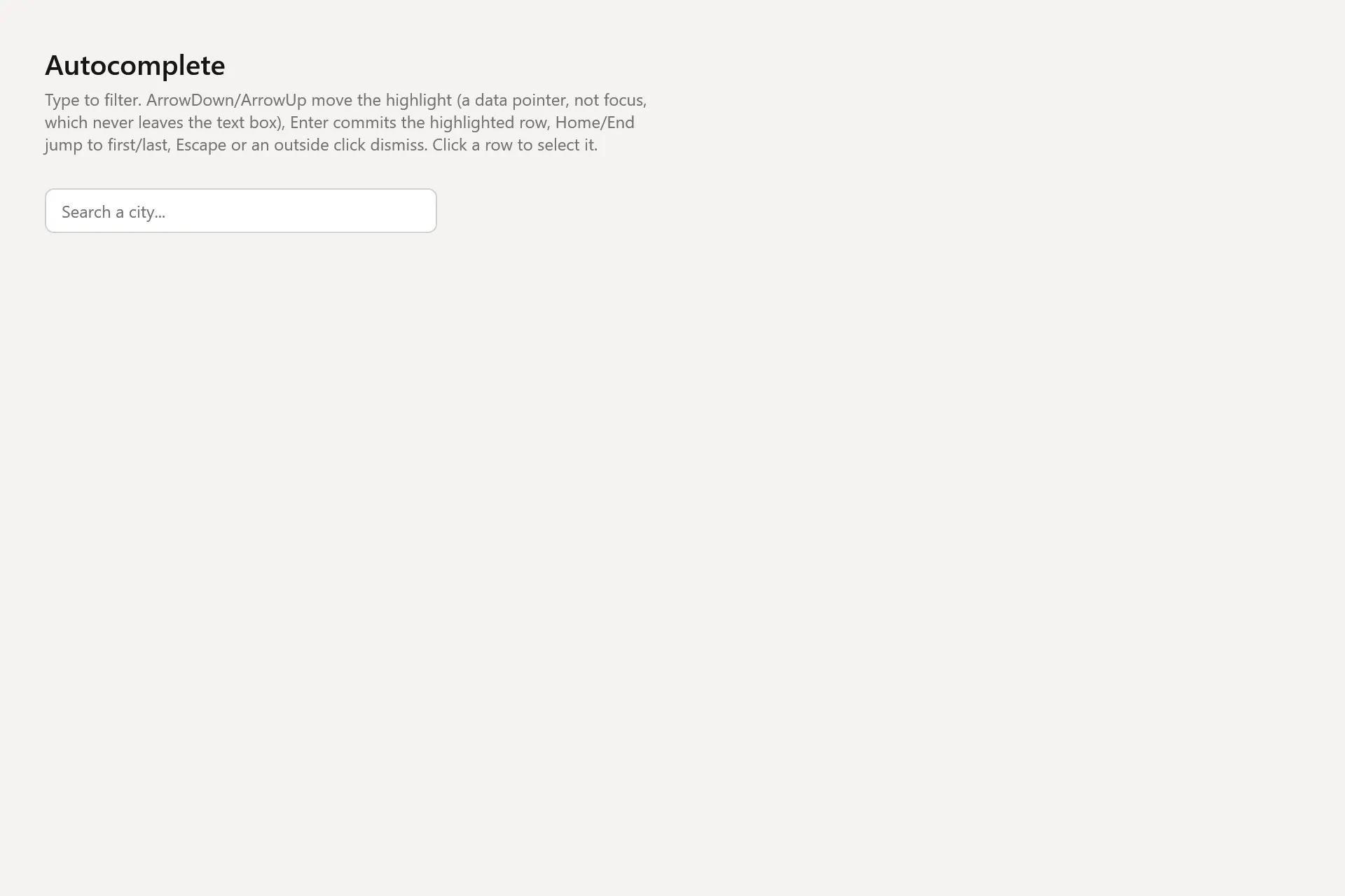
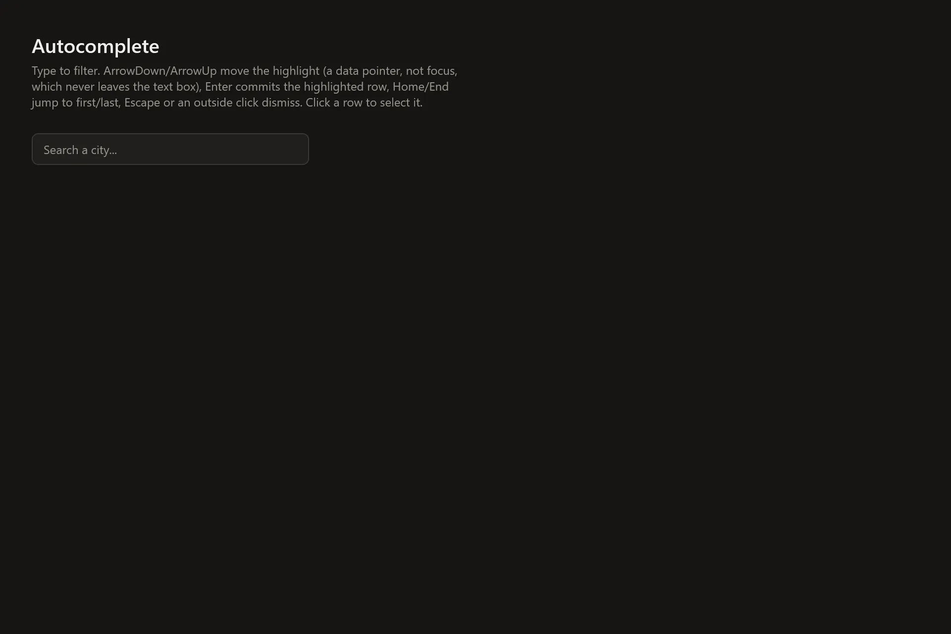
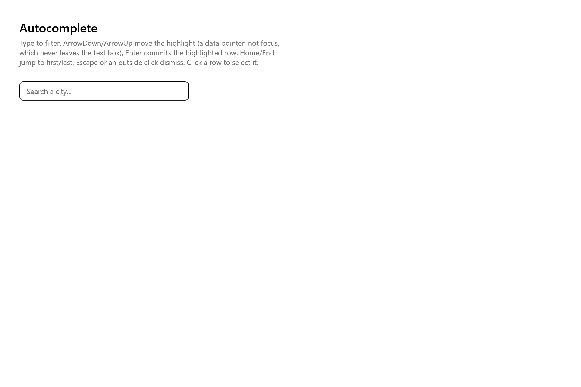
Section titled “Captures”The Autocomplete Gallery page rendered at the pinned commit, in each theme.