DateInput
Overview
Section titled “Overview”DateInput is a lookless Control that composes one NaviusFieldSegment per year/month/day unit
(plus non-focusable literal separators) inside its PART_Segments panel, built from the culture’s
ShortDatePattern via SegmentLayoutBuilder and driven by the shared, WPF-free SegmentMath/
DateTimeSegment engine (Controls/Internal/SegmentEngine.cs, shared verbatim with
NaviusTimeInput). No native WPF control edits a date as independently focusable, steppable
segments (WPF’s own DatePicker edits as one masked text run), so this is a from-scratch spinbutton
row rather than a re-templated native control.
xmlns:dateInput="clr-namespace:Navius.Wpf.Primitives.Controls.DateInput;assembly=Navius.Wpf.Primitives"
<dateInput:NaviusDateInput Value="{Binding DueDate, Mode=TwoWay}"                           Granularity="day"                           MinValue="{Binding EarliestDate}"                           Required="True" />
Properties
Section titled “Properties”| Property | Type | Default | From | Description |
|---|---|---|---|---|
Value |
DateOnly? |
null |
NaviusDateInput |
Two-way bindable by default. |
Granularity |
string |
"day" |
NaviusDateInput |
"day" (y/m/d), "month" (y/m), or "year". Changing it at runtime rebuilds the segment layout and reseeds from Value, discarding in-progress typing. |
MinValue |
DateOnly? |
null |
NaviusDateInput |
Drives IsOutOfRange/IsInvalidState; never clamps the composed value. |
MaxValue |
DateOnly? |
null |
NaviusDateInput |
Same as MinValue, upper bound. |
PlaceholderValue |
DateOnly? |
null (→ today) |
NaviusDateInput |
Basis an empty segment jumps to on the first Arrow key. |
ReadOnly |
bool |
false |
NaviusDateInput |
Blocks every segment key (short-circuits in OnSegmentPreviewKeyDown). |
Required |
bool |
false |
NaviusDateInput |
Drives IsInvalidState (Required && Value is null). Fixed in the M6 audit: previously a dead property with no effect. |
Invalid |
bool |
false |
NaviusDateInput |
Force-invalid regardless of range/required state; ORed into IsInvalidState. |
ForceLeadingZeros |
bool |
false |
NaviusDateInput |
Pads month/day (and the year to 4 digits) with leading zeros. |
Culture |
CultureInfo? |
null (→ CultureInfo.CurrentCulture) |
NaviusDateInput |
Drives segment order and separators via ShortDatePattern. |
Name |
string? |
null |
NaviusDateInput |
Marker-only (no native-form mirror is ported); shadows FrameworkElement.Name via new. |
IsFilled |
bool |
false |
NaviusDateInput |
Read-only. True when any segment has a value. |
IsOutOfRange |
bool |
false |
NaviusDateInput |
Read-only. True when the composed value is outside [MinValue, MaxValue]. |
IsInvalidState |
bool |
false |
NaviusDateInput |
Read-only. Invalid || IsOutOfRange || (Required && Value is null). |
IsEnabled |
- |
- |
Control |
Disabled is not a separate DP: it maps directly onto the inherited Control.IsEnabled. |
FlowDirection |
- |
- |
Control (FrameworkElement) |
Dir is not a custom string parameter: native FlowDirection drives ArrowLeft/ArrowRight segment-focus mirroring directly. |
Methods
Section titled “Methods”| Method | Description |
|---|---|
FocusFirstSegment() |
Focuses the first editable segment cell; this port’s stand-in for the web contract’s Field.FocusControl hookup, since no ambient NaviusField integration exists between the two families yet. |
Events
Section titled “Events”| Event | Signature | Fires when |
|---|---|---|
ValueChanged |
RoutedPropertyChangedEventHandler<DateOnly?> |
On every committing keystroke (Arrow/Page/digit/Home/End/Backspace) that changes the composed value, not only once fully composed. |
Keyboard interactions
Section titled “Keyboard interactions”| Key | Behavior |
|---|---|
ArrowUp |
+1, wraps at [Min, Max]; an empty segment reveals the placeholder basis (today, or PlaceholderValue) instead of stepping from nothing. |
ArrowDown |
-1, same wrap/placeholder-reveal rule. |
PageUp |
Steps by the segment’s page step (year 5, month 3, day 7). |
PageDown |
Steps back by the same page step. |
Home |
Jumps to Min, clears the type buffer. |
End |
Jumps to Max, clears the type buffer. |
Backspace / Delete |
Clears the segment to unfilled. |
ArrowLeft |
Moves focus to the previous segment (flipped to next under FlowDirection.RightToLeft). |
ArrowRight |
Moves focus to the next segment (flipped to previous under RTL). |
Digit 0-9 |
Appends to the type buffer; auto-advances to the next segment when the candidate value exceeds what one more digit could stay within bounds for, or the buffer reaches its max digit count (4 for year, 2 for month/day); ignores RTL (always advances forward). |
The day segment’s Max is recomputed from the current year/month after every value-changing key,
clamping an out-of-range day down immediately (e.g. typing day “31” then changing month to
February).
UIA mechanism
Section titled “UIA mechanism”NaviusDateInputAutomationPeer (a FrameworkElementAutomationPeer) reports
AutomationControlType.Group plus a read-only IValueProvider surfacing the composed value as an
ISO yyyy-MM-dd string, matching the NaviusSelectAutomationPeer/NaviusTimePicker precedent since
a template-only control otherwise exposes nothing over UIA. Each NaviusFieldSegment cell has its
own NaviusFieldSegmentAutomationPeer reporting AutomationControlType.Spinner plus
IRangeValueProvider (Minimum/Maximum/Value/SetValue), including the day-period segment
where applicable (shared with TimeInput). An unfilled segment reports Value = NaN over
IRangeValueProvider, a distinct empty signal independent of the visible placeholder token.
Segment-engine and control-level behavior (27 [Fact] plus 1 [Theory] engine tests, 20 [StaFact]
control/peer tests) is exercised by DateInputTests.cs against real hosted windows for focus
travel, typed-digit composition, and both automation peers.
Web deltas
Section titled “Web deltas”- No
NaviusBubbleInputhidden form-mirror: this repo’s Select-family precedent already drops native-form wiring for Tier B controls;Namestays a marker-only property. - No ambient
NaviusFieldintegration (that family is a sibling port, not cascaded):FocusFirstSegment()stands in forField.FocusControl;IsFilled/IsOutOfRange/IsInvalidStateare public read-only DPs a Field port can read directly instead of anApplyControlStateAsyncpush. Diris WPF’s nativeFlowDirection, not a custom string parameter; ArrowLeft/ArrowRight segment-focus mirroring honors it exactly as the web’sMoveFocusdoes forDir="rtl".Disabledmaps onto the inheritedControl.IsEnabled, not a separate dependency property.DefaultValue(the web’s uncontrolled-initial-value parameter) has no separate property:Valueis a plain two-way DP, and WPF’s DP system needs no controlled/uncontrolled split.- Placeholder rendering: an unfilled segment shows a unit-shorthand token (
"yyyy"/"mm"/"dd") instead of the web’s literalaria-valuetextstring"Empty", WPF’s own masked-input placeholder idiom. - Month/day-name
aria-valuetextis not ported: UIA’sIRangeValueProvideronly exposes a numericValue, so a screen reader hears the month as a number, not a localized name; reproducing it would need a second pattern layered on top, left as a follow-up. - Segment row RTL fix (ADR-0006): the
PART_Segmentspanel is pinned toFlowDirection="LeftToRight"inThemes/DateInput.xamlso the visual segment order (year/month/ day plus separators) never mirrors under an ambient RTLFlowDirection, while the surrounding control still carries the ambientFlowDirectionthatOnSegmentPreviewKeyDownreads correctly for ArrowLeft/ArrowRight focus-travel direction. Verified with a pixel-renderedRenderTargetBitmapdiff (byte-for-byte identical segment layout between LTR and RTL) and locked in byDateInputTests.PartSegments_FlowDirectionPinnedToLeftToRight_*andPartSegments_ChildOrder_UnaffectedByFlowDirection. - Known residual (M6 audit, a coverage gap rather than a defect): culture-driven segment
ordering/separators is only exercised against
CultureInfo.InvariantCulturein the test suite; no test drives add/MM/yyyy-style culture (e.g.en-GB/de-DE) throughSegmentLayoutBuilder, so that specific coverage breadth is unverified. The underlying code is written generically and was not found to be wrong.
Captures
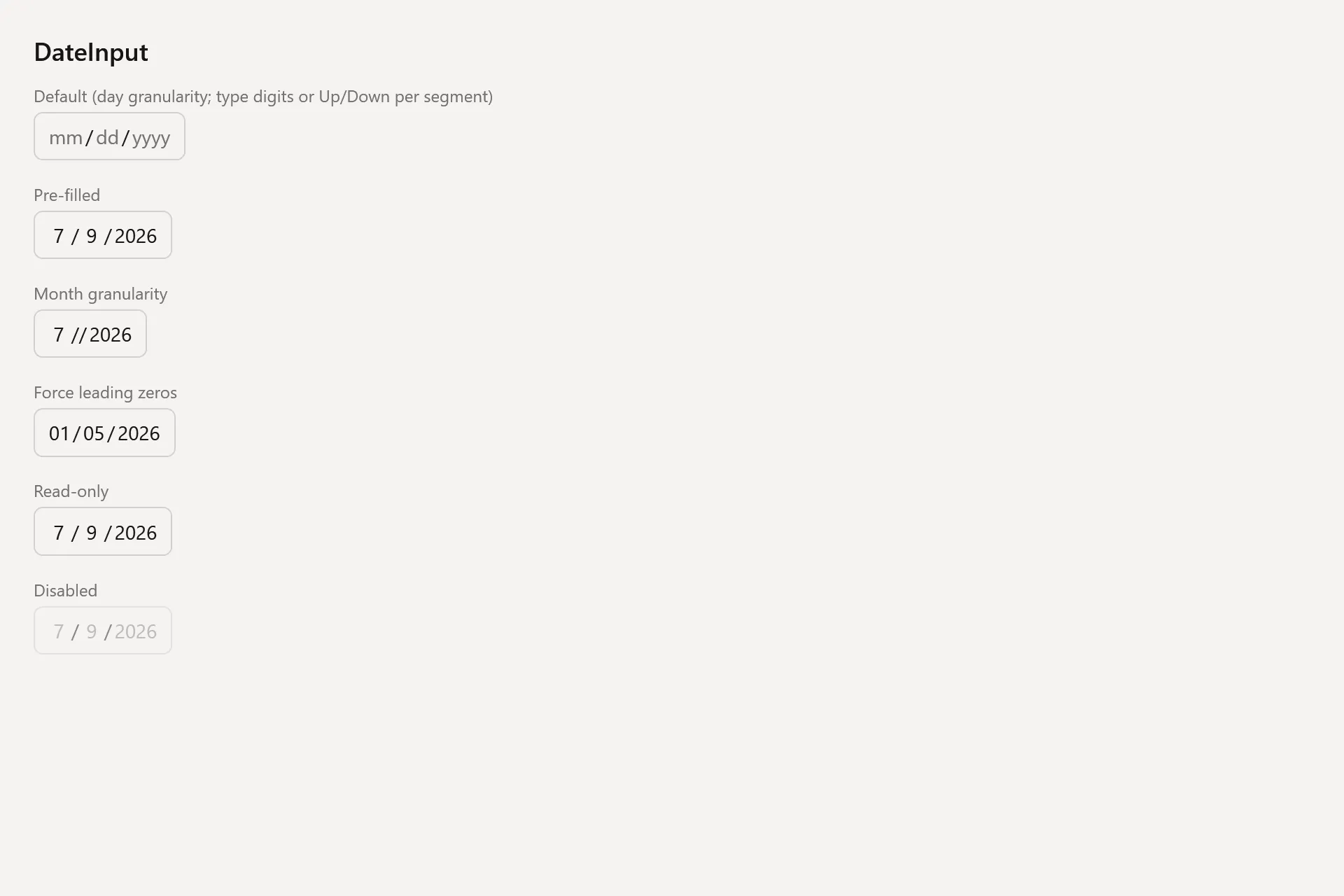
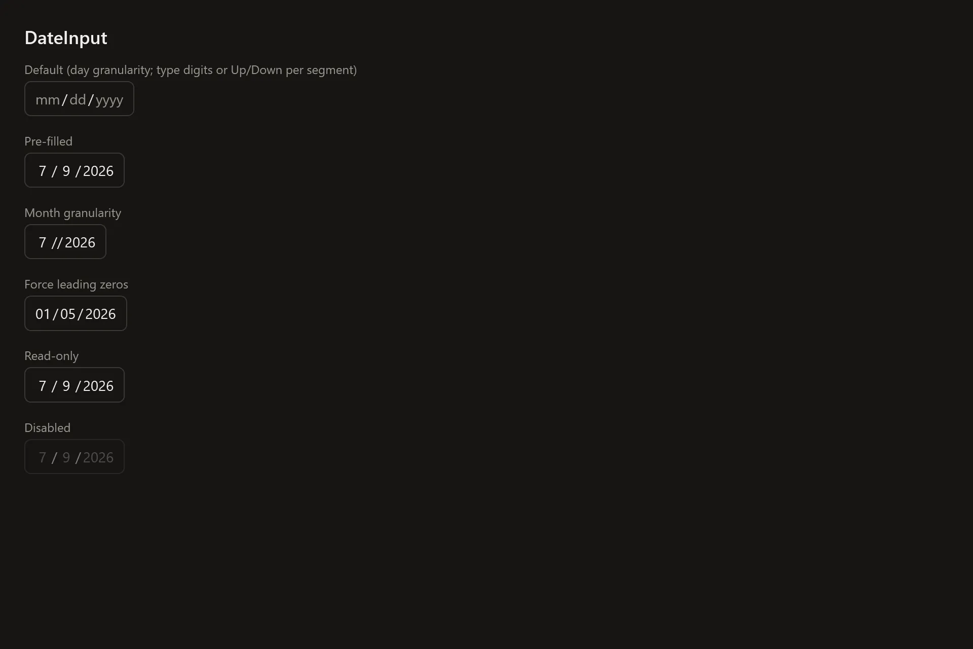
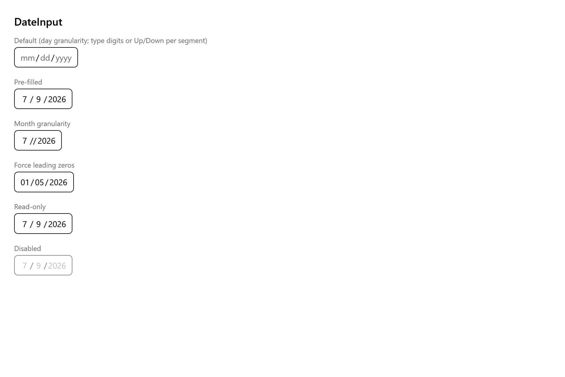
Section titled “Captures”The DateInput Gallery page rendered at the pinned commit, in each theme.