Theming
The token system
Section titled “The token system”Every control template in Navius.Wpf.Primitives and Navius.Wpf.Ui reads its colors and corner
radii through Navius.* DynamicResource keys, never a literal value. Button.xaml, for example,
sets Background from {DynamicResource Navius.Primary} and the button’s corner radius from
{DynamicResource Navius.Radius.Control}.
Three dictionaries under src/Navius.Wpf.Primitives/Themes/ supply those keys:
Tokens.Light.xaml, Tokens.Dark.xaml, and Tokens.HighContrast.xaml. Each carries the same key
set: a Navius.Tokens.Theme marker string ("Light", "Dark", or "HighContrast"), twenty-one
SolidColorBrush entries (Navius.Background, Navius.Foreground, Navius.Card,
Navius.CardForeground, Navius.Popover, Navius.PopoverForeground, Navius.Primary,
Navius.PrimaryForeground, Navius.Secondary, Navius.SecondaryForeground, Navius.Muted,
Navius.MutedForeground, Navius.Accent, Navius.AccentForeground, Navius.Destructive,
Navius.DestructiveForeground, Navius.Warning, Navius.WarningForeground, Navius.Border,
Navius.Input, Navius.Ring), and three
CornerRadius entries (Navius.Radius.Small, Navius.Radius.Control, Navius.Radius.Card).
That key-set match is not just convention: tests/Navius.Wpf.Tests/ThemeManagerTests.cs’s
TokenDictionary_HighContrast_CoversSameKeysAsLight loads both Tokens.Light.xaml and
Tokens.HighContrast.xaml and asserts their key sets are equal, so an addition to one dictionary
that is not mirrored in the other fails the test suite rather than surfacing as a missing token at
runtime.
ThemeManager
Section titled “ThemeManager”Navius.Wpf.Primitives.Theming.ThemeManager (src/Navius.Wpf.Primitives/Theming/ThemeManager.cs)
owns which token dictionary is live:
Apply(NaviusTheme theme)applies a theme toApplication.Current.Resources.Apply(NaviusTheme theme, ResourceDictionary scope)applies it to an explicit scope instead (a single window, or a test’s isolated dictionary). Both walk the scope’sMergedDictionariesbackward, remove any dictionary carrying theNavius.Tokens.Thememarker key, then add a freshly loadedThemes/Tokens.{theme}.xamlin its place, so repeated calls swap the token set instead of stacking dictionaries.Currentis the last-appliedNaviusTheme(Light,Dark, orHighContrast), defaulting toLight.ThemeChangedfires after every swap, including the high-contrast enter/restore transitions below, so a consumer that reads token values in code (rather than throughDynamicResource) has a signal to re-resolve them.EnableSystemHighContrastSync()is opt-in and idempotent (a second call is a no-op). It subscribes toSystemParameters.StaticPropertyChangedand checksSystemParameters.HighContrastimmediately on enable and again on every subsequent change. When the OS flag turns on, it records whatever theme was active immediately before (unless already in a high-contrast state) and appliesNaviusTheme.HighContrast. When the flag turns back off, it re-applies whatever theme was recorded before the switch, restoring the prior theme rather than falling back to a fixed default. Both transitions go through the sameApplypath, soThemeChangedfires for them like any other theme change.
Consuming tokens
Section titled “Consuming tokens”Because every template binds tokens with DynamicResource rather than StaticResource, swapping
the token dictionary at runtime re-paints every live control immediately, with no rebuild of the
visual tree. An app (or a vendored copy of a control) can override a single token by inserting its
own dictionary above the Navius one, or by setting the key directly in a narrower scope:
<Window.Resources> <SolidColorBrush x:Key="Navius.Primary" Color="#2954FF" /></Window.Resources>Because DynamicResource re-resolves on lookup, this only needs to be declared once; it does not
need to be re-applied when ThemeManager.Apply runs on an ancestor scope, since resource lookup
walks up the tree and stops at the first dictionary that defines the key.
High contrast (ADR-0007)
Section titled “High contrast (ADR-0007)”Windows high contrast is a native accessibility mode the web port never had to handle: browsers
own high-contrast rendering themselves, but a WPF app’s SolidColorBrush values are exactly what a
high-contrast theme needs to replace with the OS’s own palette. Tokens.HighContrast.xaml maps
every Navius.* brush key to a SolidColorBrush whose Color is bound with DynamicResource to
a SystemColors.*ColorKey, never a literal color, so a live OS palette change repaints the brush
without an app restart or another Apply call. Per ADR-0007’s mapping:
| Navius token | SystemColors key |
|---|---|
| Background / Foreground | Window / WindowText |
| Card / Popover (+Foreground) | Window / WindowText |
| Primary / PrimaryForeground | Highlight / HighlightText |
| Secondary / Accent (+Foreground) | Control / ControlText |
| Muted / MutedForeground | Control / GrayText |
| Destructive / DestructiveForeground | WindowText / Window |
| Warning / WarningForeground | WindowText / Window |
| Border / Input | WindowText |
| Ring (focus) | Highlight |
Navius.Radius.Small/Control/Card are kept identical to the Light and Dark dictionaries; ADR-0007
notes there is no high-contrast-specific corner-radius concern. There is no SystemColors key for
a warning or destructive color, so both semantic roles fall back to WindowText; warning and
destructive affordances need to carry their meaning through icon or label rather than hue while
high contrast is active.
Applying NaviusTheme.HighContrast is opt-in in both directions: nothing switches to it
automatically just because the token dictionary exists. A consumer either calls
ThemeManager.Apply(NaviusTheme.HighContrast) directly (the same call used for Light or Dark),
or calls EnableSystemHighContrastSync() once to have ThemeManager track
SystemParameters.HighContrast for the lifetime of the app and switch automatically as the OS
setting changes.
The three themes side by side
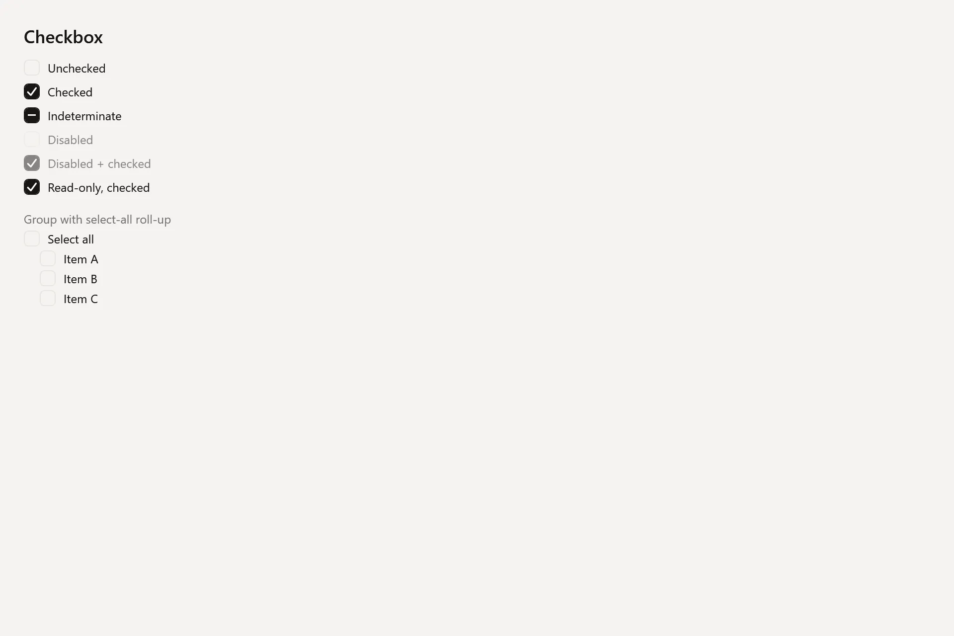
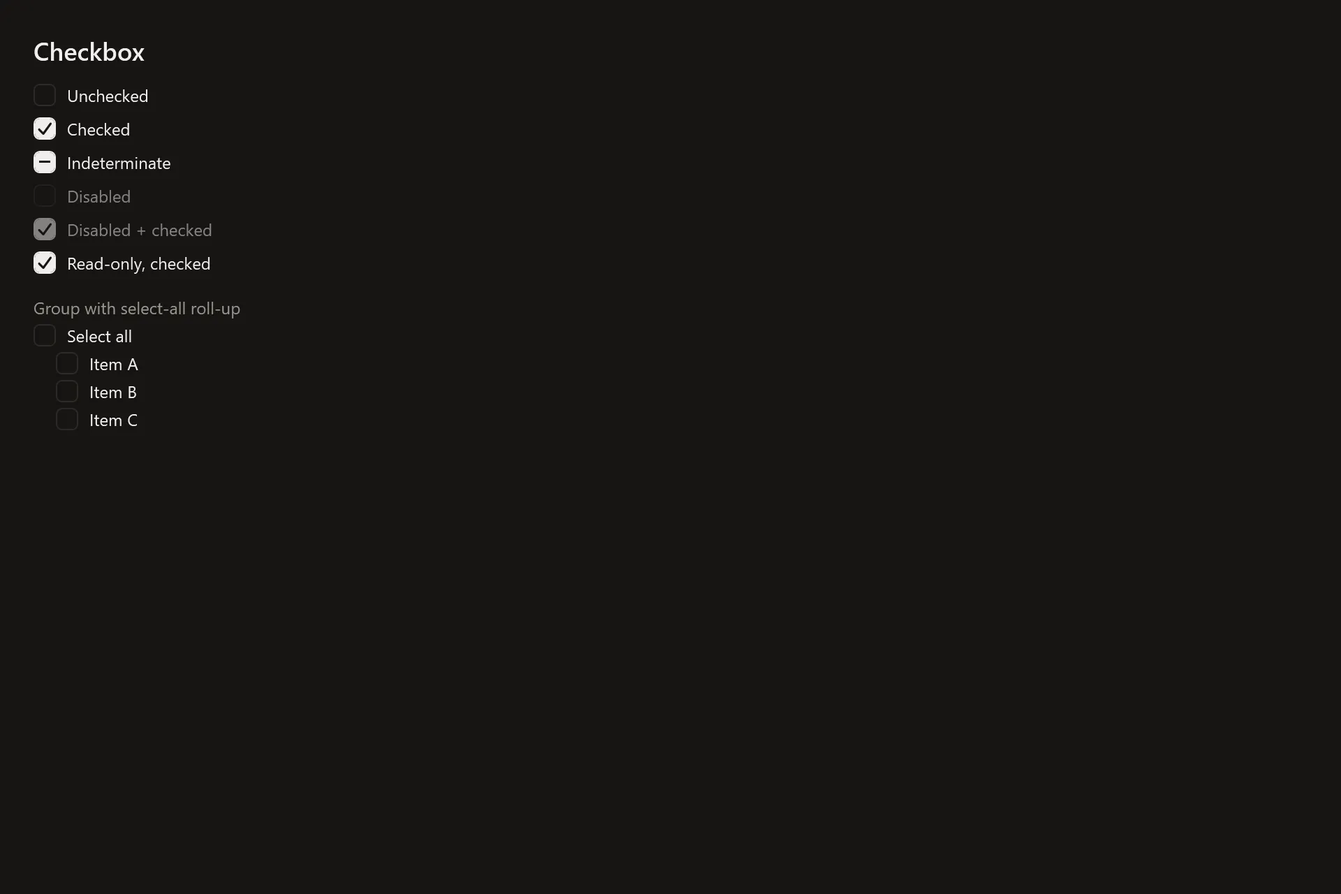
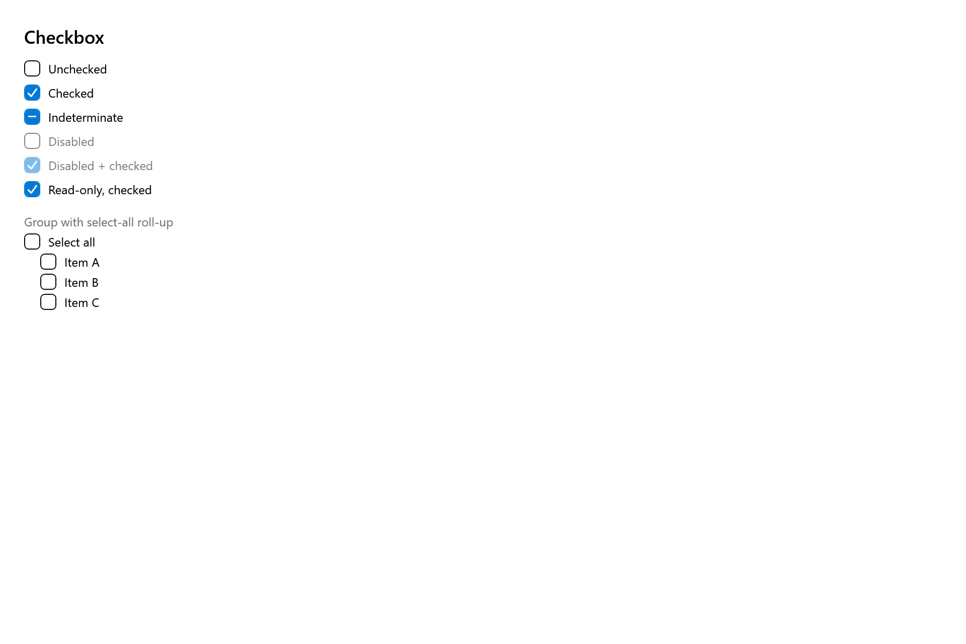
Section titled “The three themes side by side”The same Checkbox Gallery page rendered at the pinned commit under each theme dictionary.