Menubar
Overview
Section titled “Overview”Menubar is the closest 1:1 web-to-native match in this catalog: WPF’s Menu is already exactly
a horizontal bar of top-level MenuItems, each of which owns its own submenu popup,
roving/typeahead keyboard navigation, and hover-to-switch (“follow focus”) between open siblings,
so almost the entire web contract’s Trigger/Portal/Positioner/Popup/Arrow/DismissableLayer/
RovingFocus machinery collapses onto native behavior for free. The 18-part web contract maps
onto 9 WPF classes.
xmlns:menubar="clr-namespace:Navius.Wpf.Primitives.Controls.Menubar;assembly=Navius.Wpf.Primitives"
<menubar:NaviusMenubar Value="{Binding OpenMenu, Mode=TwoWay}">    <menubar:NaviusMenubarMenu Value="file" Header="File">        <menubar:NaviusMenubarItem Header="New" Command="ApplicationCommands.New" />        <menubar:NaviusMenubarCheckboxItem Header="Word wrap" Checked="{Binding WordWrap, Mode=TwoWay}" />        <menubar:NaviusMenubarSeparator />        <menubar:NaviusMenubarSubTrigger Header="Recent">            <menubar:NaviusMenubarItem Header="Document 1.txt" />        </menubar:NaviusMenubarSubTrigger>    </menubar:NaviusMenubarMenu>    <menubar:NaviusMenubarMenu Value="edit" Header="Edit">        <menubar:NaviusMenubarItem Header="Copy" Command="ApplicationCommands.Copy" />    </menubar:NaviusMenubarMenu></menubar:NaviusMenubar>
A labeled group of items is expressed the idiomatic native way: a NaviusMenubarLabel followed
by its items followed by a NaviusMenubarSeparator, all as flat siblings (there is no
NaviusMenubarGroup wrapper type). A mutually-exclusive radio set is coordinated through a
non-visual NaviusMenubarRadioGroup resource rather than nesting:
<menubar:NaviusMenubarRadioGroup x:Key="ViewGroup" Value="list" />...<menubar:NaviusMenubarRadioItem Value="list" Group="{StaticResource ViewGroup}" Header="List" /><menubar:NaviusMenubarRadioItem Value="grid" Group="{StaticResource ViewGroup}" Header="Grid" />Properties
Section titled “Properties”| Property | Type | Default | From | Description |
|---|---|---|---|---|
Value |
string? |
null |
NaviusMenubar |
Controlled open-menu value; two-way bindable. Set from the child NaviusMenubarMenu.Value on submenu open/close. |
Orientation |
Orientation |
Horizontal |
NaviusMenubar |
Horizontal (native Menu layout) or Vertical (swaps ItemsPanel to a StackPanel). |
Dir |
string? |
null |
NaviusMenubar |
ltr/rtl; overrides inherited FlowDirection when set. |
Loop |
bool |
false |
NaviusMenubar |
When false, arrow-key navigation across top-level triggers clamps at the ends instead of wrapping (best-effort, see Web deltas). |
Modal |
bool |
true |
NaviusMenubar |
API-parity only; native per-submenu Popup dismissal already scopes outside-press/Escape, so there is no additional behavior. |
Value |
string? |
null |
NaviusMenubarMenu |
Identity of this menu; throws InvalidOperationException in OnInitialized if null/empty. |
TextValue |
string? |
null |
NaviusMenubarItem |
Kept for API parity; native typeahead already matches Header text and is not wired to this property. |
Checked |
bool? |
null |
NaviusMenubarCheckboxItem |
Two-way bindable tri-state; null = indeterminate, mirrored one-way into native IsChecked (indeterminate maps to false). |
Value |
string? |
null |
NaviusMenubarRadioItem |
Throws InvalidOperationException in OnInitialized if null/empty. |
Group |
NaviusMenubarRadioGroup? |
null |
NaviusMenubarRadioItem |
The coordinator this item participates in. |
Value |
string? |
null |
NaviusMenubarRadioGroup |
Selected value shared across every RadioItem pointed at this group; a non-visual DependencyObject, not part of the visual/logical tree. |
Dir |
string? |
null |
NaviusMenubarSubTrigger |
Overrides cascaded FlowDirection for this submenu. |
Events
Section titled “Events”| Event | Signature | Fires when |
|---|---|---|
ValueChanged |
RoutedEventHandler |
NaviusMenubar.Value changes, driven by the child menus’ SubmenuOpened/SubmenuClosed cascade. |
Select |
EventHandler<NaviusMenubarSelectEventArgs> |
An item/checkbox item/radio item is activated, before the native click; cancelable via PreventDefault(). |
CheckedChanged |
EventHandler<bool?> |
NaviusMenubarCheckboxItem.Checked changes, raised from the DP-change callback so it fires on every change, programmatic or click-driven. |
ValueChanged |
EventHandler<string?> |
NaviusMenubarRadioGroup.Value changes, including from a RadioItem selection. |
OpenChanged |
RoutedEventHandler |
NaviusMenubarSubTrigger’s submenu opens or closes, forwarded from native SubmenuOpened/SubmenuClosed. |
Keyboard interactions
Section titled “Keyboard interactions”| Key | Behavior |
|---|---|
ArrowLeft / ArrowRight (trigger row, no menu open) |
Native roving across top-level MenuItems; clamped instead of wrapped when Loop=false via a PreviewKeyDown interceptor (best-effort, see Web deltas). |
Home / End (trigger row) |
Native (inherited). |
ArrowDown / ArrowUp / Enter / Space (on a trigger, its menu closed) |
Opens that menu (native MenuItem submenu-open behavior). |
| Hovering a different trigger while another menu is open | Native “follow focus”: that trigger’s menu opens automatically. |
ArrowDown / ArrowUp (inside an open menu) |
Native roving between items. |
ArrowRight (ArrowLeft in rtl) / Enter / Space (on a submenu header) |
Opens the submenu (native). |
ArrowLeft (ArrowRight in rtl) (inside a submenu) |
Closes only that submenu (native). |
Escape |
Closes the open (sub)menu (native Popup dismissal). |
UIA mechanism
Section titled “UIA mechanism”NaviusMenubarAutomationPeer derives from MenuAutomationPeer, overriding only
GetClassNameCore(); the automation control type and patterns it reports are otherwise whatever
the native MenuAutomationPeer provides. NaviusMenubarLabel ships its own peer (a
MenuItemAutomationPeer subclass) reporting AutomationControlType.Text with
IsControlElementCore() true, since it is a non-interactive heading, not a real menu item.
Ordinary items, checkbox items, and radio items inherit MenuItemAutomationPeer. The unit suite
exercises the Value-required throws, the Loop=false clamp, and the CheckedChanged-raises-on-
programmatic-set regression added at M6.
Web deltas
Section titled “Web deltas”- 18 web parts collapse onto 9 WPF classes:
NaviusMenubarMenuabsorbs Trigger+Portal+ Positioner+Popup+Arrow (itsHeaderrenders as the trigger, itsItemsas the floating, dismissable popup);NaviusMenubarSubTriggerabsorbs Sub+SubTrigger+SubContent via nativeMenuItemnesting. NaviusMenubarGrouphas no wrapper type: express a labeled group as aNaviusMenubarLabelfollowed by its items followed by aNaviusMenubarSeparator, all flat siblings (wrapping in an arbitraryItemsControlwould make WPF auto-generate a blank containerMenuItem).NaviusMenubarRadioGroupdoes not nest its items either, for the same reason: it is a non-visualDependencyObjectcoordinator declared as a resource and pointed at by eachRadioItem.Group, rather than anItemsControlwrapper.- CheckboxItem/RadioItem never call
base.OnClick(): nativeMenuItem’s ownIsCheckableclick handling would double-toggleIsCheckedagainst this port’s own tri-state/Group-driven logic, so both raiseClickmanually instead. Net effect: a boundCommandon either type never executes (an accepted OnSelect-driven delta, not a regression). Loop=falseis best-effort: native WPF top-level menu navigation always wraps;falseis implemented as aPreviewKeyDowninterceptor that swallows the wrapping keypress, not a first-class navigation-engine setting.- Every stateful DP (
Value,Checked,RadioGroup.Value) is a plain two-wayDependencyPropertywhose paired event always raises on change; this collapses the web contract’s split controlled/uncontrolled (HasDelegatevs. explicit-SetParametersAsync- tracking) strategies into one canonical model. - Captured unmatched attributes (
Attributes) are not ported anywhere in this family; there is no Blazor-style unmatched-parameter bag in WPF. - Known residual (M6 audit):
NaviusMenubar.Value’s own DP-change callback does not itself raiseValueChanged; the event only fires through theSubmenuOpened/SubmenuClosedcascade, so a programmaticValuechange in a headless context (or when the target menu is already open) may not raise it, even though every other DP in this family “always raises on change.” - Known residual (M6 audit): bound
Command/CommandParameteronNaviusMenubarCheckboxItem/NaviusMenubarRadioItemnever executes, for the reason above; documented as an accepted delta, not a regression.
Captures
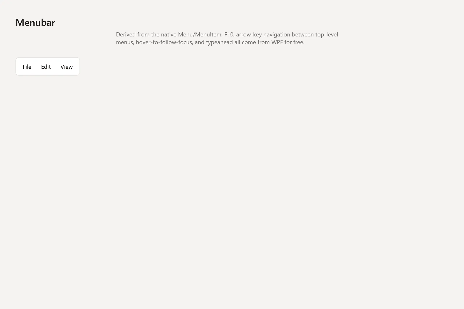
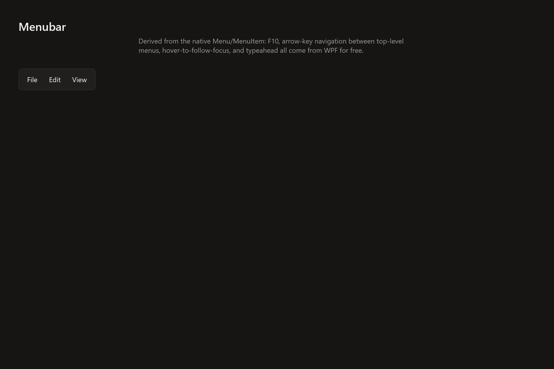
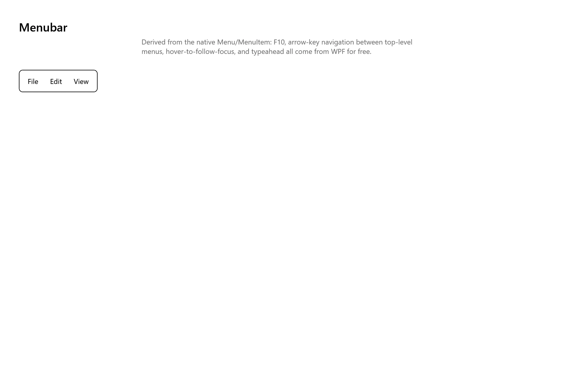
Section titled “Captures”The Menubar Gallery page rendered at the pinned commit, in each theme.