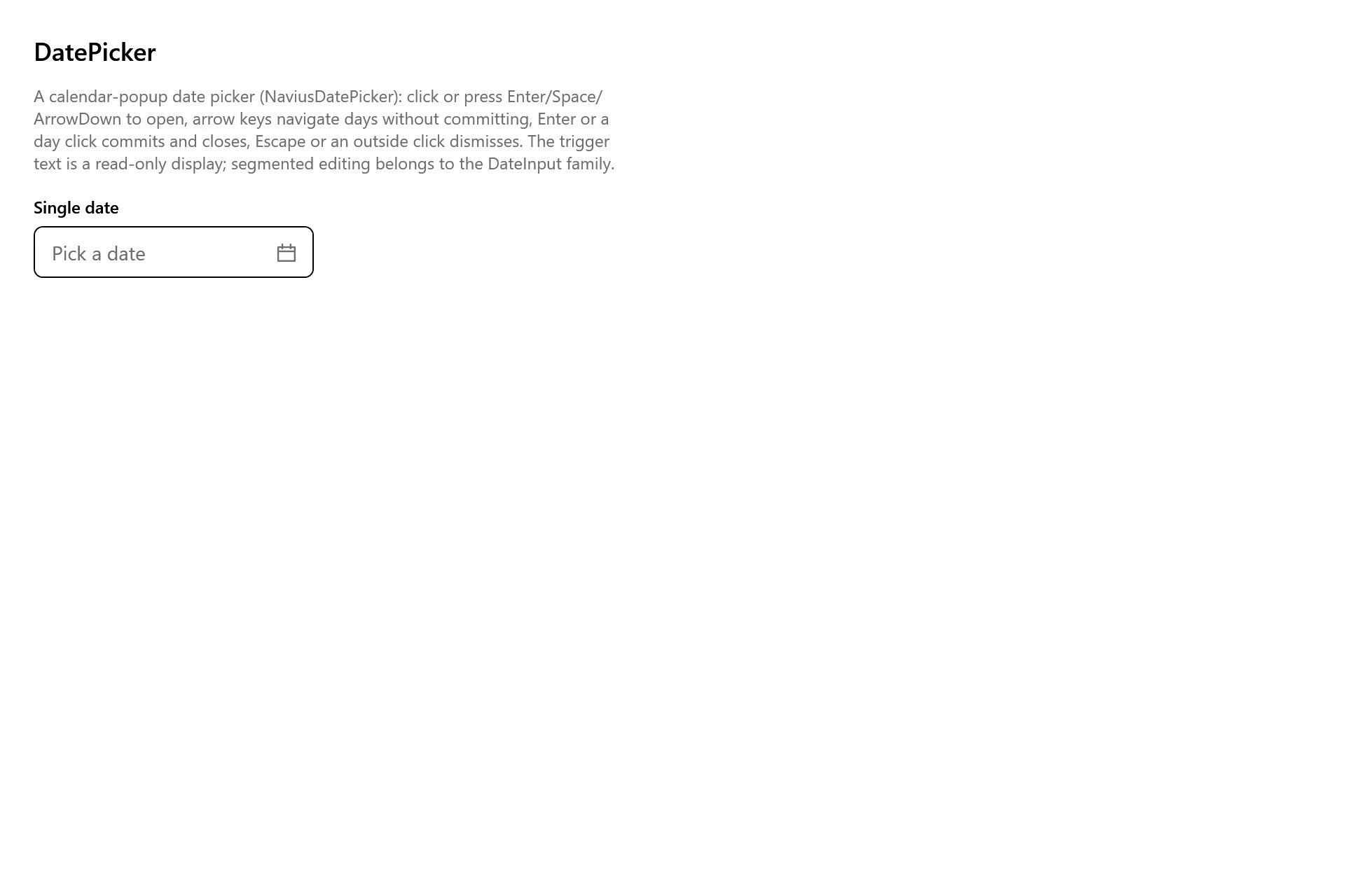
DatePicker
Overview
Section titled “Overview”The web Navius primitives library has no standalone DatePicker family: the nearest web relatives
are date-input (the segmented editor) and date-range-picker (the popup composite). The contract
source for this document is the date-range-picker family composition: NaviusDatePicker is the
same trigger + anchored popup + calendar anatomy that composite specifies, applied to a single
date. NaviusDatePicker is Tier B, a custom lookless control, not derived from the native
System.Windows.Controls.DatePicker (its DatePickerTextBox editing surface belongs to the
DateInput family, and its popup does not route through this repo’s OverlayStack dismissal
substrate). This control also owns the shared base class NaviusDatePickerBase, which
NaviusDateRangePicker derives from for its own open/close lifecycle, placement properties, and
pick detection.
xmlns:datePicker="clr-namespace:Navius.Wpf.Primitives.Controls.DatePicker;assembly=Navius.Wpf.Primitives"
<datePicker:NaviusDatePicker Value="{Binding Birthday, Mode=TwoWay}"                              Placeholder="Select a date" />
Properties
Section titled “Properties”| Property | Type | Default | From | Description |
|---|---|---|---|---|
Value |
DateTime? |
null |
NaviusDatePicker |
The committed date (date component only). Two-way bindable by default. Setting it directly updates the display but does not raise ValueChanged; only a pick commit does. |
IsOpen |
bool |
false |
NaviusDatePickerBase |
Two-way bindable by default; also settable via Enter/Space/ArrowDown when closed. |
Placeholder |
string? |
null |
NaviusDatePickerBase |
Muted trigger text shown while nothing is selected. |
Side |
PlacementSide |
Bottom |
NaviusDatePickerBase |
Popup placement side. |
Align |
PlacementAlign |
Start |
NaviusDatePickerBase |
Popup placement alignment (matches the web contract’s NaviusDateRangePickerContent default Align="start"). |
SideOffset |
double |
6 |
NaviusDatePickerBase |
See “Web deltas”: the web composite’s Content documents a default of 4. |
AlignOffset |
double |
0 |
NaviusDatePickerBase |
|
DisplayText |
string? |
null |
NaviusDatePickerBase |
Read-only. The formatted value, or the placeholder. A plain read-only display, not an editable segment field: composing NaviusDateInput into the picker is a recorded follow-up. |
HasSelection |
bool |
false |
NaviusDatePickerBase |
Read-only. Drives placeholder-muting trigger styling. |
Formatting uses the "d" pattern with CultureInfo.CurrentCulture.
Events
Section titled “Events”| Event | Signature | Fires when |
|---|---|---|
ValueChanged |
RoutedEventHandler |
On every committed pick: OnPickCommitted sets Value, raises the event, then closes. Verified by DatePickerTests.PickCommit_SetsValue_RaisesChanged_AndCloses. |
Keyboard interactions
Section titled “Keyboard interactions”| Key | Behavior |
|---|---|
Enter / Space / ArrowDown (trigger, popup closed) |
Opens the popup. Unit-tested (DatePickerTests.ClosedTrigger_OpenKeys_OpenThePopup). |
Escape (popup open) |
Closes without committing. Unit-tested (DatePickerTests.Escape_ClosesWithoutCommitting). |
Arrow keys / PageUp / PageDown / Home / End (inside the calendar) |
Native NaviusCalendar day-grid navigation, without committing. Inherited native behavior, not independently test-driven here; see calendar.md for the Home/End wording caveat. |
Enter / Space (a focused calendar day) |
Commits the focused day and closes. Read from CalendarPart.SelectedDate after the native class handler has already moved it there; attached with handledEventsToo because Calendar’s class handlers mark the event handled. |
| Left mouse-up on a calendar day | Commits that day and closes, same path as the keyboard commit. |
| Outside press | Dismisses the popup without committing, via the OverlayStack session. Asserted by code reading, not independently driven by a test. |
Pick detection deliberately does not listen to Calendar.SelectedDatesChanged: the native calendar
moves its selection on every arrow key, and the contract wants arrow keys to navigate without
committing.
UIA mechanism
Section titled “UIA mechanism”NaviusDatePickerAutomationPeer (a FrameworkElementAutomationPeer) reports
AutomationControlType.Custom with localized control type "date picker", mirroring the native
WPF DatePickerAutomationPeer’s shape, plus a read-only IValueProvider surfacing the formatted
date (empty while unset, never the placeholder; SetValue throws InvalidOperationException) and
IExpandCollapseProvider over IsOpen. The web trigger’s aria-haspopup="dialog"/aria-expanded
pair has no direct WPF equivalent; ExpandCollapsePattern plus focus moved onto the calendar on
open is the native WPF idiom instead. Verified by DatePickerTests.ValuePattern_SurfacesFormattedDate_NeverThePlaceholder
and DatePickerTests.ExpandCollapsePattern_TracksIsOpen. Both Expand() and Collapse() throw
ElementNotEnabledException while the picker is disabled, as required by UIA.
Web deltas
Section titled “Web deltas”- Not derived from the native
System.Windows.Controls.DatePicker: itsDatePickerTextBoxediting surface belongs to the DateInput family (a separate, concurrently ported family), and its popup does not route through this repo’sOverlayStackdismissal substrate. - The trigger shows a plain read-only formatted date rather than the web’s editable segmented
input; composing
NaviusDateInputinto the picker is a recorded follow-up once both families are merged. - The web composite delegates its calendar grid to
ZitsCalendar, a styled-layer component with no source inNavius.Primitivesat all. This port composesNaviusCalendar, a Tier A control derivingSystem.Windows.Controls.Calendarand inheriting its native keyboard model andCalendarAutomationPeerfor free (seecalendar.md). - Known residual:
SideOffsetdefaults to6, while the web composite’sNaviusDateRangePickerContentdocuments a default of4; no rationale is recorded in the source for the difference. - Known residual: no dedicated end-to-end coverage exists for this control (
tests/Navius.Wpf.E2Edoes not reference it); coverage is unit-level only. - Known residual: the in-grid native
Calendarnavigation (arrows,PageUp/PageDown,Home,End) and outside-press dismissal are asserted only as inherited platform behavior, not independently driven by a test; seecalendar.mdfor the additional Home/End wording caveat.
Captures
Section titled “Captures”The DatePicker Gallery page rendered at the pinned commit, in each theme.